Introduction
The landscape of Frontend Development has undergone a seismic shift over the last decade. Gone are the days when developers relied on table-based structures or complex float-clearing hacks to achieve multi-column designs. Today, the convergence of HTML5 Features and advanced CSS3 Features has empowered Web Design professionals to create intricate, two-dimensional layouts with unprecedented precision. At the heart of this revolution lies the Grid Layout—a system that has evolved from a static styling specification into the backbone of dynamic, interactive user interfaces.
While CSS Grid provides the native browser engine for placing elements, the demands of modern web applications often exceed static placement. Users now expect dashboard-style interfaces where widgets are draggable and resizable, adapting fluidly to different screen sizes. This moves the conversation beyond simple CSS Selectors and into the realm of complex state management within frameworks like React, Vue, or Angular. This article explores the full spectrum of Grid Layouts, from the fundamental W3C Standards of native CSS to the implementation of interactive, responsive grid systems used in enterprise-grade applications. We will examine how to leverage Semantic HTML, ensure Web Accessibility, and utilize modern tooling to build layouts that are not only visually stunning but also robust and maintainable.
Section 1: The Foundation – Understanding the Native CSS Grid Specification
To build complex, interactive interfaces, one must first master the underlying technology: the CSS Grid Layout Module. Unlike CSS Flexbox, which is designed for one-dimensional layouts (either a row or a column), CSS Grid is the first CSS module created specifically to solve the layout problems we’ve been hacking around for as long as we’ve been making websites. It allows for two-dimensional manipulation of rows and columns simultaneously, making it the premier choice for overall Page Layout.
The Terminology of the Grid
Understanding Grid requires a vocabulary shift. We no longer speak merely of margins and padding, but of tracks, lines, and areas. A grid container is defined by setting display: grid on an element. Inside this container, we define Grid Tracks using properties like grid-template-columns and grid-template-rows. A crucial innovation here is the introduction of the fr unit, a flexible length that represents a fraction of the available space in the grid container. This allows for fluid layouts that standard percentages or pixels cannot easily achieve.
Grid Areas and Semantic Structure
One of the most powerful features of CSS Grid is the ability to name sections of your layout. Using grid-template-areas, developers can create a visual map of the layout directly in the CSS. This pairs perfectly with HTML Semantic elements. For instance, you can map a <header>, <main>, <aside>, and <footer> to specific named areas. This separates the visual structure from the source order, allowing for SEO-optimized HTML structures where the content hierarchy remains logical for screen readers, regardless of where elements appear visually on the screen.
Implicit vs. Explicit Grids
A common pitfall for newcomers to CSS Tutorial guides is the difference between implicit and explicit grids. The explicit grid is what you define with your template properties. However, if you add more content than fits into those defined tracks, the browser creates an implicit grid to hold them. Understanding how to control these auto-generated tracks using grid-auto-rows and grid-auto-flow is essential for handling dynamic content, such as a feed of blog posts or a gallery of images, ensuring the design remains robust without breaking the layout.
Section 2: Responsive and Adaptive Strategies in Modern Layouts
Responsive Design is no longer an optional feature; it is a mandatory requirement for Mobile-First Design. While CSS Framework options like Bootstrap or Foundation historically relied on rigid 12-column systems controlled by classes, native CSS Grid offers a more fluid approach that often reduces the need for media queries.
The Power of Minmax and Auto-Fit
The combination of the `repeat()`, `auto-fit` (or `auto-fill`), and `minmax()` functions creates a “holy grail” of responsive layout. This technique allows grid items to automatically arrange themselves based on available width. If the screen is wide, the items stretch or add more columns; if the screen is narrow, they wrap to new rows. This behavior mimics the utility of Flexbox Layout but maintains the strict two-dimensional alignment of a grid. This drastically reduces the lines of code required compared to traditional methods using floats or inline-blocks.
Handling Breakpoints in Complex Applications
While native CSS handles fluid responsiveness well, complex applications often require distinct layout changes at specific breakpoints. This is where CSS Variables (Custom Properties) shine. By defining grid parameters as variables (e.g., --grid-cols: 1fr;), you can simply update the variable value inside a media query to completely restructure the page. This approach aligns with Modern CSS best practices, keeping the layout logic centralized and the implementation clean.
Container Queries: The Future of Component Layouts
As we look toward the future of Web Standards, Container Queries are changing how we think about grids. Instead of changing a grid based on the viewport size (media queries), Container Queries allow a component to adapt based on the size of its parent container. This is vital for component-driven architectures in React or Vue, where a specific “card” component might be used in a wide main content area or a narrow sidebar. A grid definition within that component needs to be context-aware, ensuring the UI Design remains consistent regardless of placement.
Section 3: Interactive Grids – Draggable, Resizable, and Dynamic
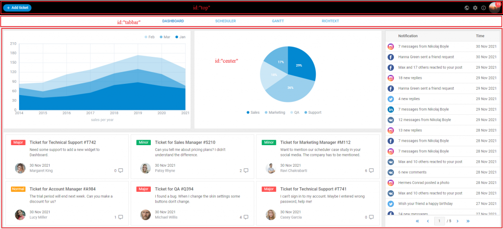
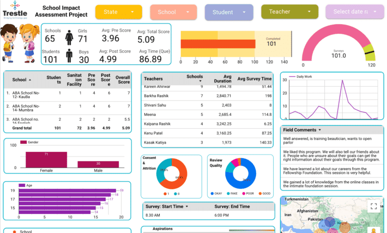
Moving beyond static document flow, the pinnacle of Frontend Web development is the interactive dashboard. Think of analytics platforms, financial tools, or personalized homepages where users can drag widgets around and resize them to fit their needs. This requires bridging the gap between CSS Grid layouts and JavaScript execution.
The Logic Behind Draggable Grids
Creating a draggable grid involves complex mathematics. While CSS handles the rendering, JavaScript must calculate the coordinates. When a user starts dragging an element, the system must translate pixel movements (X/Y coordinates) into grid units (Row/Column indices). This often involves:
1. Event Listeners: Capturing mouse or touch events.
2. Shadow Placeholders: Calculating where the item would land if dropped, and rendering a visual cue.
3. Collision Detection: Determining if the moving item overlaps with others and calculating how those items should reflow (move out of the way) or compact upwards.
State Management and Reactivity



In modern frameworks like React, the DOM is a reflection of state. Therefore, a draggable grid is essentially a visual representation of an array of objects, where each object contains data like `{ i: ‘widget1’, x: 0, y: 0, w: 2, h: 2 }`. When a user resizes a widget, the library updates this state, and the Virtual DOM re-renders the grid. This approach is superior to direct DOM manipulation because it ensures consistency and allows for features like “undo/redo” or saving the layout configuration to a database. CSS-in-JS libraries or Styled Components are often used here to dynamically generate the `transform` properties needed for smooth CSS Transitions during the drag operations.
Performance Considerations
CSS Animations and layout thrashing are major concerns in interactive grids. If every pixel of movement triggers a browser reflow, the application will feel sluggish. CSS Best Practices dictate using `transform: translate()` for movement rather than changing `top` or `left` properties, as transforms are handled by the GPU (compositor thread) and do not trigger layout recalculations. Furthermore, utilizing techniques like debouncing resize events and using `requestAnimationFrame` ensures the animation loop remains smooth at 60fps, providing a high-quality UX Design.
Section 4: Best Practices, Accessibility, and Implementation
Whether building a static blog layout or a dynamic trading terminal, adhering to HTML Best Practices and accessibility standards is non-negotiable. A visually perfect grid that is unusable by keyboard navigators or screen readers is a failed product.
Accessibility (a11y) in Grid Layouts
One of the most dangerous features of CSS Grid is the ability to visually reorder elements using the `order` property or by placing items in grid areas that differ from the DOM order. Screen readers generally follow the DOM order, not the visual order. If your visual layout disconnects significantly from the HTML structure, you create a confusing experience for visually impaired users.
Tip: Always ensure your source code order is logical. Use CSS Grid for visual positioning, but do not rely on it to fix poor HTML structure. Use ARIA Labels and roles to define relationships between widgets in an interactive dashboard.


Tooling and Preprocessors
While modern CSS is powerful, preprocessors like SASS or LESS, and post-processors like PostCSS, remain valuable. They allow for the generation of complex grid utility classes or the management of fallbacks for older browsers (though support for Grid is now almost universal). For those using utility-first frameworks like Tailwind CSS, grid utilities allow for rapid prototyping, though they may lack the semantic clarity of named grid areas. Choosing the right tool depends on the project scale; CSS Modules are excellent for scoping grid styles to specific components to prevent side effects.
HTML Forms and Tables in Grids
HTML Forms and HTML Tables often present layout challenges. CSS Grid is exceptionally useful for form layout, allowing labels and inputs to align perfectly across multiple columns without the need for nested divs. However, one must be careful with tables; while `display: grid` can be applied to `<tbody>` or `<tr>` elements to force table data into a grid layout, this can sometimes break the semantic accessibility of the table. It is often better to use standard table elements for tabular data and CSS Grid for the macro layout of the page.
Conclusion
The evolution of the Grid Layout represents a maturity in Web Development that bridges the gap between graphic design tools and browser rendering engines. From the robust, declarative nature of the native CSS Grid specification to the complex, imperative logic of JavaScript-driven dashboard libraries, developers now possess a toolkit capable of building any interface imaginable.
However, with great power comes great responsibility. As we embrace these advanced layout techniques, we must remain grounded in the fundamentals: Semantic HTML, Web Accessibility, and performance optimization. Whether you are hand-coding a CSS Grid for a landing page or implementing a sophisticated drag-and-drop system for a SaaS application, the goal remains the same—to deliver a seamless, intuitive, and responsive experience for the user. As CSS Features continue to expand with additions like Subgrid, the boundary between content and layout will continue to blur, offering even more exciting possibilities for the future of the web.

