The Evolution of Web Layout: An Introduction to CSS Grid
For years, frontend developers wrestled with the constraints of CSS to create compelling web layouts. We journeyed from the rigid, inaccessible world of <table> layouts to the often-unpredictable realm of floats and clearfixes. The arrival of CSS Flexbox was a revolutionary step, providing a robust system for one-dimensional alignment. Yet, the challenge of creating complex, two-dimensional page structures remained. Enter CSS Grid Layout, a true game-changer in the world of Web Design and Frontend Development. It is not just another property; it’s a complete module designed specifically for building sophisticated, grid-based user interfaces with unprecedented control and simplicity.
CSS Grid is a two-dimensional layout system that allows developers to arrange content into rows and columns. Unlike its predecessors, it provides a native solution for managing both axes simultaneously, making it the ideal tool for overall Page Layout. This article offers a comprehensive technical deep dive into the core properties of CSS Grid. We will explore how to define grid structures, arrange items with semantic precision, and apply these concepts to build modern, responsive layouts. By mastering these CSS Properties, you can move beyond hacks and frameworks to write cleaner, more maintainable, and more powerful CSS for any project, from simple blogs to complex web applications.
The Foundation of Modern Web Layout: Understanding CSS Grid
At its core, CSS Grid operates on a simple parent-child relationship. By applying display: grid to an element, you declare it a “grid container.” All direct children of this element automatically become “grid items.” This simple declaration unlocks a powerful new set of properties for both the container and its items, allowing you to dictate the entire structure and flow of your layout from a central control point. This paradigm shift is a cornerstone of Modern CSS and aligns with W3C Standards for creating logical and accessible web pages.
The Core Concepts: Grid Container and Grid Items
Understanding the terminology is the first step to mastery. A grid container is the element on which display: grid is applied. This container establishes a grid formatting context for all its direct children, which are the grid items. The layout is defined by a network of intersecting horizontal and vertical lines that form the grid. The space between two adjacent grid lines is called a grid track (either a column or a row), and the space created by the intersection of a row and a column is a grid cell. Grid items can be placed within these cells or be made to span across multiple cells, creating a highly flexible and dynamic Grid Layout.
<!-- HTML Structure -->
<div class="grid-container">
  <div class="grid-item">1</div>
  <div class="grid-item">2</div>
  <div class="grid-item">3</div>
</div>

/* CSS Styling */
.grid-container {
  display: grid;
  /* ...grid properties go here... */
}
Why Grid is a Game-Changer for UI Design
Before CSS Grid, achieving two-dimensional layouts often required nested elements, complex calculations, or reliance on heavy CSS Framework libraries like Bootstrap or Foundation. Floats were fragile and could easily break, while Flexbox, though excellent for single-axis alignment, became cumbersome when trying to align items across both rows and columns simultaneously. CSS Grid solves this “content-out” problem by providing a “layout-in” approach. You define the layout grid first and then place your content into it. This separation of concerns improves the HTML Structure, enhances maintainability, and makes creating sophisticated layouts for dashboards, portfolios, and editorial sites remarkably intuitive. This control is fundamental to achieving pixel-perfect UI Design and improving the overall UX Design by ensuring content is presented in a clear, organized manner.
Mastering the Grid Container: `grid-template-columns`, `rows`, and `areas`
The true power of CSS Grid is unlocked through its container properties, which allow you to define the entire blueprint of your layout. Three of the most fundamental and powerful properties are grid-template-columns, grid-template-rows, and grid-template-areas. These properties are the architects of your grid, dictating its structure, size, and semantic meaning.
Defining the Structure: `grid-template-columns` and `grid-template-rows`
These two properties are used to define the tracks (columns and rows) of your grid. You provide a space-separated list of values, where each value defines the size of a corresponding track. You can use standard length units like pixels (px), percentages (%), or a powerful new unit exclusive to Grid: the fraction unit (fr).
The fr unit represents a fraction of the available space in the grid container. This makes creating flexible and proportional columns incredibly easy. For example, grid-template-columns: 1fr 2fr; creates two columns where the second column is always twice as wide as the first, regardless of the container’s width.
.grid-container {
  display: grid;
  /* Creates three columns: 100px, auto-sized, and 2 fractions of remaining space */
  grid-template-columns: 100px auto 2fr;

  /* Creates two rows, each 200px tall */
  grid-template-rows: 200px 200px;

  gap: 10px; /* A handy property to define space between grid items */
}
For repetitive grids, the repeat() function is a fantastic piece of syntactic sugar. grid-template-columns: repeat(3, 1fr); is identical to writing grid-template-columns: 1fr 1fr 1fr;, making your CSS Styling cleaner and more scalable.
The Art of Naming: `grid-template-areas`
While `grid-template-columns` and `rows` define the physical structure, grid-template-areas defines the semantic structure. This property provides a wonderfully visual and intuitive way to map out your layout. You create a “drawing” of your grid in your CSS, assigning names to different regions. Each string represents a row, and the space-separated names within it define the cells in that row. A period (.) can be used to signify an empty cell.
Once the areas are defined on the container, you can assign a grid item to a named area using the grid-area property. This approach decouples the source order of your HTML Elements from their visual presentation, which is incredibly powerful for Responsive Design and enhances Web Accessibility by maintaining a logical document flow.
.container {
  display: grid;
  grid-template-columns: 1fr 3fr;
  grid-template-rows: auto 1fr auto;
  grid-template-areas:
    "header header"
    "sidebar main"
    "footer footer";
}

.header { grid-area: header; }
.sidebar { grid-area: sidebar; }
.main-content { grid-area: main; }
.footer { grid-area: footer; }
This method makes your layout code self-documenting and incredibly easy to refactor, especially when combined with media queries to redefine the areas for different screen sizes. It’s a perfect example of how Modern CSS promotes more readable and maintainable code.
Practical Applications: From Responsive Design to Complex Bento Grids
Theory is essential, but the real test of any technology is its practical application. CSS Grid excels in real-world scenarios, particularly in creating responsive layouts and modern UI patterns like the increasingly popular Bento Grid. Its features provide robust solutions for challenges that developers have faced for years.
Building for Every Screen: Grid and Responsive Design
CSS Grid is a first-class citizen in the world of Responsive Design. The most common approach is to use media queries to redefine the grid structure at different breakpoints. For a Mobile-First Design, you might start with a single-column layout and then use `grid-template-areas` to rearrange content into a more complex structure on larger screens.



/* Mobile-First Default Styles */
.page-layout {
  display: grid;
  grid-template-areas:
    "header"
    "main"
    "sidebar"
    "footer";
}

/* Tablet and Desktop Styles */
@media (min-width: 768px) {
  .page-layout {
    grid-template-columns: 1fr 3fr;
    grid-template-areas:
      "header header"
      "sidebar main"
      "footer footer";
  }
}
Even more powerfully, Grid enables intrinsically responsive layouts that adapt without media queries. By combining the repeat() function with auto-fit or auto-fill and the minmax() function, you can create a grid of columns that automatically wraps and adjusts to the container’s width. This is one of the most powerful CSS Tricks available today for creating fluid, flexible grids.
.card-grid {
  display: grid;
  /* Each column will be at least 250px wide, and they will all grow equally to fill the space.
     New columns are created automatically as space becomes available. */
  grid-template-columns: repeat(auto-fit, minmax(250px, 1fr));
  gap: 1rem;
}
Case Study: The Trendy Bento Grid Layout
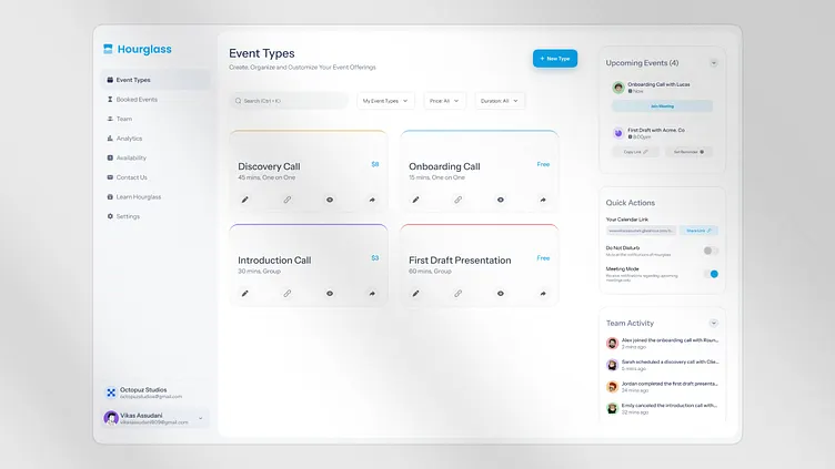
The “Bento Grid” is a modular layout style perfect for dashboards, portfolios, and Landing Pages. It features items of various sizes arranged in a neat grid, resembling a Japanese bento box. CSS Grid makes building this type of layout trivial.
You can achieve this by having grid items span multiple tracks. Using the grid-column and grid-row properties, you can instruct an item to start at one grid line and end at another. The span keyword is particularly useful here.
<!-- HTML for a Bento Grid -->
<div class="bento-grid">
  <div class="item item-1">Featured</div>
  <div class="item item-2">Small 1</div>
  <div class="item item-3">Small 2</div>
  <div class="item item-4">Wide</div>
</div>

/* CSS for the Bento Grid */
.bento-grid {
  display: grid;
  grid-template-columns: repeat(3, 1fr);
  grid-auto-rows: minmax(150px, auto); /* Ensure rows have a minimum height */
  gap: 1rem;
}

.item-1 {
  /* This item will span 2 columns and 2 rows */
  grid-column: span 2;
  grid-row: span 2;
  background-color: #f0a;
}

.item-4 {
  /* This item will span 3 columns */
  grid-column: span 3;
  background-color: #0af;
}
This example demonstrates how easily you can break from a uniform grid to create a dynamic and visually engaging Web Layout, a task that would have been incredibly complex with older layout techniques.
CSS Grid vs. Flexbox: Choosing the Right Tool for the Job
A common point of confusion for developers new to modern CSS is when to use Grid and when to use CSS Flexbox. They are not competing technologies; rather, they are complementary tools designed to solve different layout problems. Understanding their core distinction is key to effective Frontend Web development.



One Dimension vs. Two Dimensions
The simplest way to differentiate them is by their dimensionality.
- CSS Flexbox was designed for one-dimensional layout. It excels at distributing space and aligning items along a single axis, either as a row or as a column. Think of it as perfect for arranging items in a line.
- CSS Grid was designed for two-dimensional layout. It excels at aligning items across both rows and columns simultaneously. Think of it as a tool for creating an entire page structure or a complex component with both vertical and horizontal alignment rules.
When to Use Which: Best Practices
The best practice is not to choose one over the other but to use them together.
- Use CSS Grid for: The overall page layout, including headers, footers, sidebars, and main content areas. It’s also ideal for any component that requires a strict grid structure, like a calendar, a dashboard, or an image gallery.
- Use CSS Flexbox for: Component-level layouts. It’s perfect for aligning items inside a navigation bar, centering content within a button or card, or distributing form elements evenly.
A powerful pattern in modern Web Development is to use Grid for the macro layout and Flexbox for the micro layouts. For example, your main page could be a grid container, and one of its grid items—like the site header—could be a flex container to align the logo and navigation links. This hybrid approach leverages the strengths of both systems to create clean, efficient, and highly maintainable code.
Conclusion: Building the Future of the Web with CSS Grid
CSS Grid is more than just a new set of CSS Properties; it represents a fundamental shift in how we approach web layout. By providing a robust, native, two-dimensional system, it empowers developers to build complex, responsive, and accessible websites with cleaner code and greater creative freedom. Mastering properties like grid-template-columns, grid-template-rows, and the highly intuitive grid-template-areas allows for the creation of layouts that are both visually stunning and semantically sound.
As we move forward, embracing Modern CSS tools like Grid and Flexbox is no longer optional—it is a best practice. By understanding their core strengths and learning how to use them in concert, you can streamline your development process, reduce reliance on third-party frameworks, and build web experiences that are more performant, maintainable, and aligned with modern Web Standards. The era of layout hacks is over; the future of web design is structured, semantic, and built on the powerful foundation of CSS Grid.


