The Architect’s Blueprint: An Introduction to Grid Layout
In the world of modern web design and frontend development, creating sophisticated, responsive, and maintainable page layouts is a foundational skill. For years, developers wrestled with floats, tables, and positioning hacks to arrange elements on a page—methods that were often brittle and counterintuitive. The arrival of CSS Flexbox revolutionized one-dimensional layout, but the challenge of creating complex, two-dimensional structures remained. Enter CSS Grid Layout, a powerful module that provides a native, two-dimensional grid-based layout system. It fundamentally changed how we approach UI design, allowing for the creation of intricate and consistent layouts with surprisingly clean and readable code. This article serves as a comprehensive technical guide to mastering CSS Grid, moving from foundational concepts and practical examples to advanced techniques and best practices. We’ll explore how Grid works, how it compares to Flexbox, and how to leverage its full potential to build balanced, accessible, and truly responsive web experiences that feel meticulously crafted from the ground up.
Section 1: Understanding the Core Concepts of CSS Grid
Before diving into code, it’s essential to grasp the terminology and mental model behind CSS Grid. Unlike its one-dimensional counterpart, CSS Flexbox, Grid operates in two dimensions: rows and columns. This makes it the ideal tool for orchestrating the overall page layout, from the header and footer to complex multi-column content areas. Understanding its core components is the first step toward building with confidence.
The Anatomy of a Grid
At its heart, a grid is a set of intersecting horizontal and vertical lines that define the structure for placing content. When you declare display: grid; on an HTML element, you create a Grid Container. The direct children of this container automatically become Grid Items. This simple declaration unlocks a new set of CSS properties for both the container and its items.
- Grid Lines: These are the horizontal and vertical dividing lines that make up the grid’s structure. They can be referenced by number (starting from 1) to position items.
- Grid Tracks: The space between two adjacent grid lines. A track can be a column or a row. You define the size and number of tracks using properties like
grid-template-columnsandgrid-template-rows. - Grid Cell: The smallest unit of the grid, representing the space between four intersecting grid lines. It’s conceptually similar to a table cell.
- Grid Area: A rectangular space composed of one or more grid cells. You can name areas for easier, more semantic placement of items using the
grid-template-areasproperty. - Gutters (Gaps): The space between grid tracks. Controlled by the
gap(or oldergrid-gap) property, gutters provide consistent spacing without needing to use margins on grid items.
This vocabulary forms the basis of all grid-based layouts. By defining tracks, you create a precise blueprint, and by placing items onto that blueprint, you build your UI. This separation of structure from content is a cornerstone of modern CSS and semantic HTML, allowing your HTML structure to remain clean and logical while CSS handles the visual presentation.
Section 2: A Practical Guide to Building with CSS Grid
Theory is important, but the true power of CSS Grid is revealed through practical application. Let’s explore the essential CSS properties and build a common web layout pattern: a responsive 12-column grid system. This is a staple in web design, popularized by CSS frameworks like Bootstrap and Foundation, and is incredibly easy to create with native CSS Grid.
Defining the Grid Container
The first step is to establish the grid on a container element. Let’s say we have a <div class="container">. The most crucial properties are grid-template-columns and grid-template-rows.
web design grid layout overlay – The Ultimate CSS Grid Tutorial for Beginners
To create a classic 12-column layout, we can use the flexible fr unit, which represents a fraction of the available space in the grid container.
<!-- HTML Structure -->
<div class="container">
  <div class="item header">Header</div>
  <div class="item sidebar">Sidebar</div>
  <div class="item main">Main Content</div>
  <div class="item footer">Footer</div>
</div>

<!-- CSS Styling -->
.container {
  display: grid;
  grid-template-columns: repeat(12, 1fr); /* Creates 12 equal-width columns */
  grid-template-rows: auto 1fr auto; /* Header, flexible content, footer */
  gap: 20px; /* 20px space between all rows and columns */
  min-height: 100vh;
}
In this CSS tutorial snippet, repeat(12, 1fr) is a powerful shorthand that tells the browser to create 12 column tracks, each taking up one fraction of the available space. The gap property ensures consistent spacing, a task that was previously cumbersome with margins.
Placing Grid Items
Once the grid is defined, you can place items onto it. There are several methods, but the most common involve using grid lines.
<!-- CSS Styling for Grid Items -->
.header {
  grid-column: 1 / -1; /* Span from the first line to the last line */
}

.sidebar {
  grid-column: 1 / 4; /* Span from line 1 to line 4 (3 columns) */
  grid-row: 2;
}

.main {
  grid-column: 4 / -1; /* Span from line 4 to the last line (9 columns) */
  grid-row: 2;
}

.footer {
  grid-column: 1 / -1; /* Span from the first line to the last line */
  grid-row: 3;
}
Here, grid-column: 1 / -1; is a fantastic CSS trick. The -1 value always refers to the very last grid line, making the layout robust even if you change the number of columns in the container. This line-based placement gives you precise control over every element’s position and size within the grid.
A More Semantic Approach: grid-template-areas
For top-level page layouts, using grid-template-areas can make your CSS even more readable and semantic. This property allows you to name your grid items and then draw a visual representation of the layout directly in your CSS.
<!-- Revised CSS for the Container -->
.container {
  display: grid;
  grid-template-columns: repeat(12, 1fr);
  grid-template-rows: auto 1fr auto;
  gap: 20px;
  grid-template-areas:
    "header header header"
    "sidebar main main"
    "footer footer footer";
}

<!-- Simplified CSS for Grid Items -->
.header { grid-area: header; }
.sidebar { grid-area: sidebar; }
.main { grid-area: main; }
.footer { grid-area: footer; }
This approach is incredibly intuitive. The string values in grid-template-areas create a visual map of your page layout. Each word corresponds to a named grid area, and the layout of the words defines the layout of the elements. This is one of the most celebrated CSS3 features for its clarity and power.
Section 3: Grid vs. Flexbox: A Tale of Two Dimensions
A common point of confusion in frontend development is when to use CSS Grid and when to use CSS Flexbox. The answer isn’t about which is “better,” but which is the right tool for the job. The key difference lies in their dimensionality.
One Dimension vs. Two Dimensions
- CSS Flexbox Layout is designed for one-dimensional layouts—either a row or a column. It excels at distributing space and aligning items along a single axis. Think of a navigation bar, a list of cards, or aligning items within a button. Flexbox is content-out; it wraps items based on their size and the available space.
- CSS Grid Layout is designed for two-dimensional layouts—rows and columns simultaneously. It excels at orchestrating the overall page structure and aligning items into a fixed grid. Grid is layout-in; you define the grid structure first and then place content into it.
Real-World Scenario: The Perfect Combination
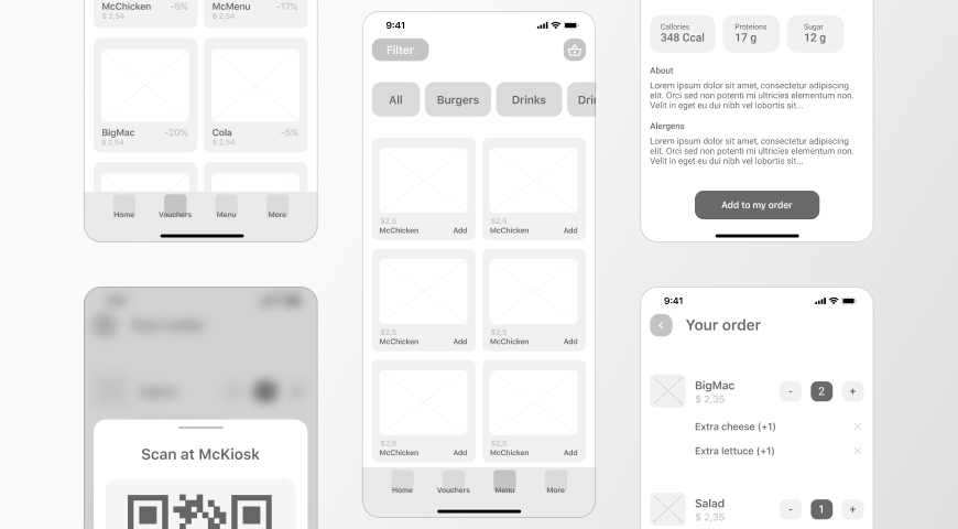
The best web layouts often use both Grid and Flexbox together. Imagine an e-commerce product listing page.
- Page Structure (Grid): You would use CSS Grid to define the main page layout: a header across the top, a filter sidebar on the left, and a main content area for the product listings. This is a two-dimensional problem, perfect for Grid.
- Product Cards (Flexbox): Inside the main content area, you have a collection of product cards. Each card contains an image, a title, a price, and a “Buy Now” button. You would use CSS Flexbox on each card’s container to align these internal elements. For example, you might use
display: flex;andflex-direction: column;withjustify-content: space-between;to ensure the button always sticks to the bottom of the card, regardless of the title’s length.

In this scenario, Grid handles the macro-layout (the page’s skeleton), while Flexbox handles the micro-layouts (the components’ internals). This synergy is a cornerstone of modern CSS architecture and a key principle in building complex, maintainable UIs. Trying to force one tool to do everything often leads to overly complex and brittle code.
Section 4: Best Practices, Accessibility, and Advanced Considerations
Leveraging CSS Grid effectively goes beyond just knowing the properties. Adhering to best practices ensures your layouts are responsive, accessible, and maintainable. This is crucial for professional web development and aligns with W3C Standards.
Mobile-First and Responsive Design
Grid is a phenomenal tool for mobile-first design. A common pattern is to start with a simple single-column layout for mobile screens and then use media queries to apply a more complex grid structure on larger viewports.

<!-- A Mobile-First Grid Approach -->
.container {
  display: grid;
  gap: 20px;
  /* Mobile: single column by default */
}

/* Tablet and up */
@media (min-width: 768px) {
  .container {
    /* Re-define grid for larger screens */
    grid-template-columns: repeat(12, 1fr);
    grid-template-areas:
      "header header header"
      "sidebar main main"
      "footer footer footer";
  }
}
This CSS Responsive approach ensures a great user experience on all devices, starting with a simple, functional layout and progressively enhancing it. Functions like minmax() and auto-fit can also create intrinsically responsive grids that adapt without needing media queries at all.
Accessibility and Source Order
A powerful—and potentially dangerous—feature of Grid is its ability to disconnect the visual order of elements from their order in the HTML document (the DOM order). You can place the footer before the main content visually, even if it comes after it in the HTML. While this offers flexibility, it can be a major Web Accessibility issue. Screen readers and keyboard navigation follow the DOM order, not the visual order. A user tabbing through your site might jump from the header to the footer, then back to the main content, creating a confusing and frustrating experience.
Best Practice: Always strive to keep the visual order and the DOM order as consistent as possible. Use Grid to enhance a logical HTML structure, not to completely rearrange it. Your Semantic HTML, using tags like <main>, <nav>, and <aside>, should provide a sensible foundation.
Integration with CSS Frameworks and Preprocessors
Modern CSS frameworks like Tailwind CSS and Bootstrap have fully embraced Grid. Tailwind CSS offers utility classes (e.g., grid grid-cols-12 gap-4) that allow you to build complex grids directly in your HTML, speeding up development. Similarly, CSS Preprocessors like SASS or LESS can be used to create powerful grid systems with mixins and functions, making your grid logic reusable and easier to manage across a large project.
Conclusion: Building the Future of Web Layouts
CSS Grid Layout is more than just another CSS feature; it’s a paradigm shift in how we approach frontend web development. It provides a robust, logical, and native solution to the age-old problem of two-dimensional page layout. By understanding its core concepts, from containers and items to tracks and areas, you can build everything from simple component grids to complex, asymmetrical magazine-style designs with clean, maintainable code. When used in harmony with CSS Flexbox, it forms a complete toolkit for modern UI design. The key takeaways are to embrace its two-dimensional power for macro-layouts, use Flexbox for one-dimensional component alignment, and always prioritize a logical, accessible HTML structure. By mastering Grid, you are not just learning a new set of CSS properties; you are learning to architect the web of the future.