The Unseen Engine: An Introduction to CSS Selectors
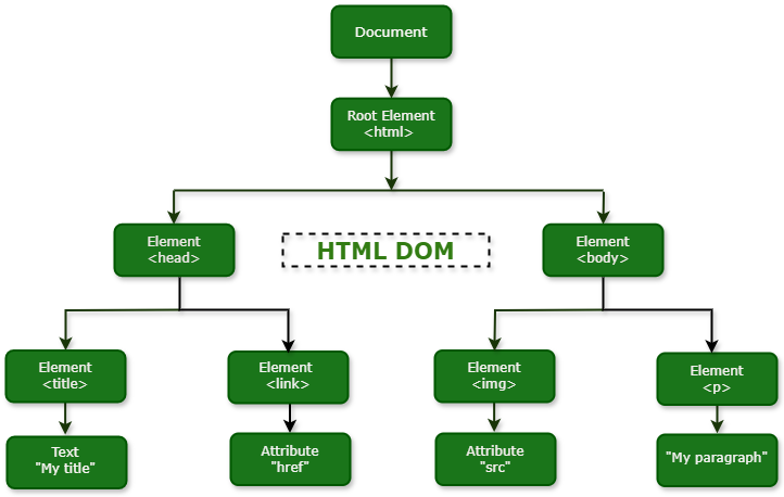
In the world of Frontend Development, HTML provides the structure and CSS provides the style. But how does a browser know which style to apply to which element? The answer lies in a powerful, yet often underestimated, feature: CSS Selectors. They are the patterns that act as a bridge, connecting your style rules in a stylesheet to the specific HTML Elements on your web page. Think of them as the precise query language for your document’s structure, allowing you to target everything from a single unique element to a complex group of elements based on their type, attributes, state, or position within the HTML Structure.
Mastering CSS Selectors is a fundamental skill that separates novice developers from seasoned professionals. A deep understanding goes beyond simply targeting a class or an ID. It unlocks the ability to write cleaner, more efficient, and more maintainable code. It’s the key to creating intricate Page Layouts, responsive components, and engaging CSS Animations without cluttering your HTML with excessive classes. This comprehensive HTML CSS Tutorial will guide you through the entire landscape of CSS Selectors, from the foundational building blocks to advanced techniques, exploring their impact on specificity, performance, and modern Web Development workflows.
The Foundation: Understanding CSS Selector Categories
Before diving into complex combinations, it’s crucial to have a firm grasp of the primary categories of selectors. These are the fundamental tools in any developer’s styling toolkit, forming the basis for nearly every CSS rule you’ll write. Understanding their purpose and appropriate use is the first step toward writing clean and effective CSS.
Basic Selectors: The Building Blocks
These are the most common selectors you’ll encounter daily. They provide direct ways to target elements based on their most identifiable features.
- Type Selectors: The most basic selector targets an element by its tag name (e.g.,
h1,p,div). While simple, they are best used for establishing broad, foundational styles or resets. For example,body { font-family: sans-serif; }sets a default font for the entire page. Overusing type selectors for specific component styling can lead to conflicts and is generally discouraged in favor of classes. - Class Selectors: Denoted by a period (
.), class selectors (e.g.,.btn,.card-header) are the workhorses of modern CSS. Their power lies in reusability; you can apply the same class to multiple HTML Elements across your site to ensure consistent styling. This is a cornerstone of component-based Web Design and frameworks like Bootstrap and Tailwind CSS. - ID Selectors: Denoted by a hash (
#), ID selectors (e.g.,#main-navigation) are the most specific of the basic selectors. An ID must be unique within a document. Because of their high specificity, they should be used sparingly for styling. Their primary role is often as JavaScript hooks or for page fragment identifiers (e.g.,). - Attribute Selectors: These selectors allow you to target elements based on their HTML Attributes. They are incredibly versatile for styling HTML Forms or elements with specific states. They are enclosed in square brackets, like
[type="submit"]to target all submit buttons, or[href^="https://"]to target links that start with “https://”. This is a powerful way to apply styles without adding extra classes. - The Universal Selector: The asterisk (
*) is the universal selector, which targets every single element on the page. Its most common use case is in CSS resets, such as the popular box-sizing reset:*, *::before, *::after { box-sizing: border-box; }. Use it with caution, as it has performance implications and can be overly broad.
Advanced Targeting: Combinators and Pseudo-Selectors
Once you’ve mastered the basics, the true power of CSS Selectors is unlocked by combining them. Combinators define the relationship between individual selectors, while pseudo-selectors allow you to style elements based on information that isn’t present in the document tree, such as user interaction or an element’s position relative to its siblings.
Combining Selectors for Precision
Combinators are the special characters that sit between simple selectors to create more complex and contextual rules. They are essential for building robust Web Layouts and component styles.

- Descendant Combinator (space):
article pselects all<p>elements that are descendants of an<article>element, no matter how deeply nested. This is common but can be overly broad if not used carefully. - Child Combinator (>):
ul > liis more precise. It selects only<li>elements that are direct children of a<ul>. This is excellent for preventing styles from “leaking” into nested lists and is a key technique in creating predictable Flexbox Layouts or Grid Layouts. - Adjacent Sibling Combinator (+):
h2 + pselects the first<p>element that is immediately preceded by an<h2>element, provided they share the same parent. This is a classic CSS Trick for adding margin-top to a paragraph that follows a heading without affecting other paragraphs. - General Sibling Combinator (~):
h2 ~ pis less restrictive. It selects all<p>elements that are siblings of and come after an<h2>. This can be useful for styling all related paragraphs following a sub-heading within a section.
Pseudo-Classes: Styling Based on State and Structure
Pseudo-classes, which begin with a single colon (:), are keywords that let you apply styles based on an element’s state or its structural position.
- User Action Pseudo-classes: These respond to user interaction, forming the foundation of interactive UI Design. Key examples include
:hover(when a mouse is over an element),:focus(when an element like an input receives focus), and:active(when an element is being activated, like a button click). - Structural Pseudo-classes: These target elements based on their position in the DOM. They are incredibly powerful for styling lists, tables, and grids without adding extra classes. Examples include
:first-child,:last-child,:nth-child(2n)(for even-numbered elements), and:not(.special)to exclude elements with a specific class.
Pseudo-Elements: Styling Parts of an Element
Pseudo-elements, now distinguished by a double colon (::) in Modern CSS for clarity (though single-colon syntax is often supported for backward compatibility), allow you to style a specific part of a selected element.
::beforeand::after: These are the most versatile pseudo-elements. They create a “phantom” child element before or after the content of the selected element, which can be styled independently. They are used for everything from custom bullet points and tooltips to complex decorative shapes, all without adding extra HTML Tags.::first-letterand::first-line: These are used for typographic effects, like creating a drop-cap on the first letter of a paragraph or styling the first line differently.::selection: This allows you to control the appearance of text that a user has highlighted with their cursor.
The Cascade, Specificity, and Performance
Writing CSS is not just about making things look good; it’s also about building a system that is predictable, maintainable, and performant. Understanding how the browser resolves conflicting styles is critical. This involves two core concepts: the cascade and specificity. While selector performance is less of a bottleneck in modern browsers, it’s still a valuable consideration in large-scale applications.
Understanding Specificity: The Deciding Factor
Specificity is the algorithm used by browsers to determine which CSS rule is the most relevant and should be applied to an element. When multiple rules target the same element, the one with the highest specificity “wins.” A common way to visualize this is with a four-part score (e.g., 0,0,0,0), representing inline styles, IDs, classes/attributes, and elements/pseudo-elements.
- Inline Styles (1,0,0,0): Styles applied directly in an HTML attribute (e.g.,
<p style="color: red;">) have the highest specificity. - IDs (0,1,0,0): An ID selector (
#main) is the next most specific. - Classes, Attributes, and Pseudo-classes (0,0,1,0): Selectors like
.btn,[type="checkbox"], and:hoverall share this level of specificity. - Elements and Pseudo-elements (0,0,0,1): Type selectors like
divand pseudo-elements like::beforehave the lowest specificity.
A selector like div#content .data p:first-child would have a specificity of (0,1,2,2). Understanding this calculation is key to debugging CSS and avoiding the dreaded !important declaration, which overrides all specificity calculations and should be considered a last resort.
Selector Performance and Modern Workflows
Historically, browsers evaluated CSS selectors from right to left. A selector like .nav > ul > li > a would first find all <a> tags on the page, then check if their parent is an <li>, and so on. This made overly generic right-most selectors (key selectors) inefficient. While modern browser engines are highly optimized, this principle still holds some truth: simpler selectors are faster. However, for the vast majority of websites, the performance difference is negligible. The bigger concern with long, nested selectors is maintainability and high specificity.
Modern CSS Frameworks and methodologies have evolved to manage this complexity:
- BEM (Block, Element, Modifier): This naming convention encourages flat, highly descriptive class names (e.g.,
.card__title--large) to keep specificity low and prevent style collisions. - Utility-First CSS (e.g., Tailwind CSS): This approach uses many single-purpose classes (e.g.,
.flex,.pt-4,.text-center), relying almost entirely on the class selector and avoiding specificity issues altogether. - CSS-in-JS (e.g., Styled Components): This technique automatically scopes styles to a specific component, often by generating unique class names, which eliminates the risk of global style conflicts.
- CSS Preprocessors (SASS, LESS): Tools like SASS allow for nesting, which is convenient but can easily lead to overly specific, hard-to-override selectors if not used with discipline.
Best Practices and Real-World Applications
Theory is important, but applying it correctly is what builds great websites. Adhering to best practices ensures your CSS is scalable, maintainable, and accessible. This means writing selectors that are just specific enough to do their job without being so rigid that they are difficult to override or reuse.
Writing Maintainable and Scalable Selectors
- Prefer Classes for Styling: Use classes for the vast majority of your styling. They are reusable and have a moderate, predictable level of specificity. Reserve IDs for JavaScript hooks and fragment identifiers.
- Keep Specificity Low and Flat: Avoid long selector chains like
.header .nav .nav-list .nav-item a. Instead, a well-named class like.main-nav__linkis more resilient, performant, and easier to understand. - Leverage the Cascade, Don’t Fight It: Write general styles first using type selectors, then override them with more specific class-based styles for components. This creates a logical and predictable stylesheet.
- Couple Selectors to Semantic HTML: Write selectors that reflect your Semantic HTML structure. Using
main article h2is more meaningful and robust than.container .col-8 .widget h2. This also improves Web Accessibility. - Use Attribute Selectors for State: For accessible components, hook into ARIA attributes. A selector like
[aria-expanded="true"]is a semantic and JavaScript-friendly way to style an open accordion panel, connecting your CSS directly to ARIA Labels and states.
Practical Example: Styling an Accessible Button
Let’s consider a common UI element: a button that can be in a disabled state. Instead of using a class like .disabled, we can use the actual HTML attribute for better semantics and accessibility.
HTML:
<button class="btn btn-primary">Submit</button>
<button class="btn btn-primary" disabled>Submitting...</button>
CSS:
.btn {
  display: inline-block;
  padding: 0.75rem 1.25rem;
  border: 1px solid transparent;
  border-radius: 0.25rem;
  font-size: 1rem;
  cursor: pointer;
  transition: background-color 0.2s ease-in-out;
}

.btn-primary {
  background-color: #007bff;
  color: white;
}

/* Style the hover and focus states for interactivity and accessibility */
.btn-primary:hover,
.btn-primary:focus {
  background-color: #0056b3;
}

/* Use the attribute selector for the disabled state */
.btn[disabled] {
  background-color: #cccccc;
  color: #666666;
  cursor: not-allowed;
  opacity: 0.65;
}
In this example, we use a combination of class selectors for the base and variant styles, pseudo-classes for interactive states, and an attribute selector for the disabled state. This approach is clean, semantic, and aligns with HTML Best Practices and W3C Standards.
Conclusion: The Art and Science of CSS Selection
CSS Selectors are far more than simple pointers; they are the very grammar of CSS. A masterful command of selectors empowers you to write code that is not only visually correct but also efficient, scalable, and deeply connected to the semantic meaning of your HTML. From basic type and class selectors to the nuanced power of pseudo-classes and attribute selectors, each tool has its place in the modern Frontend Web developer’s arsenal.
By prioritizing low specificity, embracing semantic relationships, and understanding the trade-offs between different approaches—from BEM to utility-first frameworks—you can build stylesheets that are a pleasure to maintain and extend. Ultimately, the art and science of CSS selection is a cornerstone of crafting high-quality, accessible, and performant user experiences on the web.