Introduction: The Intersection of Design, Code, and Conversion
In the fast-paced ecosystem of Frontend Web development, the landing page remains the single most critical asset for digital marketing campaigns, SaaS product launches, and startup growth. Unlike a general homepage, which encourages exploration, a landing page has a singular focus: conversion. Whether the goal is capturing an email address via HTML Forms, selling a subscription, or prompting a software download, the architecture of the page must be meticulously crafted to guide user behavior.
Creating an effective landing page in 2025 requires more than just aesthetic appeal; it demands a deep understanding of Web Design principles, User Experience (UX) Design, and robust technical implementation using Modern HTML and Modern CSS. Developers must bridge the gap between persuasive copywriting and technical performance, ensuring that pages load instantly, look flawless on all devices via Mobile-First Design, and remain accessible to all users.
This article explores the technical and strategic nuances of building high-performance Landing Pages. We will delve into the essential HTML Structure, advanced CSS Styling techniques including CSS Grid and CSS Flexbox, and the role of CSS Frameworks like Tailwind CSS and Bootstrap. By mastering these elements, developers can transform static HTML Templates into dynamic revenue-generating engines.
Section 1: The Structural Anatomy of a High-Converting Landing Page
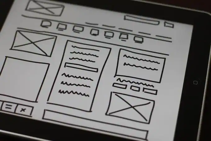
To build a landing page that converts, one must start with a solid foundation. This begins with Semantic HTML. Using correct HTML Tags and HTML Elements not only improves SEO but also ensures the document outline is logical for screen readers, aligning with W3C Standards. A well-structured landing page generally follows a specific narrative arc, translated into code.
The Hero Section: First Impressions Matter
The hero section is the “above the fold” area that determines whether a user stays or bounces. From an HTML Tutorial perspective, this section should be wrapped in a <header> or a dedicated <section> tag. It must contain a clear H1 tag defining the value proposition. HTML5 Features allow for rich media integration here, such as video backgrounds or high-quality SVG illustrations, without relying on heavy external scripts.
Structuring Value Propositions with Semantic Grids
Following the hero, the “Features” or “Benefits” section typically utilizes a grid layout. Here, HTML Lists (<ul> and <li>) are often semantically appropriate, even if they are styled to look like cards. By using HTML Attributes correctly, such as id for anchor linking, developers create a smooth navigation experience for single-page applications. This structure is crucial for Search Engine Optimization (SEO), as search engines parse the HTML hierarchy to understand content relevance.
The Engine of Conversion: HTML Forms
The most critical component of any landing page is the data capture mechanism. HTML Forms have evolved significantly. Modern HTML Input Types (email, tel, url) trigger the correct keyboards on mobile devices, enhancing UX Design. Furthermore, utilizing HTML Attributes like required, pattern, and autocomplete ensures data integrity before the information even reaches the server. A common pitfall is neglecting the <label> tag; for Web Accessibility, every input must have an associated label, either visible or hidden via CSS.
Trust Signals and Social Proof
Testimonials and logos are essential for building trust. Structurally, these should be organized using <figure> and <blockquote> elements. This semantic approach tells the browser that the content is a quote and its attribution, rather than just generic text in a <div>. This attention to HTML Best Practices separates professional Frontend Development from amateur coding.
Server rack GPU – Brand New Gooxi 4u Rackmount case ASR4105G-D12R AMD Milan 7313 Cpu …
Section 2: Styling, Layout, and Technical Implementation
Once the HTML Structure is in place, the focus shifts to CSS Styling. The visual presentation is what creates emotional resonance and guides the user’s eye. Modern CSS3 Features have revolutionized how we approach Web Layout, moving away from floats and positioning hacks to robust layout systems.
Mastering Layouts with CSS Grid and Flexbox
For landing pages, the debate between CSS Grid and CSS Flexbox is settled: use both. CSS Grid is ideal for the macro layout—defining the main regions of the page (Hero, Features, Pricing, Footer). It allows for two-dimensional control, making it incredibly easy to rearrange layout sections for different screen sizes using CSS Responsive techniques.
Conversely, CSS Flexbox excels at the micro-layout—aligning items within a button, centering text in a card, or distributing navigation links. For example, a pricing table is best constructed with Grid for the columns and Flexbox for the internal alignment of price, features list, and CTA button. Understanding CSS Selectors (including pseudo-classes like :nth-child and :hover) allows for sophisticated styling without adding unnecessary classes to the HTML.
Responsive and Mobile-First Design
In 2025, Mobile-First Design is not optional. Development should start with the base CSS for mobile screens and use @media (min-width: ...) to layer on complexity for tablets and desktops. This approach reduces the amount of code the browser needs to parse on mobile devices, improving load times. A Responsive Design ensures that HTML Tables (often used for pricing comparisons) transform into readable cards or scrollable areas on smaller screens.
Enhancing Interaction with Animations
Static pages can feel lifeless. CSS Transitions and CSS Animations add a layer of polish that improves the perceived quality of the product. Simple hover effects on buttons, smooth scrolling (scroll-behavior: smooth;), and fade-in effects as the user scrolls down (often triggered via Intersection Observer API toggling classes) keep the user engaged. However, CSS Tips dictate moderation; too much animation can distract from the conversion goal and hurt performance.
The Power of CSS Variables and Theming
CSS Variables (Custom Properties) have changed the game for maintaining landing pages. By defining colors, spacing units, and typography in the :root, developers can implement dark mode or change the entire color scheme of a landing page with a few lines of code. This is particularly useful when working with HTML Templates that need to be branded quickly for different campaigns.
Section 3: Frameworks, Accessibility, and Modern Workflows
The ecosystem of tools available to build landing pages is vast. Choosing the right stack affects development speed, maintainability, and performance. This section analyzes the implications of using CSS Frameworks versus custom code and the non-negotiable requirement of accessibility.
Frameworks vs. Custom CSS
Developers often face a choice: use a framework like Bootstrap, Foundation, or Tailwind CSS, or write custom CSS (perhaps using SASS or LESS as CSS Preprocessors).
- Bootstrap/Foundation: These offer pre-built components (modals, carousels). They are excellent for speed but can lead to “cookie-cutter” designs and bloated file sizes if not properly tree-shaken.
- Tailwind CSS: This utility-first framework has gained massive popularity for landing pages. It allows developers to style elements directly in the HTML, speeding up the iteration process. It pairs perfectly with component-based libraries like React or Vue but works just as well with vanilla HTML.
- CSS-in-JS / Styled Components: For landing pages built as Single Page Applications (SPAs), scoping styles to components prevents side effects, though it adds a JavaScript runtime overhead.
For a simple, high-performance landing page, a lightweight custom stack using PostCSS often yields the best performance metrics (Core Web Vitals).

Web Accessibility (A11y) as a Standard
Web Accessibility is not just a legal requirement; it expands your potential market. A landing page must be navigable via keyboard alone. This involves managing focus states using CSS and ensuring semantic HTML. ARIA Labels should be used to describe interactive elements that lack visible text (like an icon-only button). High contrast ratios for text and backgrounds are essential for readability. Ignoring Accessibility excludes users with disabilities and negatively impacts SEO.
Optimization for Performance
Speed is a feature. High-resolution images should be optimized and served in modern formats (AVIF, WebP). HTML5 Features like loading="lazy" on images and iframes ensure that assets are only loaded when they enter the viewport. Minimizing CSS and JavaScript bundles is crucial. If you are using Google Fonts, ensure they are preconnected to reduce render-blocking time.
Section 4: Strategic Recommendations and Common Pitfalls
Building the page is only half the battle. Optimizing it for user behavior is where the ROI is realized. Here are strategic recommendations and common technical pitfalls to avoid.
Pros and Cons of HTML Templates
Using pre-made HTML Templates can significantly accelerate launch times.
Pros:
1. Rapid deployment for startups.
2. Professional UI Design out of the box.
3. Often include pre-written CSS Media Queries for responsiveness.
Cons:
1. Code bloat: Templates often contain CSS/JS for features you aren’t using.
2. Generic look: Requires significant customization to stand out.
3. “Div soup”: Some templates rely on poor HTML Structure, making them hard to maintain or accessible.
Best Practices for Conversion Optimization
A/B Testing is vital. Developers should structure the code to easily swap out headlines, hero images, or button colors. CSS Tricks like using utility classes make these swaps faster. Furthermore, ensure your “Call to Action” (CTA) looks clickable. A common UI Design mistake is making buttons that look like badges or vice versa.
HTML Email Integration
Often, a landing page is part of a funnel that triggers an email. While HTML Email development is a different beast (relying on archaic table-based layouts), the branding from the landing page—colors, fonts, and tone—must carry over to the email CSS for a consistent user experience.
Common Pitfalls to Avoid
1. Ignoring Cross-Browser Compatibility: Just because it works in Chrome doesn’t mean it works in Safari. Always test.
2. Overloading with JavaScript: Do not use JavaScript for layout or basic styling. Keep the Frontend Web stack lean.
3. Hidden Content: Avoid hiding crucial content behind tabs or accordions on landing pages; users often scan and won’t click to reveal text.
Conclusion
Building a modern, high-converting landing page is a multidisciplinary effort that combines precise HTML Structure, creative CSS Styling, and psychological insight. Whether you are leveraging SaaS-ready UI packs, utilizing a framework like Tailwind CSS, or hand-coding a bespoke solution using CSS Grid, the fundamentals remain the same: prioritize the user.
By adhering to W3C Standards, ensuring Web Accessibility, and focusing on Mobile-First Design, developers can create landing pages that not only look futuristic and polished but also perform exceptionally well in search rankings and conversion metrics. As we move through 2025, the ability to rapidly deploy clean, fast, and semantic landing pages will continue to be a high-value skill in the digital economy. The code you write is the direct conduit between a product and its potential users; make every tag count.