The Evolving Role of CSS in Modern Web Development
For years, Cascading Style Sheets (CSS) was the humble workhorse of the web, a declarative language primarily concerned with color, typography, and page layout. Its evolution was steady but predictable. However, the rise of complex, component-based JavaScript frameworks exposed a gap: how do we manage dynamic, state-driven styles efficiently without resorting to complex JavaScript manipulations or heavy-handed library abstractions? The answer has emerged from within CSS itself. Modern CSS is no longer just a static rulebook; it’s a powerful, dynamic system capable of handling complex application states, theming, and responsive interactions with unprecedented elegance. This shift is powered by two core features: CSS Custom Properties (Variables) and a more sophisticated understanding of pseudo-classes.
This comprehensive CSS tutorial will explore this revolution in CSS styling. We will dissect how CSS Variables have moved beyond the capabilities of preprocessors like SASS and LESS, enabling real-time style updates directly in the browser. We will then dive into the architectural patterns that leverage these variables to manage component states like hover, focus, and active, bridging the declarative world of CSS with the imperative logic of JavaScript. This journey will provide actionable insights for any developer working on frontend development, from crafting beautiful landing pages to building scalable enterprise applications, all while adhering to Web Standards and best practices.
The Foundation: CSS Variables and Pseudo-Classes
Before building complex systems, it’s crucial to understand the fundamental building blocks. In the realm of modern, dynamic CSS, these blocks are CSS Variables and the pseudo-classes that define interactive states. While they may seem like basic CSS3 Features, their true power is unlocked when they are used in concert.
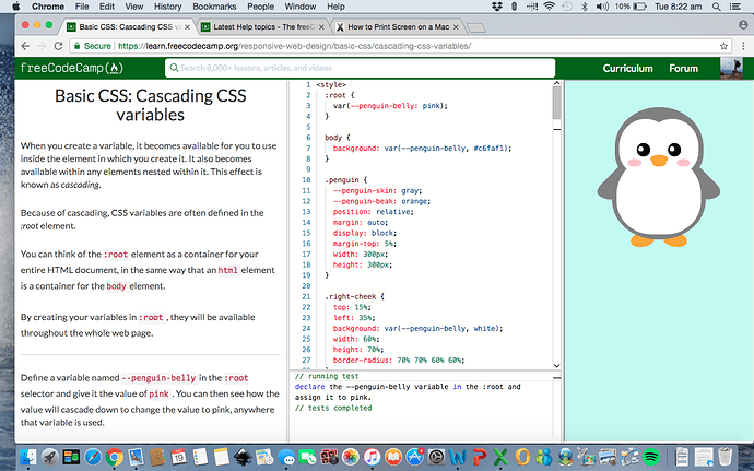
Unlocking Dynamic Theming with CSS Variables
CSS Custom Properties, more commonly known as CSS Variables, are entities defined by CSS authors that contain specific values to be reused throughout a document. They are set using custom property notation (e.g., --main-color: #3498db;) and are accessed using the var() function (e.g., color: var(--main-color);).
The key difference between CSS variables and variables in preprocessors like SASS or LESS is their scope and timing. Preprocessor variables are static; they are compiled into fixed CSS values before the code ever reaches the browser. CSS Variables, on the other hand, are live. They exist in the DOM, can be updated with JavaScript in real-time, and cascade just like any other CSS property. This opens up a world of possibilities for dynamic UI design.
A classic real-world scenario is creating a light/dark mode theme switcher. With CSS variables, this becomes remarkably simple:
<!-- In your HTML -->
<html>
<body>
  <button id="theme-switcher">Toggle Theme</button>
  <h1>My Awesome Website</h1>
  <p>Some content here...</p>
</body>
</html>

<!-- In your CSS -->
<style>
:root {
  --background-color: #ffffff;
  --text-color: #333333;
  --primary-color: #007bff;
}

[data-theme="dark"] {
  --background-color: #121212;
  --text-color: #eeeeee;
  --primary-color: #1e90ff;
}

body {
  background-color: var(--background-color);
  color: var(--text-color);
  transition: background-color 0.3s ease, color 0.3s ease;
}

h1 {
  color: var(--primary-color);
}
</style>

<!-- In your JavaScript -->
<script>
const switcher = document.getElementById('theme-switcher');
const doc = document.documentElement;

switcher.addEventListener('click', () => {
  const currentTheme = doc.getAttribute('data-theme');
  if (currentTheme === 'dark') {
    doc.removeAttribute('data-theme');
  } else {
    doc.setAttribute('data-theme', 'dark');
  }
});
</script>
In this example, all the styling logic remains in the CSS. JavaScript is only responsible for toggling a single data-theme attribute on the root HTML element. The CSS handles the rest, dynamically swapping out the variable values. This is a clean separation of concerns and a core tenet of modern CSS.
Managing User Interaction with Pseudo-classes
Pseudo-classes like :hover, :focus, :active, and :disabled are the bread and butter of interactive web design. They allow us to provide essential visual feedback to users, improving the overall UX design. For example, changing a button’s background on hover signals that it’s clickable. These are fundamental CSS Selectors that every developer learns early on. The traditional challenge, however, arises in component-based architectures where an element’s “state” might be controlled by JavaScript, not just direct user interaction. How do you apply a :hover style when a dropdown menu is programmatically opened, even if the user’s cursor isn’t over the trigger button? This is where the synergy with CSS variables begins to shine.
When CSS Meets JavaScript: The Rise of Dynamic Styling

The true power of modern CSS is realized when its dynamic capabilities are orchestrated by JavaScript. This combination allows us to build highly interactive and responsive interfaces that feel native to the web platform, often with less code and better performance than solutions relying heavily on framework abstractions.
Manipulating CSS Variables with JavaScript
Beyond the theming example, JavaScript can directly get and set CSS variables on any element. This allows for a granular level of control that was previously only achievable by directly manipulating inline styles, which is often considered a poor practice for maintainability. The API is straightforward: element.style.setProperty('--variable-name', 'new-value');.
Consider a real-world scenario: a user-configurable dashboard where a slider controls the corner rounding of all cards on the page.
<!-- HTML -->
<label for="radius-slider">Card Radius:</label>
<input type="range" id="radius-slider" min="0" max="24" value="8">
<div class="card">...</div>
<div class="card">...</div>

<!-- CSS -->
<style>
:root {
  --card-border-radius: 8px;
}
.card {
  border-radius: var(--card-border-radius);
  /* other styles */
  background: #f0f0f0;
  padding: 1rem;
  margin-top: 1rem;
}
</style>

<!-- JavaScript -->
<script>
const slider = document.getElementById('radius-slider');
slider.addEventListener('input', (e) => {
  document.documentElement.style.setProperty('--card-border-radius', e.target.value + 'px');
});
</script>
Here, a single line of JavaScript updates one CSS variable at the root level, and every element using that variable instantly reflects the change. This is far more efficient and scalable than querying for all .card elements and updating their style.borderRadius property individually. This technique is also fantastic for CSS Animations and CSS Transitions, as you can transition the variable’s value itself.
The Challenge of State-Based Styling in Component Frameworks
In frameworks like React, Vue, and Svelte, application state lives in JavaScript. A button might have an isLoading prop, or a form input might have an isInvalid state. The traditional methods of reflecting this state in the UI have drawbacks:
- Toggling CSS Classes: The most common approach. You might add a
.button--loadingclass. This works but can lead to “class soup” in your HTML and requires a corresponding CSS rule for every state combination. It couples the JS logic tightly to specific class names. - CSS-in-JS: Libraries like Styled Components and Emotion solve this elegantly by allowing you to pass props directly to your styles (e.g.,
<Button loading />). This offers excellent encapsulation but introduces a runtime dependency, can impact performance if not used carefully, and moves styling logic entirely into JavaScript, which some teams prefer to avoid.
The challenge is to find a solution that leverages the power of the platform, maintains a clear separation of concerns, and works seamlessly within a component-based model. This is where new architectural patterns come into play.
Architectural Patterns for Dynamic and State-Driven UIs
By combining CSS variables, data attributes, and a bit of JavaScript orchestration, we can create robust and maintainable patterns for state management that feel both modern and standards-compliant. This approach often provides the best of both worlds: the power of dynamic styling without the overhead of a large library.
The “Style Property” Pattern with CSS Variables
This powerful pattern involves using CSS variables to represent the dynamic parts of a component’s style. Instead of creating state-specific classes (.btn-danger, .btn-success), you define a base component and expose its customizable properties through variables.
Let’s design a button component. In our CSS, we define its structure using variables with sensible defaults.
<!-- CSS -->
<style>
.button {
  --button-bg: #3498db;
  --button-text-color: #ffffff;
  --button-border-color: #2980b9;

  background-color: var(--button-bg);
  color: var(--button-text-color);
  border: 1px solid var(--button-border-color);
  padding: 0.5em 1em;
  border-radius: 4px;
  cursor: pointer;
  transition: 0.2s ease;
}

.button:hover {
  /* On hover, we can change the variable itself! */
  --button-bg: #2980b9;
}

.button:disabled {
  --button-bg: #bdc3c7;
  --button-border-color: #a0a6ab;
  cursor: not-allowed;
}
</style>
Now, if our JavaScript logic determines a button should be in a “success” state, we don’t need a new class. We simply update the variables on that specific button instance:
<!-- JavaScript -->
<script>
const successButton = document.getElementById('my-success-button');
successButton.style.setProperty('--button-bg', '#2ecc71');
successButton.style.setProperty('--button-border-color', '#27ae60');
</script>
This approach is incredibly flexible. The core button style, including its hover and disabled states, remains defined in one place in the CSS. The JavaScript is only concerned with providing the dynamic values, not with the styling implementation itself. This pattern scales beautifully for complex components and design systems.
Combining Variables and Data Attributes for Semantic State
For a more semantic and accessible approach, we can use data-* attributes to represent component state. This is often superior to using classes because it clearly communicates the *purpose* of the state, not just its visual representation. This is a cornerstone of Web Accessibility, as these attributes can be targeted by assistive technologies.
Let’s refine our button. Instead of setting styles directly, we’ll use a data-variant attribute.

<!-- HTML -->
<button class="button">Default</button>
<button class="button" data-variant="success">Success</button>
<button class="button" data-variant="danger">Danger</button>

<!-- CSS -->
<style>
.button {
  /* Default variables */
  --button-bg: #3498db;
  --button-border-color: #2980b9;
  /* ... other base styles ... */
}

/* Override variables based on the data attribute */
.button[data-variant="success"] {
  --button-bg: #2ecc71;
  --button-border-color: #27ae60;
}

.button[data-variant="danger"] {
  --button-bg: #e74c3c;
  --button-border-color: #c0392b;
}
</style>
This pattern is exceptionally clean. The HTML structure is semantic, the CSS is highly readable, and the JavaScript logic is simplified to just changing a data attribute (e.g., button.dataset.variant = 'success'). This aligns perfectly with W3C Standards and makes creating accessible components with clear states (using ARIA labels where appropriate) much easier.
Choosing the Right Tool for the Job: A Comparative Look
While the native CSS approach is powerful, it’s important to understand where it fits within the broader ecosystem of styling tools, which includes CSS-in-JS libraries and utility-first frameworks like Tailwind CSS.
Native CSS vs. CSS-in-JS vs. Utility-First
- Native CSS + Variables:
- Pros: Zero dependencies, excellent performance, leverages platform standards, great for theming and design systems. Maintains separation of concerns.
- Cons: Can require more manual JavaScript orchestration for complex state logic compared to integrated solutions. Scoping requires methodologies like BEM or CSS Modules.
- CSS-in-JS (e.g., Styled Components):
- Pros: Automatic critical CSS, scoped styles by default, seamless integration with component props for dynamic styling.
- Cons: Adds runtime overhead, can increase bundle size, creates a higher-level abstraction away from the CSS standard.
- Utility-First (e.g., Tailwind CSS):
- Pros: Extremely rapid development, enforces a consistent design system, handles states like
hover:andfocus:with simple prefixes. - Cons: Can lead to verbose HTML (“class soup”), styling is co-located with markup which can be hard to read for complex components, less semantic by nature.
- Pros: Extremely rapid development, enforces a consistent design system, handles states like
The best choice often depends on the project and team. For performance-critical applications or for teams that value platform standards, the native CSS approach is increasingly viable. For React-heavy teams building highly encapsulated components, CSS-in-JS remains a strong contender. For rapid prototyping and projects where a strict design system is paramount, Tailwind CSS excels.
Best Practices for Dynamic Styling
Regardless of the tool you choose, follow these HTML Best Practices and CSS Tips:
- Scope Your Variables: Define global variables (like theme colors) on
:root, but scope component-specific variables directly to the component’s class to avoid naming collisions. - Use a Naming Convention: Adopt a clear naming scheme, such as
--component-property-state(e.g.,--button-background-hover), to keep your variables organized. - Prioritize Accessibility: Always ensure that dynamic style changes maintain sufficient color contrast and that focus states are clear and visible.
- Combine with CSS Functions: Use CSS variables inside functions like
calc(),rgba(), and gradients for incredibly powerful computed styles. - Provide Fallbacks: When using
var(), you can provide a fallback value (e.g.,color: var(--undefined-variable, black);) to ensure your design doesn’t break if a variable isn’t defined.
Conclusion: Embracing the Future of CSS
The landscape of frontend web development is in constant flux, but the recent evolution of CSS marks a significant paradigm shift. CSS is no longer a simple styling layer but a sophisticated and dynamic system that is fundamental to modern application architecture. By mastering CSS Custom Properties, you can build flexible, high-performance theming systems that were once the exclusive domain of JavaScript. By adopting architectural patterns that combine variables with semantic data attributes, you can manage complex component states with a clarity and efficiency that respects the separation of concerns between style, structure, and behavior.
As developers, embracing these native platform features not only reduces our reliance on external libraries but also makes our applications faster, more maintainable, and more aligned with the future of the web. The line between CSS and JavaScript is blurring, creating a powerful synergy that empowers us to build richer, more interactive user experiences than ever before.