The Evolution of the Web: Unpacking the Power of HTML5 Features
In the ever-evolving landscape of web development, few updates have been as transformative as the introduction of HTML5. More than just an incremental upgrade, HTML5 represented a paradigm shift, fundamentally altering how we build, experience, and interact with the web. It moved HyperText Markup Language from a language for structuring static documents to a powerful platform for creating rich, interactive, and dynamic web applications. For any aspiring or seasoned developer, understanding the core HTML5 features isn’t just beneficial—it’s essential for modern frontend development.
This comprehensive HTML tutorial will take you on a deep dive into the most impactful features of HTML5. We’ll explore the semantic revolution that brought meaning and accessibility to our code, the enhanced form controls that improved user experience (UX Design), the native multimedia capabilities that freed us from third-party plugins, and the powerful APIs that unlocked new possibilities for web applications. Whether you’re working on simple landing pages, complex web apps, or even HTML email templates, mastering these concepts is the key to writing clean, efficient, and future-proof code. Let’s explore how HTML5 became the bedrock of modern web design and standards.
Section 1: The Semantic Revolution – Structuring Content with Meaning
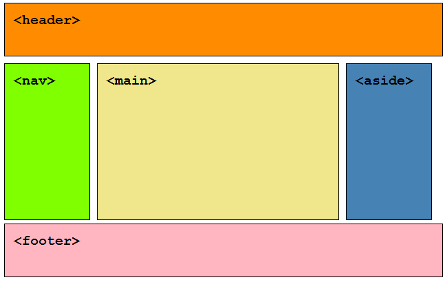
Before HTML5, web structure was often a chaotic mess of nested <div> tags, a phenomenon developers affectionately termed “div-itis.” A typical page layout might have looked like <div id="header">, <div class="main-content">, and <div id="footer">. While functional, this approach lacked intrinsic meaning. It told the browser *how* to group content but said nothing about *what* that content was. HTML5 introduced a suite of new semantic HTML elements designed to solve this problem by describing the purpose of the content they contain.
Beyond the <div> Soup: Core Semantic Elements
The introduction of semantic HTML tags provided a standardized, meaningful vocabulary for structuring web pages. This not only makes the HTML structure cleaner and more readable for developers but also provides crucial context for browsers, search engines, and assistive technologies. Here are the cornerstone elements:
- <header>: Represents introductory content for its nearest ancestor sectioning content or for the entire page. It typically contains headings, logos, search forms, and navigation links.
- <nav>: Designates a section of a page whose purpose is to provide navigation links, either within the current document or to other documents.
- <main>: Specifies the main, dominant content of the
<body>of a document. A document must not have more than one<main>element. - <article>: Represents a self-contained composition in a document, page, application, or site, which is intended to be independently distributable or reusable (e.g., a forum post, a magazine or newspaper article, or a blog entry).
- <section>: Represents a generic standalone section of a document, which doesn’t have a more specific semantic element to represent it. Typically, a section should have a heading.
- <aside>: Represents a portion of a document whose content is only indirectly related to the document’s main content. It’s often presented as a sidebar.
- <footer>: Represents a footer for its nearest sectioning content or the page as a whole. A footer typically contains information about the author, copyright data, or links to related documents.
- <figure> & <figcaption>: The
<figure>tag specifies self-contained content, like illustrations, diagrams, photos, or code listings. The<figcaption>provides a caption for its parent<figure>element.
The SEO and Web Accessibility Payoff
The benefits of semantic HTML extend far beyond code aesthetics. According to W3C Standards, using these tags correctly is a cornerstone of web accessibility. Screen readers and other assistive technologies use these elements as “landmarks” to help users with disabilities navigate a page efficiently. For example, a user can command their screen reader to jump directly to the <main> content or the <nav>, bypassing repetitive headers. This is a massive improvement over hunting through ambiguous <div> tags. For even greater accessibility, ARIA labels can be used to provide additional context where semantic HTML alone isn’t sufficient.
From an SEO perspective, search engine crawlers use these tags to better understand the hierarchy and importance of content on a page. A heading within a <header> and content within an <article> carry more contextual weight than if they were in generic divs. This improved understanding can lead to better indexing and search engine rankings, making semantic markup one of the most important HTML best practices.
Practical Example: Before and After
Consider a simple blog post layout. Here’s the old way vs. the modern HTML5 way:
Before (Div-based):
<div id="header">
    <h1>My Awesome Blog</h1>
    <div class="nav">...</div>
</div>
<div id="content">
    <div class="post">
        <h2>Post Title</h2>
        <p>Post content...</p>
    </div>
</div>
<div id="sidebar">...</div>
<div id="footer">...</div>
After (Semantic HTML5):

<header>
    <h1>My Awesome Blog</h1>
    <nav>...</nav>
</header>
<main>
    <article>
        <h2>Post Title</h2>
        <p>Post content...</p>
    </article>
</main>
<aside>...</aside>
<footer>...</footer>
The second example is instantly more readable and meaningful, forming a solid foundation for CSS styling and JavaScript manipulation.
Section 2: Interactive Forms and Rich Media Integration
HTML5 dramatically enhanced the user-facing elements of the web, particularly with HTML forms and media. These improvements allow for a richer, more interactive, and more intuitive user experience directly in the browser, reducing reliance on JavaScript for basic functionality and eliminating the need for third-party plugins like Adobe Flash.
Supercharging HTML Forms with New Input Types and Attributes
Web forms are a critical point of interaction. HTML5 introduced a host of new input types and attributes that provide better user guidance, built-in browser validation, and improved usability, especially on mobile devices.
New Input Types: These types instruct the browser on what kind of data is expected, often resulting in a more appropriate UI. For example, on a mobile device, using type="email" will bring up a keyboard with the ‘@’ symbol, while type="tel" will show a numeric keypad.
email: Expects a valid email address format.url: Expects a valid URL format.tel: For telephone numbers (no specific validation, but aids mobile UX).number: For numeric values, often rendered with spinner controls.range: A slider control for selecting a value within a range.date,month,week,time,datetime-local: Native date and time pickers.search: A text field specifically for search queries.color: A native color picker control.
New Form Attributes: These attributes provide more control over form behavior and validation.
placeholder: Displays hint text in a field that disappears when the user starts typing.required: Specifies that a field must be filled out before submitting the form.pattern: Allows you to specify a regular expression for the input’s value to be checked against.autofocus: Automatically focuses an input field when the page loads.multiple: Allows multiple values to be selected for<input type="file">and<input type="email">.
Native Multimedia Without Plugins: <audio> and <video>
Perhaps one of the most celebrated HTML5 features was the introduction of the <audio> and <video> elements. Before this, embedding media required plugins like Flash, which was a security risk, not universally supported (especially on mobile), and bad for performance. These new HTML tags made embedding media as simple as embedding an image.
A basic implementation is straightforward:
<video controls width="640" height="360">
    <source src="movie.mp4" type="video/mp4">
    <source src="movie.webm" type="video/webm">
    <!-- Fallback text for older browsers -->
    Your browser does not support the video tag.
</video>
The <source> element allows you to provide multiple file formats, and the browser will use the first one it supports. Key attributes like controls (adds play/pause, volume, etc.), autoplay, muted, and loop give developers fine-grained control over the media playback experience. Furthermore, the <track> element can be used to add subtitles, captions, and other timed text data, which is another significant win for web accessibility.
Section 3: Advanced Capabilities and APIs – The Application Layer
HTML5 is more than just markup; it’s a collection of technologies and APIs that empower developers to build full-fledged web applications that can compete with native desktop and mobile apps. These APIs provide access to client-side storage, graphics rendering, and even device hardware, all governed by browser security models.
Drawing and Graphics: <canvas> and SVG
HTML5 introduced two powerful ways to render graphics directly in the browser:
- The <canvas> Element: This element provides a bitmap drawing surface that you can control with JavaScript. It’s essentially a blank canvas for drawing 2D (and with WebGL, 3D) graphics on the fly. It’s ideal for dynamic applications like games, data visualizations, and interactive photo editors where performance and pixel-level control are critical.
- Scalable Vector Graphics (SVG): While not new, SVG was fully integrated into HTML5, allowing it to be written directly in the HTML document. Unlike the raster-based canvas, SVG is an XML-based vector format. This means it’s resolution-independent (scales perfectly) and can be manipulated with CSS and JavaScript. It’s perfect for logos, icons, and interactive charts.
Offline Storage and Connectivity
To create a truly app-like experience, applications need to work offline or with intermittent connectivity. HTML5 introduced several mechanisms for this:

- Web Storage (localStorage and sessionStorage): A modern, simpler, and more spacious alternative to cookies.
sessionStoragestores data for one session (until the browser tab is closed), whilelocalStoragepersists data even after the browser is closed and reopened. It’s perfect for storing user preferences, application state, or caching data. - Service Workers: The successor to the now-deprecated Application Cache, Service Workers are JavaScript files that run in the background, separate from a web page. They can intercept and handle network requests, manage a cache of responses, and enable push notifications. This is the core technology behind Progressive Web Apps (PWAs) that can work offline.
Geolocation and Device Access APIs
HTML5 began to bridge the gap between the web browser and the physical device. The Geolocation API allows a web application to request a user’s geographical position, with their explicit permission. This has enabled a whole class of location-aware services, from mapping applications to local business finders. Other APIs have followed, providing access (always with user consent) to the camera, microphone (WebRTC), device orientation, and more, further blurring the lines between native and web applications.
Section 4: HTML5 in a Modern CSS and Frontend Ecosystem
HTML5 does not exist in a vacuum. Its true power is realized when combined with modern CSS3 features and the broader frontend development ecosystem. The semantic structure provided by HTML5 creates the perfect skeleton for advanced styling and layout techniques.
Styling Modern HTML with Modern CSS
The clean structure of semantic HTML makes styling with CSS more intuitive and efficient. CSS selectors can be simpler and more robust. Instead of a complex selector like div#main-content .article > h2, you can use a much cleaner main article h2.

This semantic foundation is the perfect partner for modern CSS layout modules:
- CSS Flexbox: A one-dimensional layout model perfect for distributing space among items in an interface. It’s ideal for component-level layouts, like aligning items in a
<nav>or centering content within a card. A Flexbox layout is a go-to for many UI design patterns. - CSS Grid: A two-dimensional layout system that allows you to control rows and columns simultaneously. It is designed for large-scale page layout, making it easy to arrange the primary semantic elements like
<header>,<main>,<aside>, and<footer>into a complex, responsive grid. A Grid layout is foundational to modern responsive design.
When combined, semantic HTML, CSS Flexbox, and CSS Grid form a powerful trio for creating any web layout imaginable, from simple mobile-first designs to complex desktop interfaces. This synergy is a core part of any modern HTML CSS tutorial.
Best Practices and Common Pitfalls
To make the most of HTML5, consider these tips and best practices:
- Do use elements for their semantic purpose. Don’t use a
<section>just to get a new block-level element; a<div>is still perfectly fine for purely stylistic grouping. An<article>should be content that could stand on its own. - Don’t rely solely on client-side validation. While HTML5 form validation is great for UX, it can be easily bypassed. Always validate user input on the server as well.
- Do provide fallbacks. For multimedia, provide multiple sources and fallback text. For advanced JavaScript APIs, check for browser support before attempting to use them.
- Do prioritize accessibility. Use semantic tags correctly, provide `alt` text for all meaningful images, and use the
<track>element for video captions.
The modern frontend world is also filled with tools that build upon this HTML5 foundation. CSS frameworks like Bootstrap and Tailwind CSS provide pre-built components and utility classes that work seamlessly with a well-structured HTML document. CSS Preprocessors like SASS and LESS, and even CSS-in-JS libraries like Styled Components, all ultimately compile down to standard CSS that styles your semantic HTML5 elements.
Conclusion: The Enduring Legacy of HTML5
HTML5 was a monumental leap forward for the web. It transformed the language from a simple markup system into a robust platform for building sophisticated, application-like experiences. By introducing semantic elements, it brought meaning, accessibility, and SEO value to our document structures. With native multimedia and enhanced forms, it created a richer, more streamlined user experience. And through its powerful APIs, it unlocked capabilities previously reserved for native applications.
Today, the features of HTML5 are not just “new”—they are the standard. They are the foundation upon which modern web standards, responsive design, and the entire frontend web ecosystem are built. For any developer, a deep understanding and correct application of these features are the hallmarks of a professional who is committed to writing clean, accessible, and high-performing code for the modern web.