In an era where digital interactions are predominantly handled through the palm of our hands, the paradigm of web design and development has undergone a seismic shift. Gone are the days of designing complex, feature-rich desktop websites and then painstakingly chipping away at them to fit a smaller screen. Today, the modern approach is to build from the ground up, starting with the most constrained environment: the mobile device. This philosophy, known as Mobile-First Design, is more than just a responsive design technique; it’s a comprehensive strategy that prioritizes user experience, optimizes performance, and aligns with the realities of modern web traffic. For frontend developers, mastering this approach is no longer optional—it’s a fundamental requirement for building effective, accessible, and future-proof web applications.
This in-depth article will serve as your comprehensive guide to Mobile-First Design. We will deconstruct its core principles, walk through practical implementation using modern HTML5 Features and CSS3 Features, and explore its profound impact on everything from user engagement to search engine rankings. Whether you’re refining your Frontend Development skills or looking to implement better Web Standards, this guide provides the actionable insights and HTML Best Practices you need to excel.
Understanding the Core Philosophy: Why Mobile-First Matters
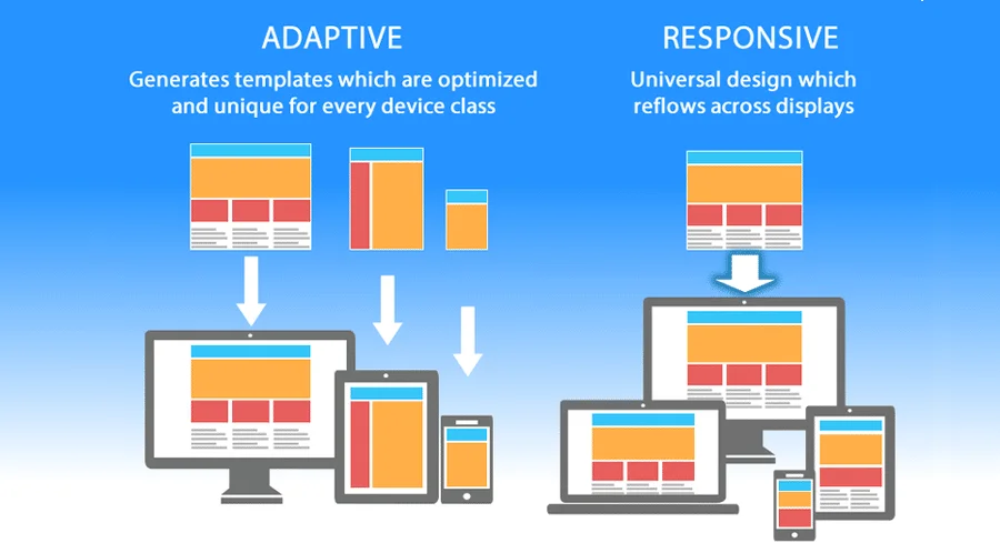
At its heart, Mobile-First Design is a strategy of progressive enhancement. Instead of starting with a full-featured desktop site and gracefully degrading it for smaller devices (a process that often leads to bloated code and a compromised mobile experience), we do the opposite. We begin by designing and building the core experience for a small screen, ensuring it’s fast, functional, and focused. From there, we progressively enhance the experience as screen real estate and device capabilities increase, adding more complex features, richer layouts, and more sophisticated interactions.
From Graceful Degradation to Progressive Enhancement
The concept of “Graceful Degradation” was the standard for years. A developer would build a website with all the bells and whistles—complex JavaScript animations, large high-resolution images, and intricate multi-column layouts—assuming a powerful desktop client. The mobile version was an afterthought, often achieved by hiding elements with display: none;, a practice that still forced mobile users to download the hidden assets, killing performance. This approach treated mobile users as second-class citizens, delivering a stripped-down, often clunky, version of the “real” site.
Progressive Enhancement flips this script. By focusing on the mobile experience first, we are forced to prioritize. This methodology is built on three key constraints inherent to mobile devices:
- Limited Screen Real Estate: The small viewport forces designers and developers to make tough decisions about content hierarchy. Only the most critical information and primary user actions can occupy the prime screen space. This constraint breeds a focused and clutter-free UI Design.
- Variable Performance and Bandwidth: Mobile networks can be unreliable and slow. A mobile-first approach compels us to write lean, optimized code from the outset. This means smaller image files, minimized CSS and JavaScript, and fewer HTTP requests, resulting in a faster-loading site for everyone, regardless of their device.
- Touch-Based Interaction: Mobile design must account for touch interfaces. This influences the size of tap targets (buttons, links), the design of HTML Forms, and the implementation of gestures. Designing for touch first ensures a more intuitive and accessible UX Design.
By embracing these constraints, we create a solid foundation that is inherently performant, accessible, and user-centric. The desktop version then becomes an *enhancement* of this solid core, not the other way around.
From Blueprint to Browser: A Practical Guide to Mobile-First Implementation
Translating the mobile-first philosophy into functional code requires a disciplined approach to both HTML structure and CSS styling. It’s about writing code that is flexible, scalable, and easy to maintain. This section provides a practical HTML CSS Tutorial for implementing a mobile-first design.
Structuring with Semantic HTML
web developer testing website on mobile phone – How to Write a Test Strategy Document for Automation?
A successful mobile-first build starts with a clean and logical HTML Structure. Using Semantic HTML is paramount. HTML Tags like <header>, <nav>, <main>, <article>, and <footer> do more than just describe their content to search engines and screen readers; they enforce a clear content hierarchy. This is crucial on mobile, where content is typically presented in a linear, single-column format. A logical document flow ensures that even without any styling, the content is readable and makes sense. This adherence to W3C Standards also improves Web Accessibility, especially when paired with appropriate ARIA Labels on interactive HTML Elements.
Styling with Mobile-First CSS
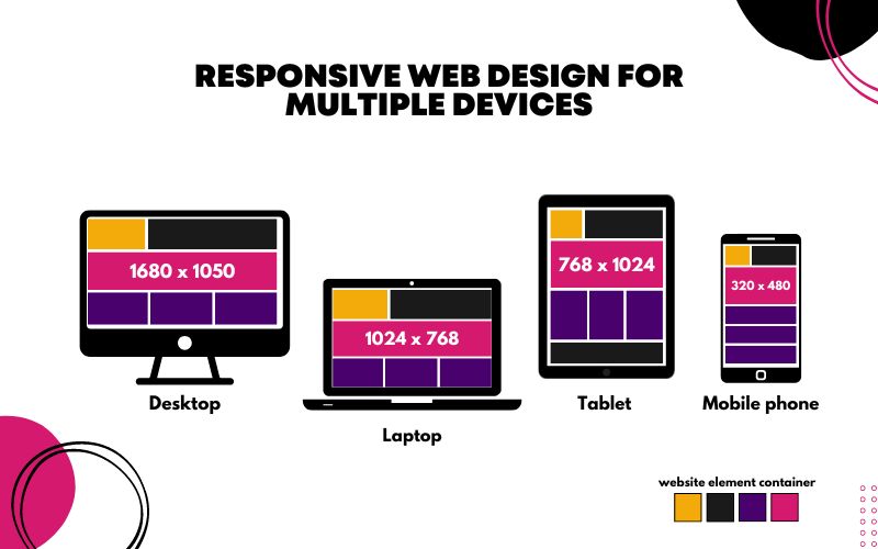
The cornerstone of mobile-first CSS is the use of min-width media queries. All the base styles in your stylesheet—the styles written outside of any media query—should target mobile devices. These are your default styles. Then, you use min-width media queries to add or override styles as the screen size *increases*.
Consider a common scenario: a grid of product cards. On mobile, we want them to stack vertically. On a tablet and larger screens, we want a multi-column grid.
Here’s a simplified code example:
<!-- HTML Structure -->
<div class="card-container">
  <div class="card">...</div>
  <div class="card">...</div>
  <div class="card">...</div>
</div>

<!-- CSS Styling (Mobile-First) -->
<style>
  /* Base (Mobile) Styles */
  .card-container {
    width: 100%;
    padding: 1rem;
  }

  .card {
    background-color: #fff;
    border: 1px solid #ddd;
    margin-bottom: 1rem;
    /* Other mobile-specific styles */
  }

  /* Tablet and larger screens (Progressive Enhancement) */
  @media (min-width: 768px) {
    .card-container {
      display: grid;
      grid-template-columns: repeat(2, 1fr);
      gap: 1rem;
    }

    .card {
      margin-bottom: 0;
    }
  }

  /* Desktop and larger screens */
  @media (min-width: 1024px) {
    .card-container {
      grid-template-columns: repeat(3, 1fr);
    }
  }
</style>
In this example, the mobile browser only needs to parse the simple base styles. It completely ignores the code within the media queries. This is far more efficient than loading complex desktop grid styles and then using a max-width media query to undo them for mobile.
Mastering Modern Layouts: CSS Flexbox and Grid
Modern CSS layout modules are tailor-made for mobile-first workflows.
- CSS Flexbox is perfect for one-dimensional layouts. It excels at distributing space along a single axis, making it ideal for navigation bars, aligning items within a component, or creating simple card layouts. A mobile navigation menu is a classic Flexbox Layout use case.
- CSS Grid is designed for two-dimensional layouts, managing both columns and rows. It’s the perfect tool for creating the complex Grid Layout for your main Page Layout on larger screens. The beauty of CSS Grid is that you can define a simple, single-column layout by default and then redefine the
grid-template-columnsinside amin-widthmedia query, as shown in the example above. This makes creating a sophisticated, CSS Responsive layout remarkably clean and intuitive.
Beyond the Code: The Ripple Effect of a Mobile-First Strategy
Adopting a mobile-first approach has far-reaching benefits that extend well beyond clean code. It fundamentally improves the end product by influencing user experience, performance, and even business-critical metrics like search engine visibility.


Enhancing User Experience (UX) Through Constraint
The limitations of the mobile screen act as a natural filter, forcing a ruthless prioritization of content and features. This “design by subtraction” process results in a cleaner, more focused user experience. By eliminating clutter and non-essential elements from the core mobile view, you create a product that is easier to navigate and understand. This clarity and simplicity often translate beautifully to the desktop version as well. Users on all devices benefit from a streamlined interface that helps them accomplish their goals more efficiently. This focus on core functionality is a hallmark of excellent UX Design.
Performance as a Core Feature, Not an Afterthought
Web performance is user experience. A slow website is a frustrating website. Mobile-first design inherently builds a performance-oriented foundation. Because you start by loading only the essential assets for the mobile experience, the initial page load is significantly faster. You aren’t burdening mobile users with heavy desktop-only JavaScript libraries, large background images, or complex CSS Animations. Advanced techniques align perfectly with this philosophy:
- Responsive Images: Using the
<picture>element or thesrcsetandsizesHTML Attributes allows the browser to download the most appropriately sized image for its viewport, saving bandwidth. - Conditional Loading: JavaScript for complex desktop-only features can be loaded conditionally, only when a certain viewport width is detected.
- Lean CSS: With mobile-first media queries, mobile devices parse a much smaller, simpler set of CSS rules, leading to faster rendering. This is one of the most powerful CSS Tricks for performance.
Winning at SEO with Mobile-First Indexing
For several years now, Google has operated on a “Mobile-First Indexing” model. This means that Google predominantly uses the mobile version of a website for indexing and ranking. If your mobile site has less content than your desktop site (a common issue with Graceful Degradation), you could be harming your SEO. A properly executed mobile-first strategy ensures that the mobile version of your site is the complete, canonical version. By presenting all your important content and structured data on the mobile view, you are perfectly aligning your site with Google’s indexing priorities, giving you a significant advantage in search rankings.
Choosing Your Tools: Frameworks and Methodologies
While mobile-first design can be implemented with vanilla HTML and CSS, several tools and frameworks can streamline the process. These tools are built with a mobile-first philosophy at their core, providing developers with a robust system for creating responsive interfaces.
Mobile-First CSS Frameworks
Many modern frameworks are built on a mobile-first foundation.
- Bootstrap: One of the earliest and most popular frameworks, Bootstrap’s powerful grid system is fundamentally mobile-first. You define column layouts for the smallest breakpoint first and then use breakpoint-specific classes (e.g.,
.col-md-6,.col-lg-4) to adjust the layout for larger screens. - Tailwind CSS: A utility-first CSS Framework that has gained immense popularity. Tailwind CSS makes mobile-first design incredibly intuitive. You apply base styles by default (e.g.,
class="w-full") and then use responsive prefixes to apply styles at specific breakpoints (e.g.,class="md:w-1/2 lg:w-1/3"). This approach keeps your HTML and styling tightly coupled and easy to reason about.
The Role of CSS Preprocessors and Tooling
Tools in the modern frontend ecosystem can further enhance a mobile-first workflow.
- CSS Preprocessors (SASS/LESS): Preprocessors like SASS or LESS allow you to manage media queries more efficiently using mixins. You can define a breakpoint mixin that encapsulates the media query logic, making your stylesheets cleaner and more maintainable (a great CSS Tip).
- PostCSS: A tool for transforming CSS with JavaScript plugins. It can be used to automatically add vendor prefixes, minify code, and perform other optimizations that contribute to a performant mobile experience.
- CSS-in-JS: Libraries like Styled Components or Emotion allow developers to write component-scoped CSS directly in their JavaScript. These libraries have elegant APIs for handling responsive styles, making it easy to build encapsulated components that adapt to different viewports.
Conclusion: Embracing the Mobile-First Mindset
Mobile-First Design is far more than a set of coding techniques or a responsive design trend. It is a fundamental shift in strategy that places the user at the center of the development process. By starting with the most constrained environment, we are forced to be disciplined, prioritize ruthlessly, and focus on what truly matters. The result is a product that is not only faster, more accessible, and easier to use on mobile devices but is also cleaner and more efficient on every platform.
For the modern Frontend Web developer, embracing this philosophy means building websites and applications that are resilient, performant, and perfectly aligned with both user behavior and search engine priorities. By mastering the principles and practical applications of mobile-first design, you are not just keeping up with industry best practices—you are building for the future of the web.


