Introduction: The Architecture of the Modern Web
The internet is not merely a collection of documents; it is a dynamic, interactive ecosystem built upon a foundation of agreed-upon rules known as Web Standards. For anyone involved in Web Development or Frontend Web engineering, understanding these standards is not optional—it is the bedrock of professional practice. Web Standards, primarily curated by the World Wide Web Consortium (W3C), ensure that the digital experiences we create are interoperable, accessible, and sustainable. Without these protocols, the web would be a fragmented landscape where websites would only function correctly on specific browsers or devices, alienating users and stifling innovation.
In the current era of Frontend Development, the browser landscape is evolving. New rendering engines and user agents are constantly being developed to challenge the status quo, aiming for speed and privacy. For these new entrants to succeed, and for existing browsers to maintain relevance, strict adherence to W3C Standards is critical. This article delves deep into the technicalities of Web Standards, exploring the symbiotic relationship between HTML Structure, CSS Styling, and the user experience. We will move beyond basic HTML Tutorial concepts to explore advanced HTML5 Features, Modern CSS paradigms, and the critical importance of Web Accessibility.
Section 1: The Structural Foundation – Semantic HTML and Accessibility
At the core of every web interface lies HyperText Markup Language (HTML). While it is easy to view HTML as a simple scaffolding tool, modern HTML Semantic practices define the meaning of content, not just its placement. Writing standards-compliant HTML is the first step in effective UI Design and UX Design.
The Power of Semantic Elements
Gone are the days of “div soup,” where developers would nest endless generic containers. HTML5 Features introduced a suite of semantic HTML Tags that describe the content they contain. Elements such as <header>, <nav>, <main>, <article>, and <footer> provide crucial context to browser engines and assistive technologies. Using the correct HTML Elements ensures that the document outline is logical. For instance, a screen reader can instantly jump to the main content if it is wrapped in a <main> tag, bypassing repetitive navigation links.
Mastering HTML Forms and Attributes
Interaction often begins with data entry. HTML Forms are a critical component of Web Standards. A robust form implementation goes beyond the <form> tag. It involves utilizing specific input types (like email, tel, date) to trigger the correct virtual keyboards on mobile devices—a key aspect of Mobile-First Design. Furthermore, understanding HTML Attributes is vital. Attributes like required, pattern, and autocomplete enhance usability and client-side validation without writing a single line of JavaScript. HTML Best Practices dictate that every input must have an associated label, explicitly linked via the for attribute to ensure accessibility.
Accessibility: The Non-Negotiable Standard
Web Accessibility is often treated as an afterthought, but in the realm of Web Standards, it is a primary requirement. Semantic HTML handles much of this natively, but complex interfaces often require ARIA Labels (Accessible Rich Internet Applications). ARIA attributes bridge the gap when standard HTML cannot adequately describe a dynamic component’s state or role. However, a common pitfall is the overuse of ARIA. The first rule of ARIA is: if you can use a native HTML element (like a <button> instead of a <div>), do so. Native elements come with built-in keyboard accessibility and focus management, which are essential for users relying on assistive technology.
Section 2: The Presentation Layer – Modern CSS Paradigms
Once the structure is defined, CSS Styling dictates the visual presentation. Cascading Style Sheets (CSS) have evolved significantly, transforming from a simple styling language into a powerful layout engine. A comprehensive CSS Tutorial today looks vastly different than one from a decade ago, thanks to CSS3 Features.
Revolutionizing Layouts: Flexbox and Grid
The days of using HTML Tables for layout or relying on fragile float-based systems are over. Modern CSS offers two powerful layout systems: CSS Flexbox and CSS Grid.
- CSS Flexbox Layout: Flexbox is one-dimensional. It excels at distributing space along a single axis (row or column). It is the standard for alignment within components, such as navigation bars or centering elements vertically and horizontally.
- Grid Layout: CSS Grid is two-dimensional. It handles both columns and rows simultaneously, allowing for complex Page Layout designs that were previously impossible without JavaScript. Grid allows developers to create magazine-style layouts that adapt fluidly to different screen sizes.
Understanding when to use Flexbox versus Grid is a hallmark of advanced Frontend Development. Often, they are used together: Grid for the overall Web Layout and Flexbox for the internal alignment of components within those grid cells.
Responsiveness and Adaptability
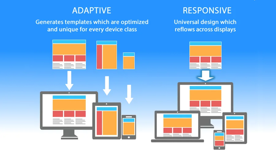
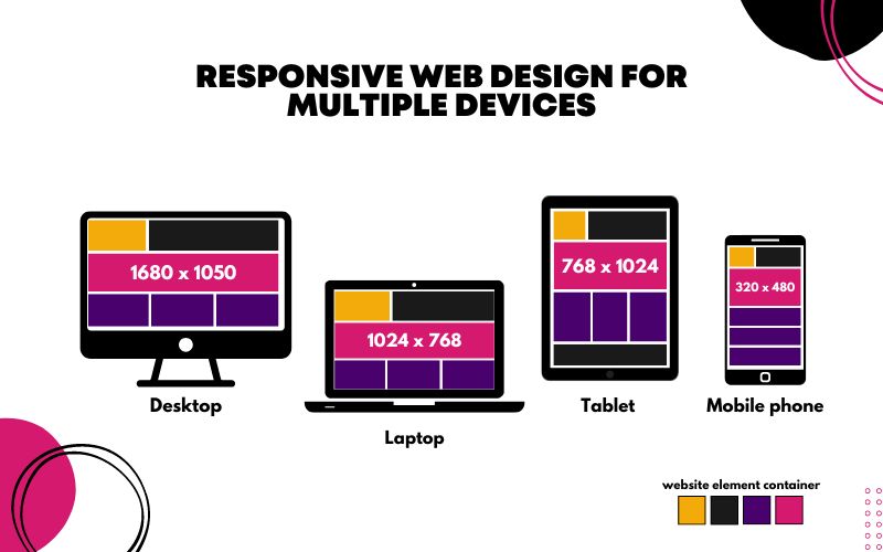
Responsive Design is no longer a luxury; it is a standard. With the variety of devices accessing the web, Mobile-First Design strategies are essential. This involves writing CSS for the smallest screens first and using media queries to enhance the layout for larger screens. This approach often results in cleaner, more performant code.
Furthermore, CSS Variables (Custom Properties) have revolutionized how we manage themes and consistency. By defining colors, spacing, and typography as variables, developers can implement dark mode switches or global theme changes with minimal effort. This contributes to better maintainability and ensures strict adherence to UI Design systems.
Animation and Interactivity
CSS Animations and CSS Transitions allow for performant, hardware-accelerated motion on the web. Instead of using heavy JavaScript libraries for simple hover effects or modal appearances, standard CSS properties can handle these interactions smoothly. CSS Tricks often involve using transform and opacity for animations to avoid triggering expensive layout repaints by the browser, ensuring a smooth 60fps experience.
Section 3: Tooling, Frameworks, and Specialized Contexts
While standards provide the raw materials, the modern developer workflow often involves tools that abstract or enhance these standards. Understanding how these tools interact with the core specifications is crucial for producing high-quality code.
The Role of CSS Frameworks and Preprocessors
To speed up development, many teams turn to a CSS Framework. Options like Bootstrap and Foundation provided the early blueprints for responsive grids. However, the industry has seen a shift toward utility-first frameworks like Tailwind CSS. Tailwind encourages a different approach to CSS Selectors, applying styles directly via classes rather than semantic class names. While this speeds up development, developers must ensure they don’t sacrifice semantic HTML structure in the process.
CSS Preprocessors like SASS, LESS, and PostCSS extend the capabilities of CSS with features like nesting and mixins before compiling down to standard CSS. These tools help manage large codebases but ultimately must output valid, standard CSS to be interpreted by the browser.
Component-Based Architecture
With the rise of JavaScript frameworks (React, Vue, Angular), styling methodologies have shifted toward CSS-in-JS and Styled Components. These technologies scope styles to specific components, solving the issue of global namespace pollution. However, they introduce new challenges regarding Web Standards. Developers must ensure that these components still render valid HTML and that the generated CSS does not bloat the DOM or hinder performance.

Specialized Contexts: Email and Landing Pages
Not all web environments support the latest standards equally. HTML Email development is notoriously difficult because email clients (like Outlook or Gmail) often use outdated rendering engines that do not support modern CSS3 Features. In this niche, developers often have to revert to using HTML Tables for layout and inline CSS, ignoring modern CSS Responsive techniques. Similarly, high-conversion Landing Pages often require specific optimization strategies where HTML Tips regarding image loading (lazy loading) and critical CSS inlining take precedence to ensure immediate visual rendering.
Section 4: Strategic Implications and Best Practices
Adhering to Web Standards is not just about code purity; it has tangible business and technical benefits. This section explores the strategic advantages and common pitfalls associated with standards compliance.
SEO and Discoverability
Search engines are the ultimate consumers of Web Standards. A crawler’s ability to index a site depends entirely on the HTML Structure. Proper use of HTML Templates, headings (h1 through h6), and meta tags directly influences search ranking. HTML Attributes like alt text on images not only serve Web Accessibility but also provide context to search engines about the visual content.
Performance and Maintainability
Standard-compliant code is generally leaner and faster. Browsers are optimized to render valid HTML and CSS efficiently. Invalid code triggers “quirks mode” or requires error-handling mechanisms that can slow down rendering. Furthermore, using modern standards like CSS Grid can reduce the amount of markup required compared to older float-based methods, reducing the DOM size and improving memory usage.
Common Pitfalls and HTML Tips
- Divitis: Overusing
<div>tags instead of semantic elements makes code hard to read and inaccessible. - Inaccessible Forms: Failing to use
<label>tags or relying solely on placeholders for instruction is a major UX failure. - Outline Suppression: Removing the focus outline (
outline: none) in CSS without providing an alternative makes the site unusable for keyboard users. - Browser Specific Hacks: Relying on vendor prefixes (
-webkit-,-moz-) without standard fallbacks can cause sites to break as browsers update.
Future-Proofing with Standards
The web is backward compatible, but it is also forward-looking. By sticking to W3C standards, developers ensure their sites will work on future browsers, including new engines that may emerge. Proprietary features or non-standard hacks are the first things to break when a browser updates. Material Design and other design systems rely heavily on these standards to ensure consistent behavior across platforms.
Conclusion
Web Standards are the unifying force of the internet. They transform a chaotic mix of technologies into a cohesive platform for communication and commerce. For the modern developer, mastering HTML5 Features, CSS3 Features, and Web Accessibility is not merely an academic exercise—it is a professional requirement. Whether you are building complex Web Layouts with CSS Grid, crafting high-performance Landing Pages, or architecting large-scale applications with Tailwind CSS or Styled Components, the underlying principles remain the same.
By prioritizing semantic HTML Structure, embracing Modern CSS capabilities, and advocating for accessibility, we create a web that is robust, inclusive, and ready for the future. As the browser landscape continues to diversify with new entrants and engines, the importance of writing standard-compliant code has never been greater. It ensures that the digital experiences we build today will continue to function and delight users for years to come.