Introduction
The landscape of Frontend Development is in a constant state of evolution. For over a decade, the cornerstone of Responsive Design has been the media query—a declarative rule that tells the browser how to behave based on the viewport size. However, as Web Standards mature and the complexity of UI Design increases, the industry is witnessing a paradigm shift. We are moving away from rigid, viewport-based layouts toward a more fluid, logic-driven approach to styling. The introduction of modern capabilities, such as Container Queries and the highly anticipated inline conditional logic within CSS Values, marks a turning point in how we conceive Web Layout.
In the early days of the web, HTML Tables were used for layout, creating rigid structures that broke easily on smaller screens. Then came floats, followed by the revolution of CSS3 Features like CSS Flexbox and CSS Grid. Today, we are standing on the precipice of a new era where CSS is becoming a programming language in its own right, capable of handling logic that was previously reserved for JavaScript or CSS Preprocessors like SASS and LESS. This article explores the journey of responsive design, deep-diving into modern techniques, and examining how new conditional functions are set to redefine Mobile-First Design.
Section 1: The Evolution of Layout and The Mobile-First Mindset
From Fixed Widths to Fluid Grids
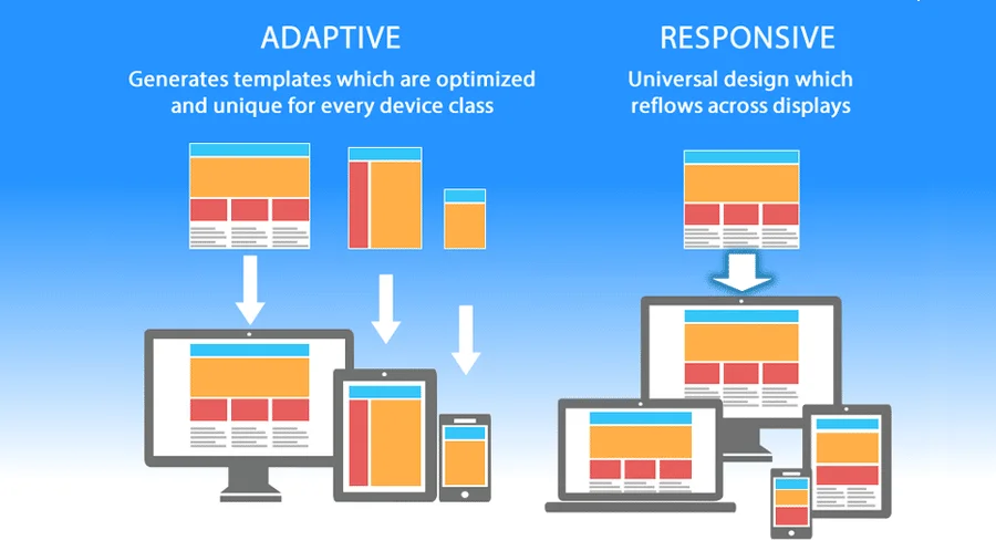
To understand where Modern CSS is going, we must appreciate where it came from. Historically, Web Design was print-centric. Designers created fixed-width Photoshop files, and developers translated them into static HTML Templates. The introduction of the smartphone forced the industry to adapt. The concept of “Responsive Web Design” (RWD) was born, relying heavily on percentages and media queries.
The core philosophy that emerged was Mobile-First Design. This approach suggests that styling should begin with the constraints of a mobile device and expand outward for larger screens. This is not just a styling preference but a performance optimization strategy. By loading the minimal styles required for mobile first, we respect the bandwidth and processing power of handheld devices, a key tenet of Web Accessibility and performance.
The Power of Flexbox and Grid
The introduction of CSS Flexbox (Flexible Box Layout) and CSS Grid fundamentally changed how we handle Page Layout. Before these tools, vertical alignment and complex grids required “hacks” involving floats and positioning.
- CSS Flexbox: Designed for one-dimensional layouts (rows or columns). It excels at distributing space between items in an interface and aligning content within a container. It is the go-to solution for navigation bars, HTML Forms alignment, and card layouts.
- CSS Grid: A two-dimensional layout system that handles both columns and rows simultaneously. It allows for the creation of complex Grid Layout structures that can drastically rearrange themselves based on screen size without changing the HTML Structure.
Combining these two CSS3 Features allows developers to build robust, responsive interfaces. For example, a Landing Page might use Grid for the overall macro-layout and Flexbox for the micro-layout of individual components.
Semantic HTML and Accessibility
Responsive design is not just about visual resizing; it is about maintaining meaning across devices. This is where HTML Semantic tags play a critical role. Using tags like <header>, <main>, <article>, and <footer> ensures that screen readers can navigate the content effectively, regardless of how the CSS rearranges it. Furthermore, proper use of ARIA Labels ensures that dynamic components remain accessible. When a navigation menu collapses into a “hamburger” icon on mobile, accessibility attributes must be updated to reflect the expanded or collapsed state.
Section 2: Beyond the Viewport – Container Queries and Variables
The Limitation of Media Queries
While media queries have served us well, they have a significant flaw: they are aware of the browser viewport, but they are ignorant of the component’s context. In modern Frontend Web architecture, we build reusable components (widgets, cards, sidebars). A card component might need to look different when placed in a narrow sidebar versus a wide main content area. Using viewport media queries for this requires writing complex, fragile selectors.
This limitation gave rise to Container Queries. This feature allows an element to style itself based on the size of its parent container rather than the browser window. This is a massive leap forward for CSS Framework development and component-based libraries like React or Vue.
CSS Variables: The Bridge to Logic
CSS Variables (Custom Properties) are perhaps the most underutilized superpower in CSS Tutorial content. Unlike variables in preprocessors like SASS, CSS variables are live in the DOM. They can be updated via JavaScript or manipulated via media queries, and the changes cascade instantly.
For example, you can define a spacing unit or a color theme as a variable:
:root {
  --spacing-unit: 16px;
  --theme-color: #3498db;
}

@media (max-width: 768px) {
  :root {
    --spacing-unit: 8px; /* Globally updates spacing on mobile */
  }
}
This capability lays the groundwork for logic-based styling. By changing a single variable, you can trigger complex CSS Transitions and layout shifts across the entire application. This dynamic nature is what bridges the gap between static styling and the future of conditional CSS.
Section 3: The Game-Changer – Inline Conditional Logic
The Rise of the if() Function
The most exciting development in the W3C Standards pipeline is the introduction of inline conditional logic, specifically the if() notation within CSS values. Historically, logic belonged to JavaScript. If you wanted to change a property based on a condition that wasn’t a media query, you had to toggle a class name using JS. The new specifications allow developers to write logic directly inside their style definitions.
Imagine a scenario where a style value depends on a variable’s state. With the new syntax, CSS Styling becomes reactive. You can define a property like width or color to change based on a boolean check or a comparison, all within the CSS declaration block.
For instance, consider a layout where an element needs to be full-width on mobile but half-width on desktop, or perhaps dependent on a custom property flag like --is-compact. Instead of writing two separate blocks of code, you can write a single line that evaluates the condition. This reduces code bloat and centralizes the logic.
Comparing CSS Logic to Preprocessors
Developers familiar with SASS or LESS might argue that they have had `if` statements for years. However, there is a critical distinction. Preprocessor logic happens at compile time. The logic is evaluated on your computer before the website ever reaches the user. Once the CSS is generated, it is static.
The new native CSS logic happens at runtime in the user’s browser. This means the styling can react instantly to changes in the DOM, changes in CSS Variables, or user interactions without needing to reload or re-render a stylesheet. This brings the power of CSS-in-JS libraries (like Styled Components) directly into the native web platform, reducing the need for heavy JavaScript bundles.

Real-World Scenarios for Conditional CSS
How does this impact UX Design? Consider the following applications:
- Theming: Instead of loading separate stylesheets for Dark Mode, inline logic can toggle color values based on a single theme variable, offering smoother CSS Animations during the switch.
- Form Validation: HTML Forms often require visual feedback. With inline logic, input fields could change their border colors or visibility based on validity state variables without complex JavaScript class toggling.
- Responsive Typography: Fluid typography has historically relied on the `clamp()` function. Adding conditional logic allows for even more granular control over font sizes and line heights based on specific layout constraints.
Section 4: Implications, Best Practices, and Future-Proofing
Simplifying the Tech Stack
As native CSS becomes more powerful, the reliance on heavy utility frameworks like Tailwind CSS or Bootstrap may evolve. While these frameworks are excellent for rapid development, they often rely on pre-defined classes. Native conditional logic allows for “smarter” styles that adapt without needing a clutter of utility classes in the HTML Tags.
This shift also benefits HTML Email development. While email clients are notoriously slow to adopt Modern HTML standards, the eventual trickle-down of these features will make creating responsive emails—which is currently a nightmare of nested HTML Tables—significantly easier.
Performance and Maintainability
With great power comes great responsibility. Writing logic inside CSS values can make stylesheets harder to read if not managed correctly. Here are some CSS Tips for maintaining sanity:
- Keep it Readable: Just because you can write a complex nested condition in one line doesn’t mean you should. Use comments and spacing.
- Use Fallbacks: Not every browser will support the latest CSS Values immediately. Always provide a fallback value for older browsers to ensure Web Accessibility and functionality are preserved.
- Don’t Abandon Semantics: Logic in CSS should handle presentation, not content structure. Ensure your HTML Elements remain semantic. A button should still be a
<button>, not a<div>styled with logic to look like one.
The Role of PostCSS
Until full browser support is achieved, tools like PostCSS will remain vital. They allow developers to write future-syntax CSS today and transpile it into code that current browsers understand. This allows teams to adopt HTML Best Practices and modern syntax without alienating users on older devices.
Conclusion
The definition of “Responsive Design” is expanding. It is no longer just about squishing a grid of boxes into a single column for a phone. It is about creating intelligent, context-aware interfaces that adapt to user preferences, container sizes, and dynamic application states. The introduction of inline conditional logic, such as the if() function, alongside Container Queries and CSS Variables, represents the maturation of CSS into a true layout language.
For professionals in Web Development, staying ahead means mastering these new specifications. By moving logic from JavaScript and preprocessors into native CSS, we can build faster, more accessible, and more maintainable websites. As we embrace these HTML Tips and CSS Tricks, we move closer to a web that is fluid, resilient, and truly responsive in every sense of the word.