Mastering Mobile-First Design: A Comprehensive Guide to Modern Frontend Development
Share
Introduction: The Paradigm Shift in Web Development
In the early days of the internet, web design was a relatively static discipline. Designers created layouts for desktop monitors, and developers wrote code that assumed a landscape orientation and a mouse cursor. However, the proliferation of smartphones has fundamentally inverted this approach. Today, Mobile-First Design is not merely a trend; it is the industry standard for Frontend Web development and UX Design. This philosophy prioritizes the mobile experience as the primary constraint, ensuring that the most essential content is delivered efficiently to the smallest screens before being progressively enhanced for tablets and desktops.
The necessity for this shift is driven by user behavior and search engine algorithms. With mobile internet traffic consistently surpassing desktop traffic, search engines like Google have adopted mobile-first indexing. This means the mobile version of a website is the benchmark for ranking. Consequently, mastering Mobile-First Design is no longer optional for those studying a Web Design or HTML CSS Tutorial; it is a critical skill. It requires a deep understanding of HTML5 Features, CSS3 Features, and the nuances of Responsive Design. By focusing on the constraints of mobile devices—limited screen real estate, touch interfaces, and variable bandwidth—developers can create robust, high-performance applications that scale elegantly to any viewport.
Section 1: The Core Philosophy and Strategic Advantages
Defining Mobile-First vs. Desktop-First
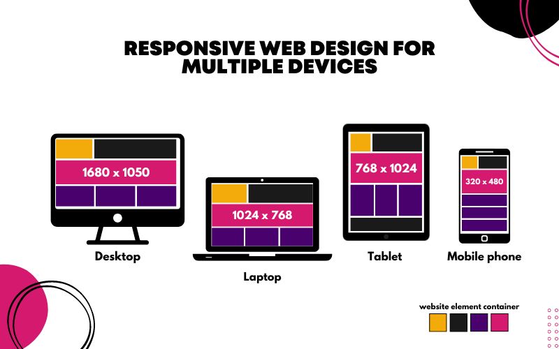
To understand mobile-first, one must contrast it with the traditional desktop-first approach. In a desktop-first workflow, a developer builds a complex layout with multiple columns, heavy graphics, and hover effects, then uses CSS Responsive techniques to “downgrade” or hide elements for smaller screens. This often leads to bloated code where mobile users download assets they never see. Conversely, mobile-first design utilizes the strategy of “Progressive Enhancement.” You start with the essential content and functionality for the smallest screen, ensuring a lightweight and fast experience. As the screen size increases, you use CSS Selectors and media queries to add complexity, layout changes, and higher-fidelity assets.
Content Prioritization and UI/UX Design
Mobile-first design forces strict content prioritization. When you only have a few inches of screen space, every pixel counts. This constraint is a blessing for UI Design and UX Design because it compels stakeholders to decide what is truly important. There is no room for fluff. This clarity often results in cleaner HTML Structure and more intuitive navigation.
For example, on a desktop Landing Page, you might have a sidebar, a mega-menu, and a hero carousel. In a mobile-first approach, you must distill this down: the sidebar might become a bottom drawer, the menu becomes a hamburger icon, and the carousel might be replaced by a single, high-impact image. This focus on essentials improves the user journey, reducing cognitive load and increasing conversion rates.
Performance and Web Standards
Performance is a key pillar of Modern HTML and Modern CSS. Mobile users are often on cellular networks with unstable connections. A mobile-first approach naturally encourages performance because you are building up from a lightweight foundation rather than stripping down a heavy one. Adhering to W3C Standards and Web Standards ensures that the site renders correctly across the fragmented landscape of mobile browsers. Furthermore, this approach aligns with Web Accessibility guidelines. By simplifying the interface for mobile, you often make the site more navigable for screen readers and users with motor impairments, utilizing proper ARIA Labels and logical document flow.
Section 2: Technical Architecture and Implementation
The Power of Min-Width Media Queries
The technical heart of mobile-first design lies in how you write your CSS. In a desktop-first approach, developers typically use `max-width` media queries (e.g., `@media (max-width: 768px)`). In mobile-first design, the default CSS styles apply to the mobile view (no media query required), and you use `min-width` queries to adjust the layout for larger screens.
For instance, consider a CSS Flexbox layout. In your base CSS, you might define a container as a column so items stack vertically on mobile. Then, inside a media query for tablets (`@media (min-width: 768px)`), you change the `flex-direction` to row. This reduces the amount of override code the browser has to parse for the mobile view, speeding up rendering.
Leveraging Modern Layout Systems: Flexbox and Grid
CSS Flexbox and CSS Grid are indispensable tools for modern Page Layout. Flexbox excels at one-dimensional layouts—distributing space along a single row or column—which is perfect for navigation bars and card components. CSS Grid, on the other hand, handles two-dimensional layouts (rows and columns simultaneously).
In a mobile-first context, a Grid Layout might start as a single column track. As the viewport widens, you can introduce more columns. For example:
Mobile: `grid-template-columns: 1fr;` (One column taking full width)
This fluidity is far superior to the rigid, float-based layouts of the past. It allows for complex Web Layout structures that adapt seamlessly without relying on heavy JavaScript or HTML Tables (which should never be used for layout in modern development).
Semantic HTML and Accessibility
A robust mobile-first site begins with Semantic HTML. Using correct HTML Tags and HTML Elements provides the skeleton upon which the design hangs. Elements like `