Introduction
The landscape of Web Design and Frontend Development has undergone a seismic shift in recent years. Gone are the days when the web was a static repository of digital documents. Today, users expect immersive, interactive narratives that respond to their actions. At the heart of this transformation lies the power of CSS Animations. While JavaScript has historically been the heavy lifter for complex motion, Modern CSS has evolved to handle sophisticated choreography directly within the stylesheet, improving both developer experience and browser performance.
For any developer mastering an HTML Tutorial or diving into CSS3 Features, understanding motion is no longer optional—it is a core competency of UX Design. Animation provides context, guides the user’s eye, and smooths the cognitive load during state changes. From subtle micro-interactions on HTML Forms to grand “scrolly-telling” experiences on Landing Pages, CSS is now capable of driving high-fidelity motion with minimal code.
In this comprehensive guide, we will explore the technical depths of CSS animations. We will move beyond basic CSS Transitions and CSS Selectors to explore the cutting-edge Scroll-driven Animations API, a feature that allows developers to link animation progress directly to the scroll offset of a container. We will also discuss HTML Best Practices, performance implications, and how to maintain Web Accessibility while bringing your Page Layout to life.
Section 1: The Foundation of Modern Web Motion
From Transitions to Keyframes
To understand the future of web motion, we must first solidify our grasp of the basics. CSS Transitions are the entry point for most developers. They allow property changes in CSS values to occur smoothly over a specified duration. This is essential for UI Design elements like buttons, links, and input fields found in HTML Templates. However, transitions are reactive; they require a trigger, such as a hover state or a class change via JavaScript.
CSS Animations, powered by the @keyframes rule, offer significantly more control. They allow for intermediate steps in an animation sequence, looping, and independent execution without immediate user interaction. A robust CSS Tutorial will emphasize that while transitions go from A to B, animations can go from A to B to C and back to A, all while manipulating complex properties like transform, opacity, and filter.
The Role of Semantic HTML and Layouts
Before applying motion, the underlying structure must be sound. HTML Semantic tags (<article>, <section>, <nav>) provide the hooks necessary for maintainable CSS. When animating, the stability of the Web Layout is paramount. Modern layout systems like CSS Flexbox and CSS Grid play a crucial role here. For instance, animating the width of an element in a Flexbox Layout can cause expensive layout thrashing (re-calculating the geometry of the page).
Instead, experienced developers utilize CSS Properties that do not affect the document flow, such as transform: scale() or translate(). This ensures that the Grid Layout remains stable while the element appears to change size or position. This distinction is vital for Responsive Design, where layout shifts can be particularly jarring on mobile devices.
The Animation Property Suite
Mastering the shorthand animation property requires understanding its sub-properties:
- animation-name: Links to the
@keyframesblock. - animation-duration: Defines how long one cycle takes.
- animation-timing-function: Controls the acceleration curve (e.g.,
ease-in-out,linear, orcubic-bezier). - animation-fill-mode: Dictates the style of the element before and after execution (crucial for ensuring elements don’t “pop” back to their original state).
By combining these with CSS Variables (Custom Properties), developers can create highly reusable and themable animation systems that integrate seamlessly with CSS Frameworks like Bootstrap or Tailwind CSS.
Section 2: The New Era of Scroll-Driven Animations


Declarative Scrolly-telling
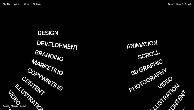
The most exciting development in Modern CSS is the introduction of Scroll-driven Animations. Historically, creating an effect where an element fades in or moves as the user scrolls required attaching scroll event listeners in JavaScript, calculating viewport positions, and manually updating styles. This approach often led to performance bottlenecks on the main thread.
The new CSS specification introduces the animation-timeline property. This feature allows developers to bind the progress of an animation to a scroll container rather than a duration of time. This is a game-changer for Frontend Web development, enabling sophisticated “scrolly-telling” experiences with just a few lines of CSS.
Understanding View Progress Timelines
There are two primary types of scroll timelines: scroll() and view(). The scroll() function links animation progress to the scroll position of a scroll container (like the document body). The view() function, however, is where the magic happens for individual elements. It tracks the progress of an element as it crosses the scrollport (the visible area).
For example, to animate an image revealing itself as it enters the viewport, you might define a keyframe animation that changes opacity from 0 to 1. Instead of setting a time duration (e.g., 2s), you apply animation-timeline: view(). Now, the animation creates a direct 1:1 mapping between the scroll position and the keyframe progress. As the user scrolls down, the image fades in. If they scroll up, it fades out. This creates a highly responsive UX Design that feels physically connected to the user’s input.
Ranges and Fine-Tuning
To provide granular control, the specification includes animation-range. This property allows you to define exactly when the animation starts and ends relative to the viewport. You might want an animation to start when the element enters the bottom of the screen and finish when it reaches the center. Values like entry, exit, cover, and contain give Frontend Development teams precise directorial control over the stage.
Consider a Mobile-First Design scenario: A card in a list needs to slide in from the side. Using animation-range: entry 0% entry 100%, the slide effect completes exactly as the element fully enters the screen. This level of precision, achieved without a single line of JavaScript, aligns perfectly with W3C Standards for performant, declarative code.
Integration with Modern Tooling
This native capability reduces the reliance on heavy external libraries. While tools like GSAP are still valuable for complex timelines, native CSS is now sufficient for the majority of scroll-triggered effects found on Landing Pages and marketing sites. It integrates well with CSS Preprocessors like SASS or LESS, and can be easily abstracted into utility classes in Tailwind CSS or components in React (via Styled Components or CSS-in-JS).
Section 3: Implications for Performance, Accessibility, and Architecture
The Rendering Pipeline and Compositor Layers
When implementing CSS Animations, understanding the browser’s rendering pipeline is critical for Web Standards compliance and user experience. Not all CSS Properties are created equal. Animating properties like margin, width, or top triggers “layout” and “paint” operations, which force the browser to recalculate the geometry of the HTML Structure and repaint pixels. This is computationally expensive and causes “jank” (stuttering).
To achieve 60fps (frames per second), developers should stick to “compositor-only” properties: transform and opacity. When these are animated, the browser promotes the element to its own layer and handles the rendering on the GPU. This is especially important for Mobile-First Design, where device resources are limited. The new Scroll-driven Animations run off the main thread in modern browsers, ensuring that even if the JavaScript thread is busy, the scroll animations remain buttery smooth.


Accessibility and Reduced Motion
Web Accessibility is a non-negotiable aspect of Web Development. While parallax effects and sweeping animations are visually engaging, they can cause vestibular disorders (motion sickness) in some users. HTML Best Practices dictate that we must respect the user’s operating system preferences.
Using the @media (prefers-reduced-motion: reduce) media query is essential. Inside this query, developers should either disable animations entirely or replace motion-heavy effects with subtle opacity fades. For scroll-driven animations, this might mean detaching the timeline or simplifying the keyframes. Semantic ARIA Labels and proper HTML Attributes ensure that the content remains understandable even if the visual flair is removed.
Architecting for Maintainability
As CSS Tips go, maintainability is key. Hard-coding magic numbers in keyframes makes code brittle. Instead, leverage CSS Variables to create dynamic animations. You can define a --animation-distance variable on a parent container and use it within a child’s transform property. This allows for context-aware animations.
Furthermore, when working with HTML Templates or component libraries, consider separating the animation logic from the component styling. Utility classes or data attributes (e.g., data-animate="fade-up") allow for a cleaner separation of concerns. This modular approach is compatible with PostCSS workflows and modern frameworks, ensuring that your animation architecture scales as the project grows.
Section 4: Pros, Cons, and Recommendations
Pros of Native CSS Motion
The primary advantage of using native CSS for animations, particularly scroll-driven ones, is performance. By offloading work to the browser’s internal engine rather than the JavaScript event loop, we achieve smoother frame rates. Additionally, the declarative nature of CSS makes the code easier to read and debug compared to imperative JavaScript logic. It reduces the bundle size of your application, as you no longer need heavy animation libraries for standard effects.


Another benefit is resilience. If JavaScript fails to load or is disabled, CSS animations often still function (or degrade gracefully), ensuring the UI Design remains intact. This robustness is vital for HTML Email development (though support varies wildly there) and core content delivery.
Cons and Limitations
Despite the advancements, there are limitations. Complex sequencing—where animation B must start exactly 0.5 seconds after animation A finishes, but only if condition C is met—is still difficult in pure CSS. While animation-delay helps, complex orchestration often requires JavaScript. Furthermore, browser support for the newest features (like animation-timeline) is growing but not universal. Developers must use @supports feature queries to provide fallbacks for older browsers.
Additionally, overuse of animation can lead to a cluttered UX Design. Just because you can animate every HTML Table row or HTML Form input doesn’t mean you should. Cognitive overload is a real risk.
Recommendations for Developers
- Progressive Enhancement: Use
@supports (animation-timeline: view())to wrap your scroll effects. If the browser doesn’t support it, the element should simply appear visible by default. - Keep it Subtle: The best animations are often felt, not seen. Use micro-interactions to provide feedback rather than distracting the user.
- Test on Devices: A smooth animation on a high-end desktop might stutter on a mid-range phone. Always test your Responsive Design on actual hardware.
- Leverage the Ecosystem: Use tools like SASS loops to generate staggered animation delays for list items, creating a “waterfall” effect without writing manual CSS for every child element.
- Semantic Anchoring: Ensure your animations are tied to HTML Semantic elements. Don’t add empty
<div>tags just for animation targets; use pseudo-elements (::before,::after) or existing structure.
Conclusion
The evolution of CSS Animations represents a maturing of the web platform. With the advent of scroll-driven animations, Frontend Development has gained a powerful tool to create immersive, storytelling experiences that were previously the domain of heavy JavaScript libraries. By mastering these CSS3 Features, developers can build interfaces that are not only visually stunning but also performant and accessible.
As you experiment with these new capabilities, remember that technology serves the user. Whether you are building complex HTML Forms, data-heavy HTML Tables, or sleek Landing Pages, motion should always enhance the usability and clarity of the content. Embrace the power of Modern CSS, adhere to W3C Standards, and continue to push the boundaries of what is possible in Web Design.


