You know the drill. The designer hands you a pristine Figma file. The product grid looks immaculate. Every product title is exactly one line long. Every description is a perfect two-line summary. The “Add to Cart” buttons form a satisfying, razor-sharp horizontal line across the screen.
Then you hook it up to the CMS.
Suddenly, “Men’s Tee” is sitting next to “Vintage 1996 Heavyweight Cotton Blend Graphic T-Shirt (Limited Edition).” Your beautiful grid turns into a jagged mess. The cards might be the same height—thanks, CSS Grid defaults—but the internal content is all over the place. The buttons are floating at different altitudes, and the whole thing looks drunk.
I ran into this again last Tuesday on a client project. We were migrating a legacy Shopify setup to a custom stack, and the product data was… messy. I spent about 45 minutes tweaking grid tracks before remembering the simple, boring solution that actually works.
The “Tetris” Problem
Here’s the thing about CSS Grid: it’s fantastic at handling the macro layout. You throw display: grid and grid-template-columns: repeat(auto-fill, minmax(300px, 1fr)) on the container, and you’re 90% there. The browser handles the responsive wrapping, and by default, grid items (the cards) stretch to match the height of the tallest item in the row.
But Grid stops at the edge of the card. It doesn’t care what happens inside.

If Card A has a three-line title and Card B has a one-line title, the “Buy” button in Card A gets pushed down. Card B’s button sits higher up. Visually, it disconnects the row. Your eyes scan for the pattern (the buttons) and stumble when the line breaks.
I see developers try to fix this with fixed heights all the time. min-height: 80px on the title. Please don’t do that. You’ll just end up with truncated text on mobile or weird whitespace on desktop. It’s a game of whack-a-mole you won’t win.
The Flexbox Fix (Inside the Grid)
The fix isn’t more Grid properties on the parent. It’s Flexbox on the child.
Since the grid items are already stretching to fill the row height (default align-items: stretch behavior), you just need to tell the card how to distribute that extra space.
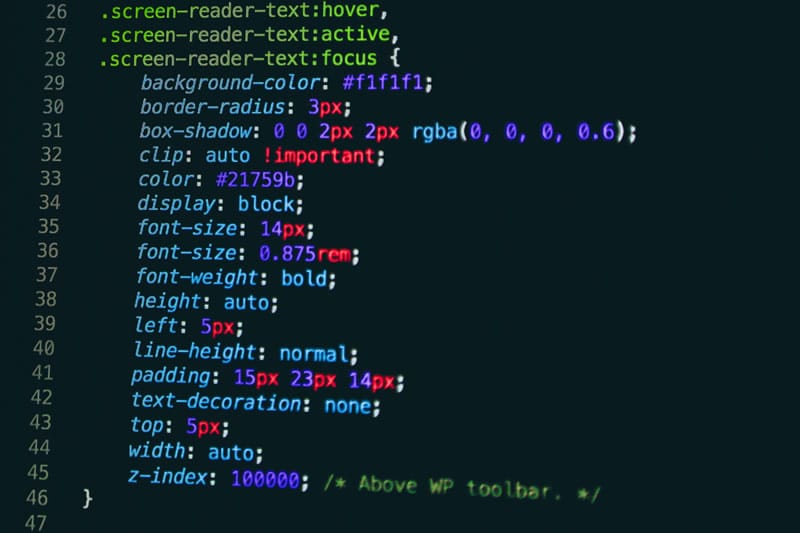
.card {
  display: flex;
  flex-direction: column;
  height: 100%; /* Ensure it fills the grid cell */
}

.card-content {
  /* Title, price, description go here */
}

.button {
  margin-top: auto; /* The magic sauce */
}
Why margin-top: auto? In a flex container, auto margins soak up all available positive free space. By putting it on the button, you force the button to the very bottom of the card, regardless of how short the content above it is. The content sits at the top, the button snaps to the bottom, and the empty space lives in the middle where nobody notices it.
What About Subgrid?
I know what you’re thinking. “It’s 2026, why aren’t we using Subgrid?”
I love Subgrid. I really do. Support in Chrome 145 is rock solid, and it’s been in Safari since… forever. If you need the titles to align across the row, Subgrid is the only sane way to do it. You define the rows in the parent and let the children snap to them.
But for this specific “floating button” issue? Subgrid is often overkill.
The Flexbox approach is self-contained. The card handles its own internal spacing. It doesn’t care if it lives in a Grid, a Flex row, or a block container. It just pushes the button to the bottom.


Performance Note
I actually benchmarked this on a low-end Android device (testing via BrowserStack) because I was worried about layout thrashing with 500+ items in the DOM. The Flexbox approach had zero measurable impact on rendering time compared to a static block layout.
Just Align It
We overcomplicate CSS. We want the “pure” Grid solution because it feels architecturally correct. But users don’t care about your architecture. They care that the “Add to Cart” button is where they expect it to be.
And, well, that’s the simple fix I stumbled upon last week. Next time your grid looks jagged, stop messing with track sizes. Just turn the card into a column flexbox and let auto-margins do the heavy lifting.
Common questions
How do I align Add to Cart buttons across CSS Grid product cards with different title lengths?
Turn each card into a flex column container with `display: flex`, `flex-direction: column`, and `height: 100%`, then add `margin-top: auto` to the button. Auto margins absorb the leftover vertical space inside a flex container, snapping the button to the bottom of the card while the title and description stay anchored at the top, regardless of content length.
Why shouldn’t I use min-height on product card titles to fix uneven CSS Grid layouts?
Setting a fixed value like `min-height: 80px` on titles becomes a whack-a-mole game. On mobile, longer titles get truncated or clipped, and on desktop you end up with awkward whitespace gaps when titles are short. It doesn’t adapt to real CMS content where title lengths vary wildly, so the layout still breaks at certain breakpoints.
Should I use CSS Subgrid instead of Flexbox to fix floating buttons in a product grid?
Subgrid is excellent when you need titles or rows to align across cards, and Chrome 145 plus Safari support it well. But for the floating-button problem alone, Subgrid is overkill. The Flexbox-on-child approach is self-contained: the card manages its own internal spacing and works whether it sits inside Grid, a Flex row, or a plain block container.
Does using Flexbox inside CSS Grid cards hurt rendering performance on mobile?
No measurable impact. The author benchmarked the Flexbox-inside-Grid pattern on a low-end Android device through BrowserStack with over 500 items in the DOM, specifically watching for layout thrashing. Rendering time was identical to a static block layout, so you can apply `display: flex` and `margin-top: auto` to product cards at scale without worrying about performance regressions.