The ASCII Art Problem
I still remember the first time I built a complex dashboard layout using grid-template-areas. I felt like a genius. I sat there in my editor, meticulously aligning strings of text to create a visual map of my website. It looked like ASCII art. It was readable, it was logical, and it felt like the future of Frontend Development.
Then the design requirements changed.
Suddenly, the sidebar needed to span two rows on specific pages, but only one on others. The main content area needed to split into three columns, but only for the analytics widget. My beautiful ASCII map turned into a tangled mess of repeated names and empty dots. I spent more time debugging the visualization of the grid than I did writing the actual code.
For the last few years, I’ve mostly abandoned named areas in favor of line numbers or simple named lines. But line numbers are brittle. If I inject a new column at index 2, everything shifts. It’s a maintenance nightmare.
This is why I’ve been experimenting heavily with the new CSS Grid Lanes concept over the last few weeks. It feels like the missing link between the rigidity of line numbers and the verbosity of template areas. If you haven’t looked at how layout engines are handling track grouping recently, you’re missing out on a significant quality-of-life upgrade.
What Are Grid Lanes?
At its core, the concept of a “lane” in CSS Grid isn’t entirely new logic, but rather a shift in how we define and target space. Traditionally, we place items by defining their start and end lines. We say, “start at line 2 and end at line 4.”
The problem is that lines are boundaries, not containers. Humans don’t think in boundaries; we think in containers. I don’t think “my content goes between the edge of the sidebar and the edge of the viewport.” I think “my content goes in the content lane.”
Grid Lanes allow us to define a named sequence of tracks as a single entity. Unlike grid-template-areas, which requires a 2D matrix, lanes are primarily about defining flow in one direction (usually columns) that creates an implicit bucket for your content. It strips away the complexity of managing both axes simultaneously when you only really care about horizontal placement.
The Syntax Shift
Here is how I’m currently writing my grids. Instead of just naming lines, I’m explicitly defining the track groups. This makes the CSS Semantic and much easier to read for anyone reviewing my PRs.
I start by defining the columns. In the past, I might have done this:
.grid-container {
  display: grid;
  grid-template-columns: [sidebar-start] 250px [sidebar-end content-start] 1fr [content-end];
}
That works, but it requires me to remember -start and -end suffixes or use the verbose grid-column: sidebar-start / sidebar-end. With the modern approach to lanes, I simply define the area names directly on the tracks. I treat the track definition as the lane definition.
I find this approach significantly cleaner when combined with CSS Variables. I can define my lane widths globally and inject them into the grid definition.
Building a Resilient Dashboard
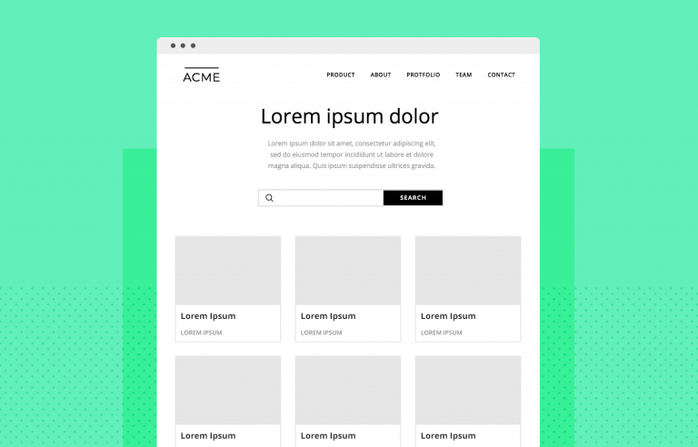
Let’s look at a real scenario. I recently rebuilt an admin panel for a client. The requirement was a classic Holy Grail layout but with a twist: a “utility” lane on the far right that appears and disappears based on user preference, without breaking the central content.
In the old days, toggling that right column meant redefining the grid-template-columns property entirely or dealing with awkward auto-placement shifts. Here is how I handled it using a lane-based mindset.
The Setup
I define my grid structure to accommodate three potential lanes: navigation, primary work, and details.
.dashboard {
  display: grid;
  gap: 1rem;
  /* Defining the lanes directly */
  grid-template-columns:
    [nav] 280px
    [work] minmax(0, 1fr)
    [details] 350px;
}
Now, when I place my items, I don’t worry about line numbers. I just tell the element which lane it belongs to. This uses the shorthand syntax that browsers have gotten much better at parsing in 2025.
.sidebar {
  grid-column: nav;
}

.main-view {
  grid-column: work;
}

.inspector-panel {
  grid-column: details;
}
This looks simple, right? But the magic happens when I need to hide the details lane. Instead of changing the grid definition on the parent, I can simply suppress the display of the element in the lane. Because I used minmax(0, 1fr) for the work lane, it automatically expands to fill the space if the grid track collapses (assuming I set the track width to 0 or auto depending on the collapse technique).
However, the real power of lanes comes when I have multiple elements that need to stack inside that work lane. If I have a header, a chart, and a data table all inside the .main-view area, I don’t need to wrap them in a container div just to keep them in the middle column. I can place them all directly on the grid and assign them all to grid-column: work.
This flattens the HTML Structure. I hate “div soup”—those layouts where you have fifteen layers of nesting just to get alignment right. By trusting the grid lane, I can keep my markup flat and semantic.
Handling Responsive Design
Responsive Design is where I used to hit a wall with complex grids. Redefining named areas inside media queries is tedious and prone to typos. If you misspell an area name in a media query, the layout silently breaks, and you end up with elements stacking weirdly.
With the lane approach, I focus on redefining the tracks, not the placement. The items stay assigned to nav or work, but I change what those names mean.
@media (max-width: 768px) {
  .dashboard {
    /* Stack everything in a single column */
    grid-template-columns: [nav] 1fr;
    grid-template-rows: auto auto auto;
  }

  /* I might need to manually reassign rows here,
     but the column assignment remains valid even if
     the tracks don't exist visually side-by-side. */
}
Actually, a better approach I use now is changing the grid definition to stack the names. This is a technique I call “Lane Stacking.”
@media (max-width: 768px) {
  .dashboard {
    grid-template-columns: 1fr;
    /* Redefining placement isn't always needed if I switch to flex
       or block, but if I stay in grid: */
    grid-template-areas:
      "nav"
      "work"
      "details";
  }
}
Wait, I just mentioned I avoid template areas. And I do. But for mobile fallbacks where linearity is key, sometimes switching to a simple stack is unavoidable. However, keeping the grid-column names consistent is the goal. If I define a single column track and name it [nav-start work-start details-start], all my items will pile into that one column. It’s a hacky but effective way to force a mobile stack without changing the child CSS.
Lanes vs. Subgrid
You might be wondering, “Why do I need this if I have CSS Subgrid?” Subgrid has been widely supported for a while now, and it is fantastic. I use it constantly. But Subgrid solves a different problem.
Subgrid is about inheritance. It allows a child to align to the parent’s tracks. Grid Lanes are about definition and placement. They are the architecture that Subgrid hooks into.
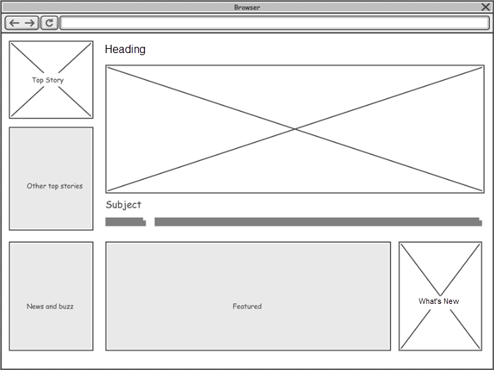
For example, I often set up my main page layout with clear lanes. Then, inside my card components, I use grid-template-columns: subgrid. This ensures that the internal padding of a card aligns perfectly with the header in the lane above it. The lane defines the “where,” and subgrid ensures the “how” aligns deeply through the DOM tree.


The Accessibility Angle
We cannot talk about modern Web Development without addressing Web Accessibility. One danger of heavy grid manipulation is that the visual order can disconnect from the DOM order. I’ve made this mistake before—placing a footer at the top of the screen visually while it remains at the bottom of the HTML.
Screen readers follow the DOM, not your CSS Grid placement. When I use lanes, I have to be disciplined. I write my HTML in the logical reading order (Nav -> Main -> Aside). I use lanes to position them side-by-side, but I never use lanes to radically reorder content that would confuse a keyboard user.
If I find myself using order: -1 or crazy grid line hacks to move the “Submit” button above the “Form,” I stop. I rewrite the HTML. CSS is for presentation, not for fixing bad document structure.
Browser Support and Reality Check
Let’s be real about the state of things in late 2025. While the spec authors and browser vendors have pushed incredible updates, not every user is on the latest version of Chrome or Safari. I still see traffic from older devices that struggle with the newest shorthand properties.
When I implement these lane-based layouts, I always include a fallback. Usually, a simple Flexbox Layout works as a safe downgrade. If the browser doesn’t understand my fancy named track definitions, it falls back to a vertical stack. That is acceptable. The site is usable.
I also use @supports queries religiously.
@supports (grid-template-columns: [name] 1fr) {
  /* Enhanced layout code */
}
This ensures that my layout doesn’t break on that one random Smart TV browser that hasn’t been updated since 2022. Progressive enhancement isn’t just a buzzword; it’s how I sleep at night knowing my client’s site won’t explode.



My Workflow for 2026
As we head into the new year, I’m standardizing my team’s approach to CSS Architecture. We are moving away from utility-class-heavy HTML for high-level layouts. Tailwind is great for buttons and typography, but for the main page skeleton, I want raw, semantic CSS Grid.
I want to see grid-column: feature-lane in the code, not col-span-4 md:col-span-8. The cognitive load of translating classes to visual space is too high when layouts get complex.
I’ve also started using CSS Preprocessors (specifically SASS) less for layout math and more just for nesting. The browser’s native calc() and grid capabilities are far superior to anything we used to compile server-side.
Why This Matters
Layouts are getting harder, not easier. We are designing for foldable phones, massive 8K monitors, and everything in between. The “12-column grid” standard of the Bootstrap era is dead. We need fluid, content-aware layouts that adapt to the data they hold.
Grid Lanes give me that flexibility. They allow me to create named zones that breathe. They let me drop content into a bucket without worrying about the specific pixel coordinates of that bucket. It feels less like engineering and more like graphic design, which is exactly what CSS should feel like.
If you are still manually counting track lines or wrestling with giant ASCII maps in your CSS files, do yourself a favor. Start grouping your tracks. Name them. Treat them as lanes. It cleans up your code, and frankly, it makes the development process a lot more fun.
I’m curious to see how the spec evolves over the next year, but for now, this is the most robust way I’ve found to build modern web interfaces.


