Stop Designing for Dribbble, Start Designing for Revenue
I see a lot of portfolios that look incredible but function terribly. If you look at the top-grossing utility apps on the market right now—the cleaners, the AI editors, the niche tools pulling in millions a year—they aren’t winning design awards for artistic expression. They are winning because their UI Design is ruthlessly optimized for conversion and utility.
I’ve spent the last few years shifting my focus from “pretty” interfaces to high-performance interfaces. My goal isn’t just to make a user smile; it’s to get them from point A (install) to point B (subscription/ad impression) with zero friction. Whether I’m building a quick MVP or scaling a mature product, the principles remain the same. I want to walk you through my exact process for designing these high-demand utility apps, focusing on the intersection of aesthetic polish and business logic.
1. The “Mobile-First” Mental Model
When I sit down to design, I don’t start with a desktop view. It sounds obvious in 2025, but I still see designers treating mobile as a squashed version of a desktop site. Mobile-First Design isn’t just a buzzword; it’s a constraint that forces clarity. Screen real estate is expensive.
I approach every screen like a Flexbox Layout. In my head, I’m already coding. I ask myself: is this a column or a row? How does this content flex when the screen size changes? If I can’t explain the layout in terms of CSS Flexbox or CSS Grid, I’m probably overcomplicating the design.
For utility apps, the hierarchy is simple:
- The Hero Action: The one thing the user came to do (e.g., “Clean Now” or “Generate Image”).
- The Value Prop: Why they should trust this tool.
- The Navigation: Secondary features tucked away.
I use Figma for this, but my layers in Figma mirror HTML Structure. I name my frames as if they were <section>, <header>, or <footer> tags. This semantic discipline makes the eventual handoff to development—whether it’s Flutter, React Native, or a PWA—infinitely smoother.
2. Data-Driven Aesthetics
Before I draw a single rectangle, I look at the data. If I’m building an AI photo editor, I don’t guess what colors users like. I look at the top 10 competitors. What are they doing?
I usually find that specific niches have specific visual languages:
- Security/Cleaners: Blues, greens, shield icons, sans-serif fonts.
- AI Tools: Dark mode, purples, neon gradients, holographic effects.
- Finance: Stark white, deep blues, very conservative typography.
I take these expectations and refine them. I’m not copying; I’m speaking the user’s language. If I design a security app that looks like a candy shop, users won’t trust it. Trust is the currency of UX Design.
I also rely heavily on Material Design principles for these types of apps. Google has already spent billions researching how users interact with buttons and sliders. I leverage that. I might customize the CSS Variables (or design tokens) to match my brand, but the core interaction patterns stay standard to reduce the learning curve.
3. The Monetization Layer: Designing the Paywall
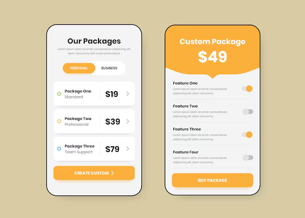
Here is where I differ from many designers: I design the paywall and the onboarding flow before I design the main dashboard. In the utility app game, if your onboarding doesn’t convert, your app is dead.
I treat the onboarding screens like a series of high-stakes Landing Pages. Each screen needs to sell a specific benefit. I use CSS Animations (prototyped in Figma using Smart Animate) to make these screens feel alive. A static image is boring; a pulsing button or a sliding graph keeps the user tapping “Next.”
My paywall design checklist usually looks like this:
- Clear Value Proposition: “Unlock 4x Speed” is better than “Premium Plan.”
- Social Proof: “Trusted by 1M users” placed near the CTA.
- Contrast: The “Subscribe” button must have the highest contrast ratio on the page.
- Transparency: I always make the “X” to close the paywall visible after a few seconds. Dark patterns might work short-term, but they kill retention and trigger refunds.
4. The “Magic” Button: Visualizing AI
Since AI is the backend for most of these apps, the UI needs to bridge the gap between a user’s input and the server’s response. The problem with AI is that it often takes a few seconds to process. If the screen just freezes, the user thinks the app crashed.
I invest heavily in CSS Transitions and loading states. I never use a default system spinner. If the app is “thinking,” I want the UI to reflect that.
For example, if I’m designing an AI text generator, I don’t just show a loading bar. I might show a terminal-style text effect where lines of code or “thoughts” are typing out rapidly. This is a psychological trick. It makes the wait feel like part of the value. It feels like “work” is being done. This is a core part of Frontend Web psychology—perceived performance vs. actual performance.
5. Structuring for Scalability (The Design System)
When I’m aiming for a high-output studio model, I can’t afford to redesign a button every time I start a new project. I build a “Utility UI Kit.”
This kit includes my standard HTML Elements translated into design components:
- Forms: Input fields with error states, success states, and focus states pre-defined.
- Typography: A type scale that works on small screens.
- Buttons: Primary, secondary, and ghost buttons.
- Modals: For alerts and confirmations.
I organize these using Auto Layout in Figma, which behaves exactly like CSS Flexbox. This means if I need to change the padding on all buttons from 16px to 24px, I do it in one place. It parallels using a CSS Framework like Tailwind CSS or Bootstrap. You define your utility classes once, and you move fast.
I also ensure my colors are set up as styles. In code, these become my CSS Variables (--primary-color, --bg-color). This setup allows me to “skin” a new app in hours. I can take a cleaner app structure, swap the variables from “Security Blue” to “Editor Purple,” change the icons, and I have a completely new product ready for the Test phase.
6. The Handoff: Thinking Like a Developer
Since I often handle the frontend code or work closely with developers using VS Code, I design with implementation in mind. I don’t just hand over a flat image.
I annotate my designs with CSS Properties. I’ll explicitly state: “This container uses justify-content: space-between.” Or “This background blur is backdrop-filter: blur(10px).”

I also pay attention to Web Accessibility and ARIA Labels. Even in a native app context, accessibility tools rely on similar structures. Buttons need to be large enough (minimum 44x44px) for fingers, and contrast ratios must meet W3C Standards. I use plugins to check contrast on the fly. There is nothing worse than shipping an app that gets rejected by the store or ignored by users because the text is illegible grey-on-grey.

7. Iteration: The Design Never Ends
Once the app is published (Google Play or App Store), the design process shifts from creation to reaction. I watch the metrics. I use tools to see where users are dropping off.
If I see 80% of users leave on the second screen of onboarding, I redesign that screen immediately. Maybe the text is too long. Maybe the “Next” button is below the fold on smaller devices. This is where HTML Best Practices come into play—keeping content concise and actionable.
I often run A/B tests on the main CTA color. Does a red “Clean” button perform better than a green one? Usually, yes, because red implies urgency. But I test it. I don’t assume.
Technical Deep Dive: The Code Connection
To really succeed in this space, you need to understand the medium. While Figma is great, understanding HTML5 Features and CSS3 Features makes you a better designer. Here is why:
- CSS Grid: Understanding grid areas helps you design complex dashboard layouts that respond gracefully to tablet sizes.
- CSS Pseudo-classes: Designing for
:hover(for web versions),:active, and:focusstates ensures the app feels responsive to touch. - Responsive Design: Knowing how media queries work helps you design breakpoints that make sense, rather than arbitrary pixel values.
I’ve recently been experimenting with Styled Components and CSS-in-JS workflows when working on web-based utility tools. It allows me to bind the design logic directly to the component state, which is incredibly powerful for complex UI interactions.
8. Avoiding Common Pitfalls

I’ve made plenty of mistakes. The biggest one was ignoring Semantic HTML principles in my mental model. I used to design “div soup”—just boxes inside boxes without meaning. This leads to messy code and confusing navigation.
Another pitfall is over-using custom fonts. In a utility app, system fonts (San Francisco on iOS, Roboto on Android) often convert better because they feel native and load instantly. Custom fonts can cause layout shifts and increase app size. If I do use a custom font, it’s usually just for headers.
Finally, ignoring HTML Forms best practices is a conversion killer. If your login form doesn’t support password managers or doesn’t automatically switch the keyboard to “email” mode, you are frustrating your user. As a designer, I specify these behaviors in my specs.
My Tool Stack
For anyone looking to replicate this workflow, here is what I use daily:
- Design: Figma (with Auto Layout heavily utilized).
- Icons: Material Symbols or specialized sets for the niche.
- Inspiration: AppBrain (to see what’s trending), Mobbin (for UI patterns).
- Handoff: Figma Dev Mode (directly inspecting CSS Attributes).
- Code Editor: VS Code (with Flutter/Dart extensions).
Final Thoughts on Utility UI
Designing for utility is different from designing for a brand site. The goal is efficiency. The user has a problem (slow phone, bad photo, need to scan a doc), and your UI is the solution. The faster you solve that problem, the more valuable you are.
I focus on clarity, speed, and trust. I strip away anything that doesn’t serve the core function. I use standard Web Development patterns because they work. And most importantly, I treat the design as a living thing that evolves with the data. If you can master this loop—ideate, design, ship, measure, repeat—you can build a portfolio of apps that do more than just look good; they actually work.