The Developer’s Guide to `aria-label`: Bridging the Gap in Web Accessibility
In the world of modern frontend development, we craft visually stunning and interactive user interfaces. We use powerful tools like CSS Grid and Flexbox for intricate web layouts, and CSS Animations to bring our designs to life. However, a significant portion of users experience the web not through sight, but through sound and touch, relying on assistive technologies like screen readers. For them, a beautiful interface can become an unusable maze if not built with accessibility in mind. This is where the Web Accessibility Initiative’s Accessible Rich Internet Applications (WAI-ARIA) suite becomes essential.
ARIA provides a set of HTML attributes that enhance the semantics of web content, making it more understandable for assistive technologies. Among these, the aria-label attribute stands out as a powerful, yet often misunderstood, tool. It offers a way to provide a clear, accessible name for an element when a visible text label is absent. This article serves as a comprehensive HTML tutorial and deep dive into aria-label, exploring its purpose, proper implementation, common pitfalls, and its crucial role in creating a truly inclusive web. By mastering this single attribute, developers can significantly improve the UX design for countless users, ensuring that functionality is never sacrificed for aesthetics.
Section 1: Understanding ARIA and the Core Function of `aria-label`
Before diving into the specifics of aria-label, it’s crucial to understand the foundation it’s built upon: WAI-ARIA. Think of the web page you build as having two structures: the DOM (Document Object Model) tree, which the browser uses for rendering, and the Accessibility Tree, which assistive technologies use to interpret and navigate the page. While semantic HTML provides a strong base for the accessibility tree, complex UI components often need extra information. ARIA bridges this gap.
What is WAI-ARIA?
WAI-ARIA is a W3C standard designed to make web applications more accessible. It’s a collection of HTML attributes that don’t alter an element’s appearance or browser behavior but add crucial semantic information for assistive technologies. For example, you can use ARIA roles to tell a screen reader that a set of <div> elements is functioning as a tabbed interface or that a specific element is a progress bar. ARIA properties and states, like aria-expanded="true", communicate the current condition of an element. This enriched HTML structure allows screen reader users to understand and interact with complex components that would otherwise be confusing or entirely inaccessible.
Introducing the `aria-label` Attribute
The aria-label attribute is one of the most direct and impactful ARIA properties. Its sole purpose is to define a string that serves as the accessible name for an HTML element. When a screen reader encounters an element with an aria-label, it will ignore the element’s other content (like text or descendant elements) and announce the value of the aria-label instead. This makes it an indispensable tool for providing context where none is visually present.
When Should You Use `aria-label`?
The primary use case for aria-label is for interactive HTML elements that are understood visually but lack descriptive text. Here are the most common scenarios in modern web design:
- Icon-Only Buttons: A classic example is the “X” button to close a modal, a gear icon for settings, or a hamburger menu icon. Visually, their function is clear. To a screen reader, they are just “button” or “unlabeled button.” Applying
aria-label="Close"oraria-label="Settings"provides the necessary context. - Ambiguous Link Text: Pages often feature multiple “Read More” or “Learn More” links. For a screen reader user navigating by links, this is unhelpful. Using
aria-labelcan add specificity, such as<a href="..." aria-label="Read more about our CSS3 Features">Read More</a>. - Visually Implicit Form Controls: A search bar might only contain a magnifying glass icon inside the
<button>element. While a sighted user understands this, an accessible name is required.<button aria-label="Search">...</button>solves this problem.
In essence, aria-label is your go-to solution when the UI design prioritizes minimalism, but the UX design demands clarity for all users. It’s a key part of responsible frontend web development.
Section 2: Practical Implementation and Best Practices
Understanding the theory is one thing; applying it correctly is another. Proper implementation of aria-label requires attention to detail and an understanding of how assistive technologies calculate an element’s accessible name. Following HTML best practices here is not just about code quality—it’s about usability for people with disabilities.
Core Syntax and Real-World Examples
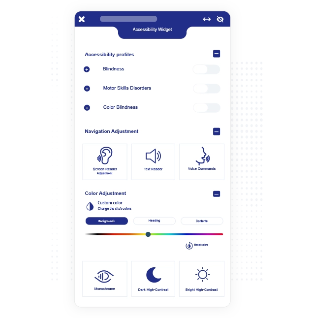
The syntax is straightforward: you add the attribute directly to the HTML element. The value should be a human-readable string.
Example 1: The Close Button in a Modal
A modal window often has a button with an ‘X’ icon for closing it. Without an accessible name, a screen reader user might not know how to dismiss the dialog.
<!-- Inaccessible Version -->
<button>✕</button>
<!-- Accessible Version -->
<button aria-label="Close dialog">✕</button>With the aria-label, the screen reader will announce: “Close dialog, button.” This is clear and actionable.
Example 2: A Social Media Link Icon Bar
A common component in a site footer is a series of social media icons that are also links. A screen reader needs to know where each link goes.
<!-- Inaccessible Version -->
<a href="https://twitter.com/...">
  <!-- SVG or Font Icon for Twitter -->
</a>

<!-- Accessible Version -->
<a href="https://twitter.com/..." aria-label="Follow us on Twitter">
  <!-- SVG or Font Icon for Twitter -->
</a>
This transforms a silent link into a descriptive one: “Follow us on Twitter, link.”
The Hierarchy of Accessible Names
It’s critical to understand that aria-label is a powerful override. Browsers and assistive technologies follow a specific order of precedence, known as the Accessible Name and Description Computation, to determine what to announce for an element. A simplified version of this hierarchy is:
aria-labelledby: If present, its value (referencing other element IDs) will be used. This is the highest priority.aria-label: Ifaria-labelledbyis not present, the value ofaria-labelwill be used. It overrides everything below it.- Native HTML Semantics: If no ARIA label is present, the browser looks for native text sources, such as the content of a
<label>element associated with an input, thealtattribute on an<img>, or the text content within a<button>or<a>tag. titleattribute: This is used as a last resort and has inconsistent support, making it unreliable for critical information.
This hierarchy demonstrates why using aria-label requires care. You are explicitly telling the accessibility tree to ignore other potential text sources for that element.
Best Practices for Writing Effective Labels
- Be Concise: The label should be short and to the point, like a visible button label would be.
- Be Descriptive: Conciseness should not come at the expense of clarity. “Next” is good, but “Next page” might be better depending on the context.
- Don’t Include the Role: Write
aria-label="Settings", notaria-label="Settings button". The screen reader already knows the element is a button (from its HTML tag or ARIA role) and will announce it. Adding it in the label results in redundant announcements like “Settings button, button.” - Ensure Accuracy: The label must accurately describe the element’s function. A label that says “Save” on a button that deletes data is a critical usability failure.
Section 3: Common Pitfalls and When NOT to Use `aria-label`
As with any powerful tool, aria-label can cause more harm than good if misused. The first rule of ARIA is: “No ARIA is better than bad ARIA.” Understanding the anti-patterns is just as important as knowing the use cases.
The Cardinal Sin: Overriding Visible Text
The most severe mistake a developer can make with aria-label is to use it on an element that already has a visible text label. For example:
<!-- INCORRECT USAGE - A MAJOR ACCESSIBILITY VIOLATION -->
<button aria-label="Send message">Submit</button>
This creates a dangerous disconnect. A screen reader user will hear “Send message, button,” while a sighted user sees “Submit.” This is confusing for low-vision users who may use a screen reader alongside visual browsing. More importantly, it breaks voice control software. A user who says “Click Submit” will find that the command fails, because the software is targeting the accessible name, “Send message.” If an element has visible, descriptive text, do not use aria-label. Let semantic HTML do its job.


Choosing the Right Tool: `aria-label` vs. `aria-labelledby` vs. `title`
Developers often get confused about which attribute to use. Here’s a clear breakdown:
aria-label: Use this ONLY when there is no visible text to act as a label. The label text is contained entirely within the attribute value.aria-labelledby: Use this when there is visible text on the page that can serve as the label. This is common for modals or complex widgets where a heading should label the entire container. It works by referencing theidof the labeling element.<h2 id="billing-address">Billing Address</h2> <div role="group" aria-labelledby="billing-address"> <!-- Form fields for address --> </div>titleattribute: Avoid using thetitleattribute for accessibility. Its content typically appears on mouse hover, making it inaccessible to keyboard-only and touch-screen users. Screen reader support is also highly inconsistent. It should only be used for supplementary, non-critical information.
Misusing `aria-label` on Static Content
Another common mistake is applying aria-label to non-interactive elements like <div>, <span>, or <p> without an appropriate ARIA role. In many cases, screen readers will simply ignore the label on such elements because they are not meant to be interactive. If you need to hide text visually but make it available to screen readers, a better approach is to use a CSS class for that purpose (often called .sr-only or .visually-hidden). This technique is common in CSS frameworks like Bootstrap and Tailwind CSS.
.visually-hidden {
  position: absolute;
  width: 1px;
  height: 1px;
  padding: 0;
  margin: -1px;
  overflow: hidden;
  clip: rect(0, 0, 0, 0);
  white-space: nowrap;
  border-width: 0;
}
This is the semantically correct way to provide extra context without resorting to an improper use of ARIA.
Section 4: Advanced Scenarios and Modern Development Workflows
In today’s dynamic web applications, accessibility needs to be just as dynamic. ARIA attributes, including aria-label, are not just static additions to your HTML templates; they are an integral part of your component’s state management.
Dynamic `aria-label`s in JavaScript Applications
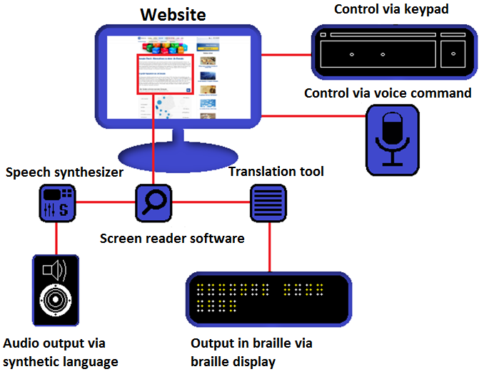


Consider a toggle button that plays and pauses a video. The icon might change from a “play” triangle to “pause” bars. The accessible name must also change to reflect the button’s current function.
<!-- HTML -->
<button id="play-pause-btn" aria-label="Play video">
  <svg id="play-icon">...</svg>
</button>

<!-- JavaScript -->
const toggleButton = document.getElementById('play-pause-btn');
let isPlaying = false;

toggleButton.addEventListener('click', () => {
  isPlaying = !isPlaying;
  // Update the accessible name based on state
  const newLabel = isPlaying ? 'Pause video' : 'Play video';
  toggleButton.setAttribute('aria-label', newLabel);

  // Logic to toggle icon and video playback...
});
This ensures that a screen reader user always knows the precise action the button will perform when activated. This pattern is fundamental for accessible single-page applications and complex UI components.
ARIA in CSS Frameworks and Component Libraries
Modern CSS frameworks and component libraries (like Material Design, Foundation, or Bootstrap) often handle accessibility basics for you. Their pre-built components for modals, dropdowns, and date pickers usually come with the necessary ARIA roles and attributes. However, as a developer, you are still responsible for providing the context-specific labels. These libraries typically expose a prop or attribute to set the aria-label. For instance, when using a generic <Icon> component, you would pass the accessible name as a prop, which the component then renders as an aria-label on the underlying <button> or <span>.
Testing Your ARIA Labels
You cannot ensure accessibility without testing. Integrating accessibility checks into your workflow is non-negotiable.
- Browser DevTools: Most modern browsers have an “Accessibility” tab in their developer tools. You can inspect an element and see its position in the accessibility tree and what its computed accessible name is. This is the fastest way to check if your
aria-labelis being applied correctly. - Automated Tools: Tools like Axe and Google Lighthouse can be run in your browser or as part of a CI/CD pipeline to catch common accessibility violations, including missing or misused labels.
- Manual Screen Reader Testing: Automation can’t catch everything. The ultimate test is to navigate your site using a real screen reader (NVDA on Windows, VoiceOver on macOS, TalkBack on Android). This provides invaluable insight into the actual user experience and reveals issues that automated tools might miss.
Conclusion: Building a More Inclusive Web
The aria-label attribute is a small but mighty tool in the vast landscape of web development. When used correctly, it bridges the gap between visual design and functional accessibility, ensuring that interactive elements are clear and usable for everyone. The key takeaways are simple yet profound: use aria-label to provide a name for otherwise non-descriptive interactive elements, never use it to override visible text, and always prefer native semantic HTML when possible.
Mastering aria-label is more than just learning another HTML attribute; it’s about embracing a mindset of inclusive design. By testing with assistive technologies and applying these best practices, you contribute to a web that is more robust, more usable, and welcoming to all users, regardless of their abilities. That is a cornerstone of truly excellent frontend web development.


