The Evolution of Web Layout: An Introduction to CSS Grid
For years, frontend developers wrestled with the limitations of CSS for creating complex page layouts. We relied on a patchwork of clever hacks and workarounds, from invisible HTML tables to the float-and-clearfix dance, and later, the advent of inline-block. While each method served its purpose, none were truly designed for the intricate, responsive layouts that modern web design demands. Then came CSS Flexbox, a revolutionary step forward that simplified one-dimensional alignment. But the true game-changer for two-dimensional page structure was the arrival of the CSS Grid Layout Module. CSS Grid is not just an incremental improvement; it’s a paradigm shift in web layout.
This powerful system provides a native, browser-level solution for creating grid-based layouts with unprecedented control and simplicity. It allows developers to manage both columns and rows simultaneously, making it the ideal tool for everything from entire page layouts to complex UI components. In this comprehensive guide, we will dive deep into the world of CSS Grid, exploring its core concepts, practical applications, and advanced features. We’ll compare it to Flexbox, uncover best practices for responsive design and accessibility, and provide actionable insights to help you master this essential tool for modern frontend development.
The Foundations of CSS Grid: Understanding the Core Concepts
To effectively use CSS Grid, it’s crucial to understand its fundamental terminology and properties. At its core, a grid is a collection of intersecting horizontal and vertical lines that create a structured system of rows and columns. By defining a parent element as a grid container, you gain control over the placement and alignment of its direct children, known as grid items.
The Grid Container and Grid Items
The journey into CSS Grid begins by declaring a container element. This is done with a single CSS property:
.grid-container {
  display: grid;
}
Once you apply display: grid, this element becomes a grid container, and its direct children automatically become grid items. By default, they will stack in a single column, but this is where the real power begins. You can now define the structure of your grid using properties like grid-template-columns and grid-template-rows.
.grid-container {
  display: grid;
  grid-template-columns: 200px 200px 200px; /* Creates three 200px columns */
  grid-template-rows: 100px 100px; /* Creates two 100px rows */
  gap: 16px; /* Defines the space between grid tracks */
}
In this example, we’ve established an explicit grid with three columns and two rows. The gap property is a convenient shorthand for row-gap and column-gap, creating a “gutter” between your grid items. This simple setup already demonstrates more control and less code than traditional float-based layouts.
Grid Tracks, Lines, and the `fr` Unit
The space between two adjacent grid lines is called a grid track (a column or a row). The lines themselves are numbered, starting from 1. These line numbers are essential for placing items precisely within the grid. For a three-column grid, you have four vertical grid lines (1, 2, 3, 4).
While fixed units like pixels are useful, CSS Grid introduced a new flexible unit that revolutionized responsive layouts: the fractional unit (`fr`). The fr unit represents a fraction of the available space in the grid container. This allows you to create fluid columns that adapt automatically.
.grid-container {
  display: grid;
  grid-template-columns: 1fr 2fr 1fr; /* The middle column is twice as wide as the others */
  gap: 1em;
}
In this scenario, the total available width is divided into four equal parts (1 + 2 + 1). The first and third columns each take one part, and the second column takes two parts. This makes creating proportional layouts incredibly intuitive and is a cornerstone of modern CSS styling.
Building Real-World Layouts: Practical Grid Techniques
CSS Grid code on screen – A Beginner’s Guide to CSS Grid Layout — SitePoint
With the foundational concepts in place, we can move on to building practical, real-world layouts. CSS Grid excels at creating both simple component grids and complex, full-page structures with ease. Its capabilities shine brightest when building responsive designs that adapt to any screen size.
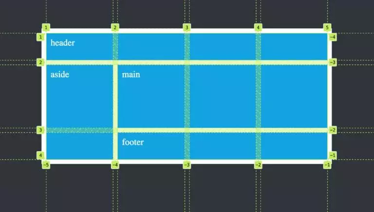
Creating a Classic “Holy Grail” Layout
The “Holy Grail” layout—a header, a footer, a main content area, and two sidebars—was notoriously difficult to achieve with older CSS techniques. With CSS Grid, it becomes trivial. We can use the grid-area property to name our grid sections and place them semantically.
First, the HTML structure, which remains clean and semantic:
<!DOCTYPE html>
<html lang="en">
<head>
  <title>Holy Grail Layout</title>
</head>
<body class="grid-container">
  <header>Header</header>
  <nav>Navigation</nav>
  <main>Main Content</main>
  <aside>Sidebar</aside>
  <footer>Footer</footer>
</body>
</html>
Now, the CSS magic using grid-template-areas:
.grid-container {
  display: grid;
  grid-template-columns: 150px 1fr 150px;
  grid-template-rows: auto 1fr auto;
  grid-template-areas:
    "header header header"
    "nav    main   aside"
    "footer footer footer";
  min-height: 100vh;
  gap: 10px;
}

header { grid-area: header; }
nav    { grid-area: nav; }
main   { grid-area: main; }
aside  { grid-area: aside; }
footer { grid-area: footer; }
The grid-template-areas property provides a visual representation of the layout, making the code incredibly easy to read and maintain. Each string represents a row, and the names correspond to the grid-area assigned to the grid items. This is a perfect example of how CSS Grid simplifies complex page layout challenges.
Responsive Grids with `auto-fit` and `minmax()`
One of the most powerful features of CSS Grid is its ability to create responsive layouts with minimal or even zero media queries. This is achieved by combining the repeat() function with the auto-fit (or auto-fill) keyword and the minmax() function.
Imagine you want to display a gallery of cards that automatically adjust the number of columns based on the available screen width. Each card should be at least 250px wide but can grow to fill the space.
.card-gallery {
  display: grid;
  grid-template-columns: repeat(auto-fit, minmax(250px, 1fr));
  gap: 1rem;
}
Let’s break this down:
repeat(): A function to repeat a track listing.auto-fit: This keyword tells the grid to fit as many columns as possible into the available space. If the columns are empty, their space collapses.auto-fillis similar but preserves the space for empty columns.minmax(250px, 1fr): This function defines a size range. Each column will be a minimum of 250px wide. If there’s extra space, it will be distributed equally among the columns (up to 1fr each).
This single line of CSS creates a fully responsive, wrapping grid of items. This is a powerful CSS trick that exemplifies mobile-first design principles and modern CSS efficiency.
Grid vs. Flexbox and the Rise of Subgrid
A common point of confusion for developers new to modern CSS is when to use Grid and when to use Flexbox. The two are not competing technologies; they are complementary tools designed to work together. Understanding their distinct strengths is key to building effective and maintainable web layouts.
Grid or Flexbox: When to Use Which?
The simplest distinction is dimensionality:

CSS Grid code on screen – Realizing common layouts using grids – CSS | MDN
- CSS Grid is for two-dimensional layouts. Use Grid when you need to control both columns and rows simultaneously. It is the ideal choice for overall page layout, arranging major sections of your UI, or creating complex, asymmetrical designs.
- CSS Flexbox is for one-dimensional layouts. Use Flexbox when you need to align items along a single axis, either as a row or a column. It excels at distributing space within a component, like aligning items in a navigation bar, centering content within a card, or managing the layout of form elements.
A common and effective pattern is to use Grid for the macro-level page structure and Flexbox for the micro-level alignment of items within those grid areas. For example, your main page layout might be a CSS Grid, but the header component within that grid might use CSS Flexbox to space out the logo, navigation links, and a search bar.

Introducing Subgrid: Aligning Nested Grids
One of the long-standing challenges with nested grids was that the inner grid’s tracks had no awareness of the parent grid’s tracks. This could lead to misalignments in complex designs where components inside a grid item needed to align with other components on the page. The subgrid feature solves this elegantly.
By setting grid-template-columns or grid-template-rows to subgrid on a grid item, that item’s grid tracks will be inherited from its parent grid container. This allows for seamless alignment across nested contexts.
Consider a card component within a larger grid. You want the card’s header and footer to align with the main grid lines.
.parent-grid {
  display: grid;
  grid-template-columns: 1fr 3fr 1fr;
  grid-template-rows: auto 1fr auto;
}

.card {
  grid-column: 2 / 3;
  grid-row: 2 / 3;

  /* The magic happens here */
  display: grid;
  grid-template-rows: subgrid; /* Inherits row tracks from .parent-grid */
}

.card-header {
  grid-row: 1; /* Aligns to the first row track of the parent grid */
}

.card-footer {
  grid-row: 3; /* Aligns to the third row track of the parent grid */
}
In this example, the .card element, which is itself a grid container, adopts the row tracks defined by .parent-grid. This ensures that its internal elements can align perfectly with the overall page structure, a powerful capability for sophisticated UI design and one of the most exciting modern CSS3 features.
Mastering Grid: Best Practices, Accessibility, and the Broader Ecosystem
Using CSS Grid effectively goes beyond just knowing the properties. It involves writing clean code, ensuring your layouts are accessible to all users, and understanding how Grid fits into the larger frontend development ecosystem, including frameworks and CSS preprocessors.
Ensuring Web Accessibility (a11y)
CSS Grid allows you to separate the source order of your HTML from the visual presentation. While this is a powerful feature, it comes with a significant responsibility. Screen readers and keyboard navigation follow the DOM order, not the visual order. Therefore, it is a critical HTML best practice to ensure your HTML document structure makes sense without CSS. The visual layout should enhance the logical flow, not contradict it. Avoid reordering elements in a way that creates a confusing experience for users relying on assistive technologies. When necessary, use ARIA labels and roles to provide additional context, but always prioritize a logical, semantic HTML structure first.
Integrating Grid with CSS Frameworks and Preprocessors
Modern CSS frameworks like Tailwind CSS and Bootstrap have fully embraced CSS Grid, providing utility classes that make it fast and easy to build grid-based layouts. For example, Tailwind CSS offers classes like grid, grid-cols-3, and gap-4 that map directly to Grid properties. This approach is excellent for rapid prototyping and maintaining a consistent design system.
For those who prefer writing their own styles, CSS preprocessors like SASS or LESS can be invaluable. You can use SASS variables to manage track sizes, gaps, and breakpoints, or create mixins for complex, reusable grid patterns. This helps keep your CSS styling organized and scalable, especially in large projects.
Common Pitfalls to Avoid
- Using Grid for One-Dimensional Layouts: While you can use Grid for a simple row of items, Flexbox is often the simpler, more appropriate tool for the job. Use the right tool for the right dimension.
- Ignoring the Implicit Grid: If you place more items into a grid than you have defined cells for, the browser creates an “implicit grid” with automatically generated rows or columns. Be aware of this behavior and control it with properties like
grid-auto-rowsif needed. - Forgetting Fallbacks for Old Browsers: While browser support for CSS Grid is now excellent, if you need to support very old browsers like IE11, you may need to provide a fallback layout using floats or Flexbox, often with the
@supportsfeature query.
Conclusion: Building the Future of Web Layouts
CSS Grid is more than just another CSS feature; it’s a fundamental building block of modern web design. It provides a robust, logical, and maintainable system for creating two-dimensional layouts that are both complex and responsive. By moving layout logic from convoluted hacks into a native CSS module, it allows developers to write cleaner, more semantic HTML and more intuitive CSS. When combined with the one-dimensional power of Flexbox and advanced features like subgrid, it unlocks a new level of creative freedom and technical precision.
Mastering CSS Grid is an essential skill for any serious frontend developer. It empowers you to build the sophisticated, adaptive, and accessible user interfaces that today’s web demands. By understanding its core principles, practicing with real-world examples, and adhering to best practices, you can harness its full potential to create web layouts that are as elegant in their code as they are in their design.