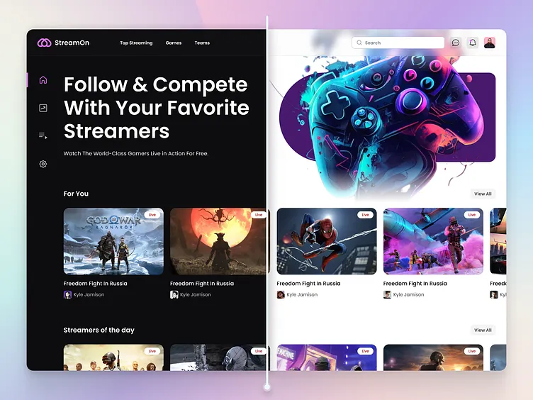
In the landscape of modern web design, user experience (UX) is paramount. One of the most requested and appreciated features in recent years is the ability to switch between a light and a dark theme. This isn’t just a fleeting trend; it’s a significant enhancement that addresses user comfort, accessibility, and even device battery life. For any frontend developer, understanding how to implement a robust, efficient, and user-friendly light/dark mode toggle is no longer a novelty but a core skill. While it might seem complex, leveraging modern CSS features can make the process surprisingly elegant and powerful.
This comprehensive CSS tutorial will guide you through building a state-of-the-art light/dark mode theme switcher from the ground up. We will move beyond legacy methods that often involved bulky JavaScript or swapping entire stylesheets. Instead, we’ll focus on a modern, performance-oriented approach using the power of CSS Custom Properties (Variables), the prefers-color-scheme media query, and the game-changing color-scheme property. This HTML CSS tutorial will provide you with the practical knowledge to implement this feature on your next project, whether it’s a simple landing page or a complex web application, ensuring you’re aligned with current web standards and best practices in frontend development.
The Foundation: Understanding Light and Dark Modes
Before diving into the code, it’s essential to understand the core principles and technologies that make modern theming possible. A well-implemented theme switcher isn’t just about inverting colors; it’s about creating two distinct, harmonious, and readable visual experiences. This requires a solid foundation built on modern CSS capabilities.
Why Bother with a Dark Theme?
Implementing a dark theme is a direct investment in your site’s UI and UX design. The benefits are multi-faceted:
- User Comfort: A dark theme significantly reduces eye strain in low-light environments, making content consumption more comfortable during the evening or in dimly lit rooms.
- Accessibility: For some users with visual impairments like photophobia (light sensitivity), a dark mode can be the difference between a usable and an unusable interface.
- Aesthetic Appeal: A well-crafted dark theme can give a website a sleek, modern, and premium feel, allowing visual content like photos and graphics to stand out more vividly.
- Battery Savings: On devices with OLED or AMOLED screens (common in modern smartphones), displaying black pixels consumes significantly less power than displaying white ones. A dark theme can lead to tangible battery life improvements for mobile users.
The Core Technologies at Play
Our modern approach relies on three key pieces of the CSS specification that work in concert to create a seamless theming system.
1. The prefers-color-scheme Media Query: This is the starting point. This CSS media feature allows you to detect if the user has requested a light or dark color theme at the operating system level (e.g., in Windows, macOS, iOS, or Android settings). This is incredibly powerful because it allows your website to automatically match the user’s system-wide preference out of the box, providing a perfect default experience without any user interaction.
/* Default (light theme) styles */
body {
  background-color: #ffffff;
  color: #111111;
}

/* Styles for users who prefer a dark theme */
@media (prefers-color-scheme: dark) {
  body {
    background-color: #111111;
    color: #ffffff;
  }
}
2. CSS Custom Properties (Variables): This is the engine of our theming system. Instead of hardcoding colors throughout your stylesheet, you define them as variables. This allows you to update a color in one place and have it cascade throughout your entire site. For theming, we can define a set of variables for our light theme and then simply redefine those same variables within the prefers-color-scheme: dark media query.
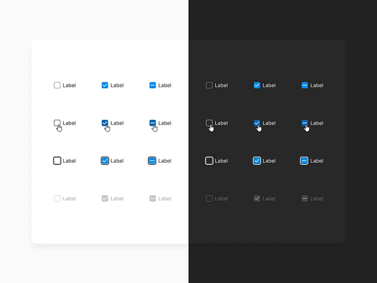
3. The color-scheme Property: This is one of the most important modern CSS properties for this task. By declaring color-scheme: light dark; on the root element (:root), you are explicitly telling the browser that your document supports both themes. The browser can then use this information to automatically adjust the styling of native HTML elements like scrollbars, form inputs (text fields, checkboxes, radio buttons), and other browser-provided UI. This saves a significant amount of time and ensures a consistent user experience without having to manually style every single native element for both themes.
Building the Toggle: A Modern CSS Approach
Now, let’s put the theory into practice. We’ll build a theme switcher that respects the user’s OS preference by default but also gives them a manual toggle to override it. This combination provides the best possible user experience.
Step 1: Structuring the Semantic HTML
A solid HTML structure is the bedrock of any web feature. We need a button to act as our toggle. Using a <button> element is crucial for accessibility, as it’s focusable and screen readers understand its purpose. We will also use an icon inside, but ensure we provide accessible text.
<!DOCTYPE html>
<html lang="en">
<head>
    <meta charset="UTF-8">
    <meta name="viewport" content="width=device-width, initial-scale=1.0">
    <title>Modern Dark Mode Tutorial</title>
    <link rel="stylesheet" href="style.css">
</head>
<body>

    <header>
        <nav>
            <!-- Other nav items -->
            <button id="theme-toggle" aria-label="Switch to dark mode">
                <!-- You can use an SVG icon for a sun/moon here -->
                ☽ <!-- Moon Icon -->
            </button>
        </nav>
    </header>

    <main>
        <h1>Welcome to Our Website</h1>
        <p>This is an example of a modern HTML CSS Tutorial for theming.</p>
        <form>
            <label for="name">Name:</label>
            <input type="text" id="name" name="name">
            <button type="submit">Submit</button>
        </form>
    </main>

    <script src="script.js"></script>
</body>
</html>
Step 2: Defining Color Palettes with CSS Variables
In your style.css, we’ll set up our color system. We define the default (light theme) variables in the :root selector. Then, we use the media query to override them for dark mode. This is a core concept of modern CSS styling.
:root {
  /* Declare support for both schemes */
  color-scheme: light dark;

  /* Light Theme Variables */
  --background-color: #f0f0f0;
  --text-color: #222222;
  --primary-color: #007bff;
  --card-background: #ffffff;
  --border-color: #dddddd;
}

@media (prefers-color-scheme: dark) {
  :root {
    /* Dark Theme Variables */
    --background-color: #121212;
    --text-color: #eeeeee;
    --primary-color: #1e90ff;
    --card-background: #1e1e1e;
    --border-color: #444444;
  }
}

body {
  background-color: var(--background-color);
  color: var(--text-color);
  font-family: sans-serif;
  transition: background-color 0.3s ease, color 0.3s ease;
}

/* Example usage */
h1 {
  color: var(--primary-color);
}

form {
  background-color: var(--card-background);
  border: 1px solid var(--border-color);
  padding: 1rem;
  border-radius: 8px;
}
Notice the color-scheme: light dark; declaration. This single line tells the browser to automatically style the scrollbar and the form inputs according to the active theme, a massive win for efficiency and one of the best CSS tricks for theming.
Step 3: Creating the User-Controlled Override
The OS preference is a great default, but we must provide a manual override. We’ll use a data attribute, data-theme, on the <html> element, which will be controlled by JavaScript. Our CSS needs to account for this attribute to force a specific theme.
/* Force light theme */
html[data-theme='light'] {
  --background-color: #f0f0f0;
  --text-color: #222222;
  --primary-color: #007bff;
  --card-background: #ffffff;
  --border-color: #dddddd;
}

/* Force dark theme */
html[data-theme='dark'] {
  --background-color: #121212;
  --text-color: #eeeeee;
  --primary-color: #1e90ff;
  --card-background: #1e1e1e;
  --border-color: #444444;
}
By using an attribute selector like html[data-theme='dark'], we create a rule with higher specificity than the :root in the media query. This ensures that the user’s manual choice will always take precedence over their system setting.
Beyond the Basics: Advanced Techniques and Accessibility
A working toggle is great, but a professional implementation requires more. We need to add interactivity, persist the user’s choice, and ensure our solution is accessible to everyone.
Adding JavaScript for Interaction and Persistence
Our script.js file will handle two things: toggling the data-theme attribute on click and saving the user’s preference to localStorage so it persists across page loads and sessions.


const themeToggle = document.getElementById('theme-toggle');
const currentTheme = localStorage.getItem('theme');
const prefersDark = window.matchMedia('(prefers-color-scheme: dark)').matches;

// Function to set the theme
function setTheme(theme) {
    document.documentElement.setAttribute('data-theme', theme);
    localStorage.setItem('theme', theme);
    if (theme === 'dark') {
        themeToggle.innerHTML = '☀'; // Sun Icon
        themeToggle.setAttribute('aria-label', 'Switch to light mode');
    } else {
        themeToggle.innerHTML = '☽'; // Moon Icon
        themeToggle.setAttribute('aria-label', 'Switch to dark mode');
    }
}

// Check local storage first
if (currentTheme) {
    setTheme(currentTheme);
} else if (prefersDark) {
    // Fallback to OS preference
    setTheme('dark');
}

// Add click event listener
themeToggle.addEventListener('click', () => {
    const newTheme = document.documentElement.getAttribute('data-theme') === 'dark' ? 'light' : 'dark';
    setTheme(newTheme);
});
Ensuring Web Accessibility (A11y)
Accessibility is non-negotiable. Our implementation already has a good start with a semantic <button>, but we can improve it.
- Contrast Ratios: Ensure that your text and background colors in both light and dark themes meet WCAG AA or AAA contrast ratio guidelines. Use online tools to check your color palette.
- Dynamic ARIA Labels: As shown in the JavaScript example, the
aria-labelon the toggle button should be updated dynamically. This tells screen reader users what action the button will perform (e.g., “Switch to dark mode”), which is much clearer than just announcing “button”. This is a critical aspect of Web Accessibility. - Focus States: Make sure your toggle button, and all other interactive elements, have a clear and visible focus state in both themes. This is vital for keyboard-only users.
Handling Images and Media
Your theming strategy should also consider images. A bright, vibrant image that looks great in light mode might be jarring in dark mode. You can use the HTML <picture> element to serve different image sources based on the user’s color scheme preference.
<picture>
  <source srcset="logo-dark.png" media="(prefers-color-scheme: dark)">
  <img src="logo-light.png" alt="Company Logo">
</picture>
Comparing Approaches: CSS Variables vs. Frameworks
While our vanilla CSS approach offers ultimate control and is a fantastic learning experience, it’s worth knowing how it compares to popular CSS frameworks like Tailwind CSS or Bootstrap.
The Modern Vanilla CSS Method
This approach, centered on CSS Variables and native browser features, is incredibly lightweight and powerful. It has no external dependencies, adheres closely to W3C Standards, and gives you granular control over every aspect of your design. It’s the ideal choice for bespoke projects, learning frontend web development fundamentals, and situations where performance is the absolute top priority.
Using a CSS Framework like Tailwind CSS
Tailwind CSS offers a utility-first approach. Implementing dark mode is as simple as prefixing utility classes with a dark: variant (e.g., bg-white dark:bg-gray-900). This is extremely fast for developers already in the Tailwind ecosystem. The downside is that it requires a build step and can lead to verbose HTML if not managed properly. It abstracts away some of the underlying CSS, which can be a pro for speed but a con for deep understanding.
Using a Component Library like Bootstrap
Modern versions of Bootstrap have embraced CSS Variables for theming. They provide a similar attribute-based system (data-bs-theme="dark") that automatically re-styles their entire suite of components. This is excellent for rapid prototyping and projects that rely heavily on Bootstrap’s pre-built components. However, it can be overkill for smaller projects and may require extensive customization to achieve a unique look.
Conclusion: Embracing Modern Theming
Implementing a light and dark theme is a hallmark of modern, user-centric web development. By moving away from outdated techniques and embracing the power of modern CSS, you can create a solution that is efficient, accessible, and deeply respectful of user preferences. The combination of CSS Custom Properties for a flexible color system, the prefers-color-scheme media query for a smart default, and the color-scheme property for seamless browser integration represents the pinnacle of current best practices.
Remember to always layer in JavaScript for user overrides and persistence, and never neglect accessibility by ensuring proper contrast and using semantic HTML with appropriate ARIA labels. Whether you choose a vanilla CSS approach for maximum control or leverage the features of a CSS framework for speed, mastering these theming techniques will elevate your skills as a frontend developer and significantly improve the experience for your users.


