Introduction
In the dynamic realm of Frontend Development, the concept of web layout serves as the foundational skeleton upon which all digital experiences are built. A well-executed layout is not merely about aesthetic appeal; it is the intersection of User Experience (UX Design), technical performance, and information architecture. As the internet has evolved from simple text-based documents to complex, application-like interfaces, the methods we use to structure content have undergone a radical transformation. Today, mastering web layout requires a deep understanding of HTML Structure and the vast capabilities of Modern CSS.
For developers and designers alike, the goal is to create interfaces that are intuitive, accessible, and responsive across a myriad of devices. Whether you are crafting high-converting Landing Pages or complex dashboards, the principles of layout dictate how users consume information. This article explores the evolution and current state of web layout, diving deep into HTML5 Features, CSS Grid, CSS Flexbox, and the Web Standards that govern the internet. We will move beyond the basics of an HTML CSS Tutorial to discuss architectural strategies, Mobile-First Design, and the critical importance of Web Accessibility in modern layout systems.
Section 1: The Evolution and Fundamentals of Web Structure
From Tables to Semantic HTML
To understand the power of modern layout engines, one must appreciate the history of Web Design. In the early days, developers relied on HTML Tables to structure pages. While effective for tabular data, using tables for layout resulted in bloated code and poor accessibility. The industry eventually moved toward CSS Styling using floats and positioning, which, while an improvement, was often hacky and fragile. The introduction of HTML5 Features marked a significant turning point. It introduced Semantic HTML elements—tags that convey meaning rather than just presentation.
Using HTML Elements like <header>, <nav>, <main>, <article>, and <footer> allows developers to define the layout’s intent. This semantic approach is a cornerstone of HTML Best Practices. It ensures that search engines and screen readers understand the hierarchy of the content. For instance, distinguishing between a generic <div> and a semantic <section> might look the same visually, but it makes a world of difference for SEO and Accessibility.
The Box Model and CSS Selectors
At the heart of every layout sits the CSS Box Model. Every element on a web page is essentially a rectangular box composed of margins, borders, padding, and the actual content. Understanding how these layers interact is crucial for UI Design. Misunderstanding the box model is a common pitfall that leads to broken layouts and spacing issues. When combined with powerful CSS Selectors, developers gain granular control over these boxes.
CSS3 Features expanded our toolkit significantly. We can now manipulate these boxes with CSS Transitions and CSS Animations, adding fluidity to the layout changes. For example, a sidebar that slides in smoothly or a card that expands on hover enhances the user experience without requiring heavy JavaScript. Furthermore, understanding HTML Attributes allows for more specific styling hooks, enabling developers to create modular and reusable layout components.
The Role of Forms and Data Presentation
While we no longer use tables for general page structure, HTML Tables remain the standard for displaying data sets. Similarly, HTML Forms are critical layout components that require specific attention. A poorly laid-out form can decimate conversion rates. Modern layout techniques allow us to structure forms—aligning labels, inputs, and buttons—in a way that is responsive and user-friendly. Integrating CSS Variables into form layouts allows for easy theming and consistency across an application, a technique often seen in Material Design and other design systems.
Section 2: Detailed Analysis of Modern Layout Systems
The Revolution of CSS Flexbox
CSS Flexbox (Flexible Box Layout) arrived as a savior for one-dimensional layouts. Before Flexbox, vertically centering content or distributing space evenly between items was notoriously difficult. Flexbox solved this by providing a container-based alignment system. It is ideal for components like navigation bars, card rows, or centering elements within a hero section. Key properties like justify-content and align-items have become second nature to Frontend Web developers.
In a practical scenario, consider a navigation menu. With CSS Flexbox, you can easily ensure that the logo stays on the left, navigation links are centered, and the “Sign Up” button is pushed to the far right, all while maintaining vertical alignment. This flexibility adapts automatically if the number of items changes, making it a robust tool for dynamic content. It simplifies what used to require complex calculations and “clearfix” hacks in older CSS Tutorials.
The Power of CSS Grid
While Flexbox handles one dimension (rows or columns), CSS Grid is the first true two-dimensional layout system for the web. It allows developers to divide a page into major regions and define relationships in terms of size, position, and layer. Grid Layout is incredibly powerful for defining the overall page structure—headers, sidebars, main content areas, and footers.
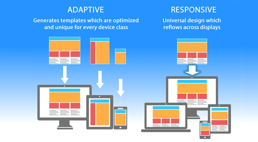
One of the most potent features of Grid is the grid-template-areas property, which allows you to name sections of your layout and place them visually in your CSS code. This makes the code highly readable and easier to maintain. For example, you can radically change the layout for mobile versus desktop simply by redefining the grid template in a media query, without changing the HTML source order. This separation of source order from visual presentation is a massive leap forward for Responsive Design.
Comparing Grid and Flexbox
A common question in Web Development is “Grid or Flexbox?” The answer is rarely one or the other; it is usually both. The general rule of thumb is: use Grid for the main page structure (macro layout) and Flexbox for the alignment of content within those grid areas (micro layout). For instance, you might use CSS Grid to define a three-column dashboard layout, but use CSS Flexbox to align the icons and text inside the sidebar navigation. Mastering the interplay between these two systems is what defines a senior-level understanding of Web Layout.
Responsive and Mobile-First Strategies
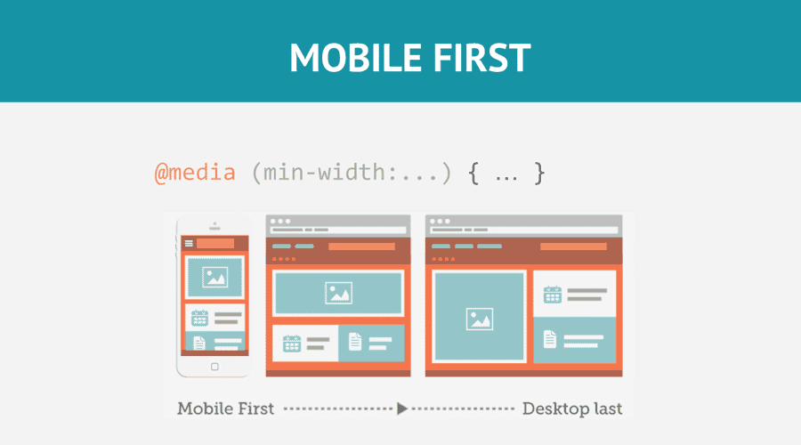
Mobile-First Design is a methodology where you design the layout for the smallest screens first and then progressively enhance it for larger screens. This approach forces you to prioritize content and leads to faster, cleaner code. CSS Responsive techniques rely heavily on media queries to adjust layout breakpoints. However, the future is moving toward container queries, a Modern CSS feature that allows components to adapt based on the size of their container rather than the viewport, offering even greater modularity.
Section 3: Implications, Frameworks, and Tooling
The Ecosystem of CSS Frameworks
To speed up development, many teams turn to a CSS Framework. Traditional frameworks like Bootstrap or Foundation provide pre-built grid systems and components. These are excellent for rapid prototyping and ensuring consistency. However, they can lead to “cookie-cutter” designs if not customized. In recent years, utility-first frameworks like Tailwind CSS have gained immense popularity. Tailwind allows developers to build custom designs without leaving their HTML, applying layout styles via utility classes. This approach aligns well with component-based architectures found in React or Vue.
Conversely, methodologies like BEM (Block Element Modifier) or styling approaches like CSS-in-JS and Styled Components offer different ways to manage layout scope. CSS-in-JS is particularly powerful in modern JavaScript applications, as it allows layout logic to be tightly coupled with component state, enabling dynamic layout changes based on user interaction.
Preprocessors and Maintainability
As layouts grow in complexity, maintaining standard CSS can become challenging. CSS Preprocessors like SASS, LESS, and PostCSS offer features like nesting, mixins, and functions. SASS, for example, allows you to store your grid configuration, breakpoints, and colors in variables. This means if you need to change your website’s maximum width or primary color, you update it in one place, and it propagates throughout the entire stylesheet. This level of maintainability is critical for large-scale Web Design projects.

HTML Email: The Layout Anomaly
It is worth noting a unique outlier in web layout: HTML Email. Unlike standard web pages, email clients have varying and often archaic rendering engines. Building CSS Email templates often requires reverting to older techniques, including nested HTML Tables and inline styles. While modern web layout relies on Flexbox and Grid, email development remains a specialized niche where HTML Tips from the late 90s are still relevant to ensure compatibility across Outlook, Gmail, and Apple Mail.
Performance Considerations
Layout choices impact performance. Complex animations or excessive use of heavy layout properties can cause “layout thrashing,” where the browser has to recalculate the position of every element repeatedly. CSS Tricks for optimization include using transform and opacity for animations rather than changing margins or padding, as the former does not trigger a full layout repaint. Efficient code ensures that Page Layout rendering is smooth, keeping the user engaged.
Section 4: Best Practices and Recommendations
Accessibility is Not Optional
A beautiful layout is useless if it is not accessible. Web Accessibility ensures that users with disabilities can navigate your site. This involves using W3C Standards and proper ARIA Labels. When using CSS Grid or Flexbox, visual order can be different from the DOM order. This can be confusing for screen reader users who navigate based on the underlying HTML code. HTML Semantic structure must always take precedence. Ensure that the tab order remains logical regardless of how you visually rearrange elements with CSS.
Semantic Structure and SEO
Search engines favor well-structured content. Using the correct HTML Tags helps crawlers understand the importance of content. A layout that uses an <aside> tag for a sidebar tells Google that the content is tangentially related to the main article. Similarly, using <h1> through <h6> correctly creates a document outline that aids in indexing. HTML Templates should be built with this hierarchy in mind from day one.
Testing and Cross-Browser Compatibility
Frontend Development requires rigorous testing. A layout that works in Chrome might break in Safari or Firefox. Tools like BrowserStack or simply resizing your browser window are essential. Developers must also consider fallback strategies. While CSS Grid has excellent support today, older browsers may need a fallback using Floats or Flexbox. Using feature queries (@supports) allows you to use cutting-edge CSS Tips while providing a safe degradation for older environments.
Continuous Learning and Adaptation
The web is a living medium. New features like Subgrid, Container Queries, and logical properties (using margin-inline-start instead of margin-left for multi-language support) are constantly emerging. Staying updated with HTML Tips and CSS Tricks is vital. Whether you prefer writing raw CSS, using SASS, or adopting Tailwind CSS, the underlying principles of geometry, hierarchy, and responsiveness remain constant.
Conclusion
Mastering web layout is a journey that bridges the gap between artistic vision and technical implementation. It requires a solid grasp of HTML Structure to provide meaning and CSS Styling to provide form. From the rigid days of tables to the fluid freedom of CSS Grid and Flexbox, the tools available to developers have never been more powerful. However, with great power comes the responsibility to build interfaces that are inclusive, performant, and maintainable.
By adhering to Web Standards, prioritizing Accessibility, and adopting a Mobile-First Design mindset, you can create digital experiences that stand the test of time. Whether you are refining Landing Pages or architecting complex web applications, remember that the layout is the stage upon which your content performs. Keep experimenting with Modern CSS, stay curious about emerging HTML5 Features, and continue to push the boundaries of what is possible on the web.