I distinctly remember the first time I centered a div without using margin: 0 auto or absolute positioning hacks. It felt like magic. Or cheating. Probably both.
Fast forward to late 2025, and we have CSS Grid, Subgrid is finally stable across browsers, and we have container queries doing heavy lifting. Yet, here I am, opening a new project file, and the first thing I type is display: flex.
Why? Because despite all the new shiny toys we’ve accumulated over the last few years, Flexbox remains the absolute workhorse of component layout. But I still see people—juniors and seniors alike—struggling with the basics when responsiveness enters the chat. They build a beautiful desktop view, shrink the browser, and watch everything explode.
Let’s cut through the academic explanations. I’m not going to give you a dictionary definition of every property. I want to talk about how to actually use this thing to build interfaces that don’t break when you turn your phone sideways.
The “One Dimension” Mental Model
Here is where most people trip up. They treat Flexbox like a grid system. It isn’t.
Grid is for the big picture—the page layout, the macro structure. Flexbox is for the stuff inside those boxes. It’s for a line of elements. That line can go horizontal (row) or vertical (column). That’s it. That is the entire mental model.
When I’m debugging a layout that’s refusing to cooperate, 99% of the time it’s because I lost track of the Main Axis.
- If
flex-directionisrow(the default), your Main Axis is horizontal.justify-contentmoves things left and right. - If
flex-directioniscolumn, your Main Axis is vertical. Nowjustify-contentmoves things up and down.
I know, I know. “Basic stuff.” But seriously, next time your alignment isn’t working, check your direction. I still catch myself trying to align-items: center to center text horizontally in a column layout, wondering why nothing is moving. It happens.
The Mobile-First “Stack to Row” Pattern
This is the bread and butter of responsive design. If you learn one pattern, make it this one.
I was working on a dashboard card component last Tuesday. On a phone, it needs to be an image on top, text below. On a tablet or desktop, the image sits on the left, text on the right.
Old me would have written complex floats or rigid grids. Current me just flips the axis.
Here is the code I actually use. No fluff.
.card {
  display: flex;
  flex-direction: column; /* Mobile default */
  gap: 1rem;
}

@media (min-width: 768px) {
  .card {
    flex-direction: row; /* Desktop switch */
    align-items: center;
  }
}
Notice I started with column. That’s mobile-first. Browsers render the mobile view by default (which is usually a vertical stack), and we only add complexity (the row layout) when the screen is wide enough to handle it.

Also, can we take a moment to appreciate gap? I remember the dark days of margin-right on every child element except the last one using :last-child selectors. If you are still doing that in 2025, stop. Just use gap. It works everywhere now.
The “Squish” Problem (and how to fix it)
Flexbox tries really hard to be helpful. Too helpful, sometimes.
By default, flex items are allowed to shrink to fit their container. This is great until you have a navigation bar with a logo and some links. You shrink the window, and suddenly your logo is a distorted mess of pixels because Flexbox decided it needed to save space.
This bit me just yesterday. I had a sidebar layout where the icons kept getting crushed.
The fix is flex-shrink: 0.
If you have an element that should never change size—like an icon, an avatar, or a button with fixed text—slap flex-shrink: 0 on it. It tells the browser, “I don’t care how small the screen gets, do not touch my width.”
Controlling the Growth
On the flip side, we have flex-grow. This is perfect for that one element you want to take up “all the remaining space.”
Think about a typical app header:
[Logo] ————— [Search Bar] ————— [Profile]
You want the Logo and Profile to be their natural size, but you want the Search Bar to stretch to fill the middle.
.header {
  display: flex;
  align-items: center;
  gap: 1rem;
}

.search-bar {
  flex-grow: 1; /* Eat all the free space */
}
That’s it. No calculating percentages. No calc(100% - 200px). Just let Flexbox do the math. I use this specific pattern probably five times a day.
Wrapping is Your Friend
Sometimes you run out of horizontal space, but you don’t want to switch to a vertical column. You just want things to… flow.
I built a tag list recently—you know, those little pill-shaped categories at the bottom of an article. On a wide screen, they sit in one line. On a phone, if I didn’t handle it, they would either overflow the screen (causing that horrible horizontal scroll) or squish into unreadable slivers.

flex-wrap: wrap is the savior here.
.tags {
  display: flex;
  flex-wrap: wrap;
  gap: 0.5rem;
}
It behaves like words in a paragraph. If a tag doesn’t fit on the line, it drops to the next one. It’s responsive behavior for free, no media queries required. I love solutions that don’t require me to maintain breakpoints.
Debugging Like a Human
If you are writing CSS blindly, refreshing the page, and hoping for the best, you are doing it the hard way.
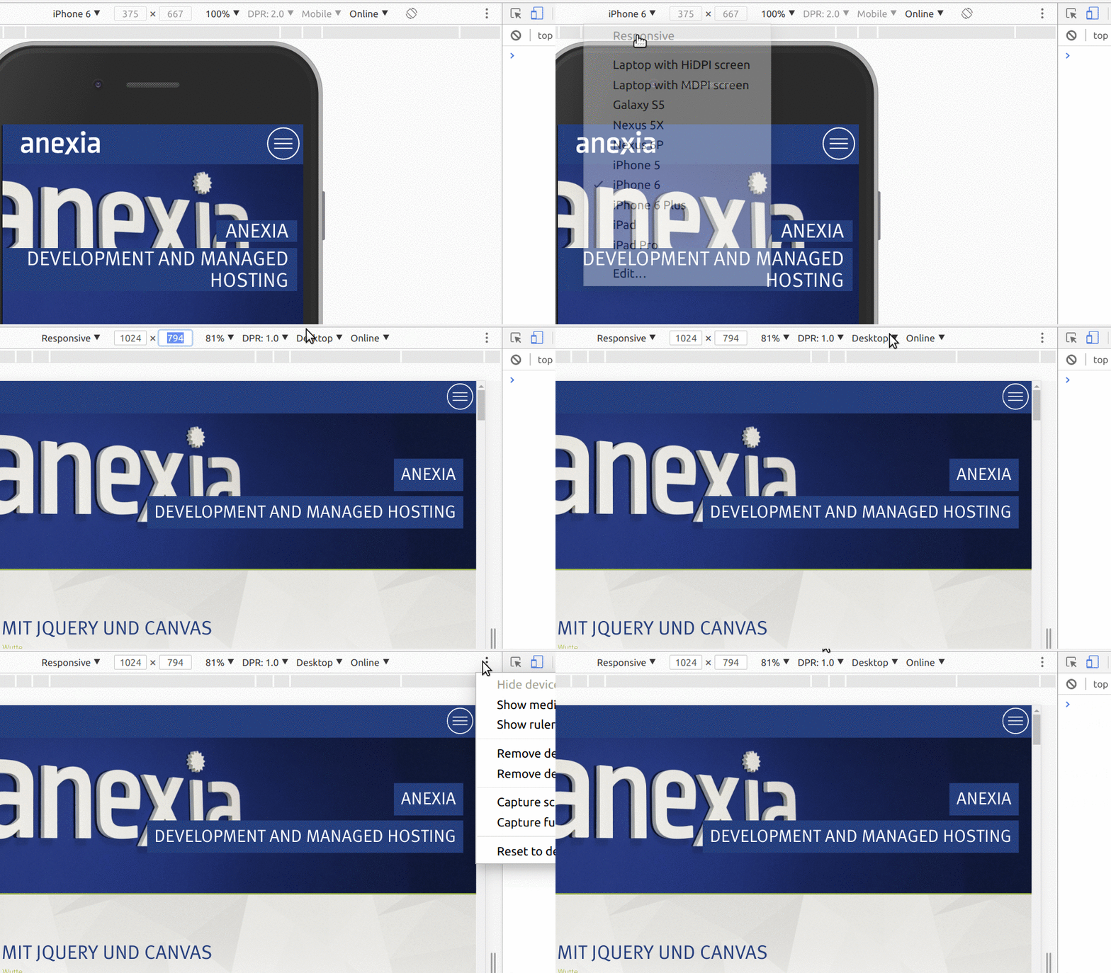
Every modern browser has a specific Flexbox debugger now. In Chrome or Firefox, if you inspect an element with display: flex, there’s a tiny badge next to it in the DOM tree. Click it.
It draws purple lines around your items. It shows you the empty space. It shows you the gap.
I cannot tell you how many times I’ve stared at a layout thinking “Why is there extra space on the right?” only to turn on the flex overlay and realize I had justify-content: flex-start (the default) and the container was just wider than the content.
A Note on “Centering”
We used to joke that centering in CSS was the hardest problem in computer science. Flexbox solved it, but people still overcomplicate it.
If you need to center something dead-center in a container (like a modal or a hero text block), just commit this to muscle memory:
.center-me {
  display: flex;
  justify-content: center; /* Main axis alignment */
  align-items: center;     /* Cross axis alignment */
}
Three lines. Works every time. I have a snippet for this in VS Code because I use it so much.
When NOT to Use Flexbox
I love Flexbox, but I’m not a zealot.
If you are trying to build a 12-column page layout where elements need to line up in both rows and columns simultaneously… stop. Put down the flex-wrap and pick up CSS Grid.
Flexbox struggles when you want strict 2D alignment. You can hack it with fixed widths, but it’s fragile. If you need a photo gallery where items line up perfectly in a grid, use Grid. If you need a navigation bar, a media object, or a list of tags, use Flexbox.
Final Thoughts
The beauty of Flexbox in 2025 isn’t that it’s new—it’s that it’s boring. It’s reliable. It works on that weird old tablet your client is testing on. It works inside Container Queries. It works.
Don’t let the complexity of modern frontend development scare you away from the basics. Master the main axis, embrace the wrap, and please, for the love of clean code, use gap.


