In the vast, interconnected world of the internet, every website, application, and digital experience you encounter is built upon a fundamental skeleton: HyperText Markup Language, or HTML. It is the universal language that gives structure and meaning to web content. While often seen as a simple starting point, mastering HTML and its powerful partner, CSS (Cascading Style Sheets), is the most critical skill in modern Frontend Development. This comprehensive HTML CSS Tutorial is designed to guide you from the absolute basics of an HTML document to the sophisticated techniques used in professional Web Design today. We will explore not just the “how” but the “why,” delving into HTML Best Practices, semantic structure, and the creation of beautiful, responsive, and accessible user interfaces. Whether you are building your first webpage or looking to refine your skills with Modern HTML and Modern CSS, this guide will provide the foundational knowledge you need to succeed.
The Bedrock of the Web: Understanding HTML Fundamentals
Before you can build complex web layouts or dynamic applications, you must first understand the core components that form the foundation of every single webpage. This section breaks down the essential anatomy of an HTML document and the basic building blocks you’ll use constantly.
The Anatomy of an HTML Document
Every HTML file follows a predictable structure. This boilerplate code, or HTML Template, tells the browser how to interpret and render the content. A minimal HTML document looks like this:
<!DOCTYPE html>
<html lang="en">
<head>
    <meta charset="UTF-8">
    <meta name="viewport" content="width=device-width, initial-scale=1.0">
    <title>My First Webpage</title>
    <link rel="stylesheet" href="styles.css">
</head>
<body>
    <h1>Hello, World!</h1>
    <p>This is my first paragraph.</p>
</body>
</html>
Let’s break this down:
<!DOCTYPE html>: This declaration defines the document type and tells the browser to render the page in standards mode, following the latest W3C Standards.<html>: This is the root element of the page. Thelangattribute is crucial for Accessibility and search engines.<head>: This section contains meta-information about the document that isn’t displayed on the page itself. This includes the character set (<meta charset="UTF-8">), the viewport settings for Responsive Design, the page<title>(which appears in the browser tab), and links to external files like CSS stylesheets.<body>: This element contains all the visible content of the webpage—headings, paragraphs, images, links, and more.
Core Concepts: Elements, Tags, and Attributes
The content within the <body> is structured using HTML Elements. An element is typically composed of an opening tag, content, and a closing tag.
- HTML Tags: These are the labels you use to create elements, enclosed in angle brackets. For example,
<p>is an opening tag for a paragraph, and</p>is the closing tag. Some elements, like<img>or<br>, are self-closing. - HTML Elements: An element is the complete unit, like
<p>This is a paragraph.</p>. - HTML Attributes: These provide additional information about an element and are always specified in the opening tag. For example, in
<a href="https://example.com">Click me</a>,hrefis an attribute that specifies the link’s destination. Common attributes includesrcfor images,classandidfor styling hooks, andaltfor image accessibility.
The evolution to HTML5 brought a wealth of new HTML5 Features, including native support for video and audio (<video>, <audio>), improved form controls, and, most importantly, a new set of semantic elements that revolutionized HTML Structure.
Building with Meaning: Semantic HTML and Modern Structure
In the early days of the web, developers often relied on generic <div> elements to structure entire pages. While functional, this approach lacks meaning. Modern HTML emphasizes the use of Semantic HTML—choosing elements that accurately describe the content they contain. This practice has profound implications for SEO, accessibility, and code maintainability.
Why Semantic HTML Matters
Using Semantic HTML is a cornerstone of professional Web Development. Instead of creating a generic container like <div class="header">, you use the <header> element. This simple change provides immediate context to both browsers and developers.
HTML code on computer screen – HTML code on computer monitor. Software Web Developer Programming …
The key benefits include:
- Improved SEO: Search engines can better understand the structure and importance of your content, which can positively impact rankings.
- Enhanced Web Accessibility: Screen readers and other assistive technologies use the semantic structure to navigate the page, making your site usable for people with disabilities. A
<nav>element is explicitly announced as a navigation block, allowing users to easily find or skip it. - Cleaner Code: A well-structured, semantic document is easier for you and your team to read, understand, and maintain over time.
Key Semantic Elements for Page Layout
HTML5 introduced a suite of elements designed specifically for structuring a typical Web Layout. These elements form the new standard for building a robust Page Layout.
<header>: Represents introductory content, typically a group of introductory or navigational aids. It can contain headings, logos, and search forms.<nav>: Contains the main navigation links for the site.<main>: Specifies the main, dominant content of the document. There should only be one<main>element per page.<article>: Represents a self-contained piece of content that could be distributed independently, like a blog post, news story, or forum post.<section>: Represents a thematic grouping of content, typically with a heading. It’s a way to break up an<article>or the<main>content into logical parts.<aside>: Represents content that is tangentially related to the content around it, such as a sidebar or a callout box.<footer>: Represents the footer for its nearest sectioning content or for the page as a whole, often containing copyright information, contact details, or related links.
Accessibility (a11y) and ARIA
Web Accessibility is not an afterthought; it’s a requirement for building inclusive web experiences. While Semantic HTML provides a strong foundation, sometimes you need to add more context. This is where ARIA (Accessible Rich Internet Applications) comes in. ARIA Labels and roles are attributes you can add to HTML elements to provide additional information to assistive technologies. For instance, if you have a button with only an icon and no text, you can make it accessible like this:
<button aria-label="Close">
    <!-- SVG or icon font here -->
</button>
A screen reader will announce “Close, button,” making the interface understandable for all users. Integrating accessibility practices is a critical part of a modern Frontend Web workflow.
Bringing Structure to Life with CSS
An HTML document on its own is just structured, unstyled text. To create a visually appealing and functional design, you need CSS. This section of our CSS Tutorial covers how to apply styles and create modern, responsive layouts.
The Synergy of HTML and CSS
CSS is used for all aspects of visual presentation, from colors and fonts to layout and animations. The best practice is to keep your HTML and CSS separate. This is achieved by linking an external stylesheet in the <head> of your HTML document. This separation of concerns makes your code modular and easier to manage.
CSS Styling works by targeting HTML elements using CSS Selectors. You can select elements by their tag name (p), class (.my-class), ID (#my-id), attributes, and more. Once selected, you apply styling rules using various CSS Properties.
/* In styles.css */
body {
    font-family: sans-serif;
    line-height: 1.6;
}

.main-title {
    color: #2c3e50;
    font-size: 2.5rem;
}
Mastering Modern Layouts: Flexbox and Grid
For years, creating complex layouts in CSS was difficult. The introduction of Flexbox and Grid, two powerful CSS3 Features, changed everything.
- CSS Flexbox: A one-dimensional layout model designed for distributing space along a single axis (either a row or a column). It is perfect for creating a Flexbox Layout for components like navigation bars, card alignments, and form controls. It excels at aligning items and managing space within a container.
- CSS Grid: A two-dimensional layout model that allows you to control both rows and columns simultaneously. CSS Grid is ideal for creating the overall Grid Layout of a page, such as a complex dashboard or a magazine-style design. It gives you precise control over the placement of items in a grid.
A common best practice is to use CSS Grid for the main Page Layout and CSS Flexbox for the components within that layout. This combination provides the ultimate flexibility for any Web Design challenge.

HTML code on computer screen – Royalty-Free photo: Computer screen showing source code | PickPik
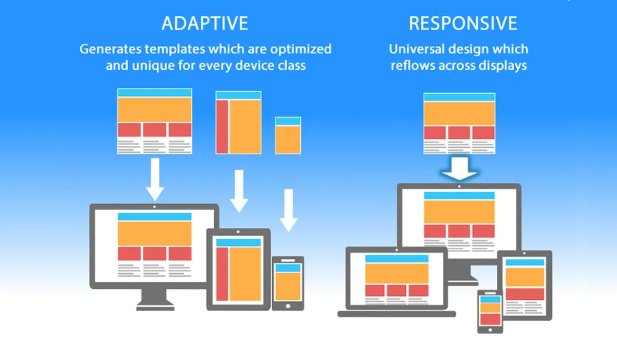
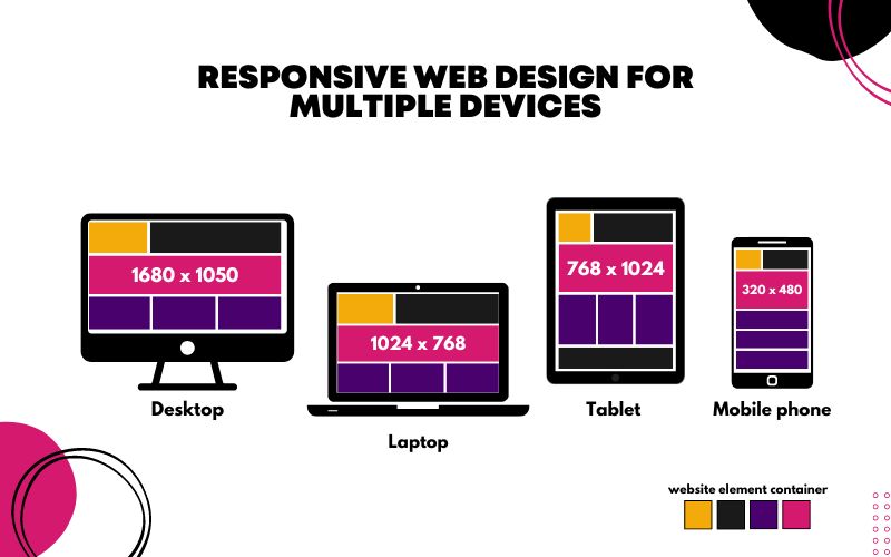
Responsive Design and the Mobile-First Approach
Today, users access websites on a vast array of devices. Responsive Design is the practice of building websites that adapt gracefully to different screen sizes. The core technology behind this is CSS media queries.
A modern best practice is the Mobile-First Design methodology. You start by writing styles for the smallest screen size (mobile) and then use min-width media queries to add or adjust styles for larger screens. This approach often results in cleaner code and better performance on mobile devices, which is critical in today’s market.
/* Mobile-first styles */
.container {
    width: 100%;
    padding: 1rem;
}

/* Tablet and larger */
@media (min-width: 768px) {
    .container {
        max-width: 720px;
        margin: 0 auto;
    }
}
The Modern Frontend Ecosystem: Tools and Best Practices
Building a modern website often involves more than just HTML and CSS. The frontend ecosystem is rich with tools, frameworks, and methodologies designed to streamline development, improve code quality, and enhance performance. Understanding this landscape is key to becoming a proficient developer.
CSS Frameworks and Preprocessors
To accelerate development, many developers turn to a CSS Framework. These provide pre-built components and a grid system to help you build UIs quickly.
HTML code on computer screen – Page 21 | Html css javascript Photos – Download Free High-Quality …
- Bootstrap and Foundation are component-based frameworks that offer ready-to-use buttons, forms, and navigation bars.
- Tailwind CSS is a utility-first framework that provides low-level utility classes to build custom designs without writing custom CSS.
For more complex projects, CSS Preprocessors like SASS or LESS are invaluable. They extend CSS with features like variables, nesting, and mixins, making your stylesheets more dynamic and maintainable. However, many of these features are now becoming native to CSS. CSS Variables (Custom Properties) are now widely supported, allowing you to define reusable values directly in your CSS, which is excellent for theming and consistency.
Essential HTML and CSS Best Practices
Following established best practices ensures your code is robust, maintainable, and performant. Here are some essential HTML Tips and CSS Tips:
- Validate Your HTML: Use the W3C validator to check for errors in your markup.
- Optimize for Performance: Compress images, minify your CSS and HTML files, and limit the use of render-blocking resources.
- Organize Your CSS: Use a consistent naming convention (like BEM) and structure your files logically.
- Comment Your Code: Explain complex or non-obvious parts of your code for your future self and your teammates.
- Prioritize Accessibility: Always use semantic HTML, provide alt text for images, ensure sufficient color contrast, and test with keyboard navigation.
Beyond the Basics: Forms, Tables, and Emails
While we’ve covered structure and layout, it’s important to mention specific-use elements. HTML Forms are the primary way to collect user input, and it’s crucial to label all inputs correctly for accessibility. HTML Tables should be used strictly for displaying tabular data, not for layout. When building an HTML Email, remember that email clients have very poor support for modern CSS, requiring a return to older techniques like using tables for layout (one of the few exceptions to the rule).
Conclusion
This HTML Tutorial has journeyed from the fundamental HTML Tags and document structure to the advanced concepts of Semantic HTML, modern CSS layouts with CSS Flexbox and CSS Grid, and the importance of Responsive Design and Web Accessibility. Mastering HTML and CSS is not a one-time event but an ongoing process of learning and refinement. The web is constantly evolving, with new HTML5 Features and CSS3 Features emerging to solve new challenges.
The key takeaway is this: a solid, semantic HTML structure is the unshakable foundation of any great website. When paired with well-organized, responsive, and accessible CSS, you have the power to create beautiful, functional, and inclusive digital experiences. Continue to build, experiment, and always prioritize writing clean, meaningful code. Your journey in Frontend Development is just beginning, and these principles will serve you every step of the way.