In the vast, ever-evolving landscape of the internet, two technologies remain the undisputed cornerstones of every website, web application, and digital experience: HTML and CSS. Whether you’re an aspiring developer, a marketer looking to create stunning landing pages, or a content creator aiming to build a unique online presence, a solid understanding of HyperText Markup Language (HTML) and Cascading Style Sheets (CSS) is non-negotiable. This comprehensive HTML CSS Tutorial is designed to take you from the absolute basics to the advanced concepts that power modern Web Design and Frontend Development.
While the digital world is filled with complex frameworks and libraries, they all ultimately render down to the fundamental HTML structure and CSS styling that browsers understand. Mastering these core technologies gives you the power to build, customize, and troubleshoot any web-based project. This guide will not only cover the foundational syntax but also delve into HTML5 Features, Modern CSS techniques like Flexbox and Grid, the importance of Responsive Design, and essential HTML Best Practices. By the end, you’ll have the knowledge and confidence to start building beautiful, functional, and accessible web content from scratch.
The Bedrock of the Web: Understanding HTML Structure and Semantics
At its core, HTML is the skeleton of a webpage. It provides the structure and meaning for your content, telling the browser what each piece of information represents—be it a heading, a paragraph, an image, or a link. Without HTML, the web would be an unreadable wall of plain text.
From Tags to a Complete Document
HTML is composed of HTML Elements, which are defined by HTML Tags. Most tags come in pairs: an opening tag (e.g., <p>) and a closing tag (e.g., </p>). The content between these tags is what the element contains. Some elements, like images (<img>) or line breaks (<br>), are self-closing.
Elements can also have HTML Attributes, which provide additional information. For example, an `` (anchor) tag uses the `href` attribute to specify the link’s destination:
<a href="https://example.com">Visit Example</a>
A basic HTML document has a standard structure that every developer should know:
<!DOCTYPE html>
<html lang="en">
<head>
    <meta charset="UTF-8">
    <meta name="viewport" content="width=device-width, initial-scale=1.0">
    <title>My First Web Page</title>
</head>
<body>
    <h1>Hello, World!</h1>
    <p>This is my first paragraph.</p>
</body>
</html>
<!DOCTYPE html>: Declares the document type, telling the browser to render it according to modern W3C Standards.<html>: The root element of the page.<head>: Contains meta-information, like the page title and character set.<body>: Contains all the visible content of the webpage.
The Power of Semantic HTML
In the early days of the web, developers often used generic <div> tags for almost every part of the Page Layout. While this works, it provides no context about the content within. Modern HTML5 Features introduced Semantic HTML elements that describe their meaning to both the browser and developers.
Using semantic tags like <header>, <nav>, <main>, <article>, <section>, and <footer> is a critical best practice. It dramatically improves Web Accessibility, as screen readers can use this HTML Structure to help visually impaired users navigate the page. It also boosts SEO, as search engines better understand the layout and importance of your content. For enhanced accessibility, you can also use ARIA Labels to provide even more context for assistive technologies.
Bringing Content to Life: A Deep Dive into CSS Styling
If HTML is the skeleton, CSS is the skin, clothes, and personality. It’s the language we use to style our HTML documents, controlling everything from colors and fonts to the layout of complex pages. CSS is what makes the web visually engaging and is essential for good UI Design.


The Core of CSS: Selectors, Properties, and Values
CSS works by applying rules to HTML elements. A rule consists of a selector and a declaration block. The selector “selects” the HTML element(s) you want to style, and the declaration block contains one or more declarations, each with a property and a value.
selector { property: value; }
Here’s a practical example:
/* This CSS rule selects all h1 elements and makes them red */
h1 {
    color: red;
    font-size: 2.5em; /* em is a relative unit of size */
}

/* This selects an element with the ID "main-content" */
#main-content {
    border: 1px solid #ccc;
}

/* This selects all elements with the class "highlight" */
.highlight {
    background-color: yellow;
}
Mastering CSS Selectors is key to efficient CSS Styling. You can select elements by their tag name, class, ID, attributes, and their relationship to other elements. This precision allows for powerful and maintainable stylesheets.
Modern CSS Features You Can’t Ignore
CSS has evolved significantly with CSS3 Features and beyond. Modern CSS offers incredible tools for creating dynamic, responsive, and maintainable designs.
- CSS Variables (Custom Properties): These allow you to store values (like colors or sizes) in a variable and reuse them throughout your stylesheet. This is a game-changer for theming and large-scale projects.
- CSS Transitions & Animations: With CSS Transitions, you can create smooth effects when a property changes (e.g., on hover). CSS Animations allow for more complex, multi-step animations using keyframes, bringing your UI to life without needing JavaScript.
- Advanced Layout Modules: The two most important modern layout tools are CSS Flexbox and CSS Grid. These have revolutionized how we approach Web Layout, moving us away from the old hacks of floats and tables.
Building Responsive & Interactive Layouts for Any Device
Today, users access the web on a staggering variety of devices, from tiny smartwatches to massive desktop monitors. A modern website must provide an excellent UX Design on all of them. This is the core principle of Responsive Design, and CSS provides all the tools you need to achieve it.
Mastering Page Layout: CSS Flexbox vs. CSS Grid
Understanding when to use Flexbox versus Grid is a hallmark of a skilled frontend developer. They are not competing technologies but complementary tools for different layout challenges.
CSS Flexbox (Flexible Box Layout) is designed for one-dimensional layouts—either a row or a column. It excels at distributing space and aligning items within a container. It’s perfect for component-level layouts like navigation bars, card components, or centering content vertically and horizontally.
Flexbox Example: A simple navigation bar
.nav-container {
    display: flex;
    justify-content: space-between; /* Pushes items to the ends */
    align-items: center; /* Vertically aligns items */
}
CSS Grid (Grid Layout) is designed for two-dimensional layouts—rows and columns simultaneously. It is the most powerful layout system available in CSS and is ideal for creating the overall Page Layout of a website, such as a traditional header, sidebar, main content, and footer structure.
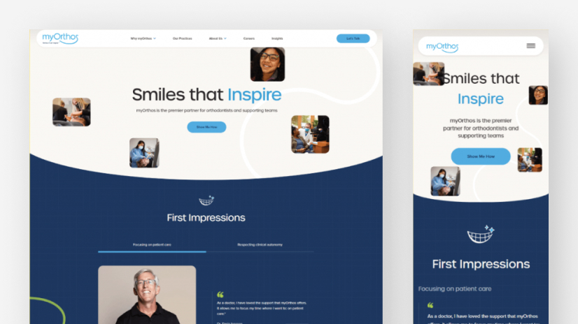


Grid Example: A basic page layout
.page-wrapper {
    display: grid;
    grid-template-columns: 1fr 3fr; /* A sidebar and a main content area */
    grid-template-rows: auto 1fr auto; /* Header, main, footer */
    grid-template-areas:
        "header header"
        "sidebar main"
        "footer footer";
}
The general rule of thumb is: use Flexbox Layout for components and content alignment, and use Grid Layout for the overall page structure.
The Mobile-First Design Philosophy
Mobile-First Design is a strategy where you design for the smallest screen first and then progressively enhance the design for larger screens. This approach forces you to prioritize content and ensures a better user experience on mobile devices, which often account for the majority of web traffic. This is implemented in CSS using media queries.
/* Base styles for mobile */
.container {
    width: 100%;
    padding: 10px;
}

/* Styles for tablets and larger */
@media (min-width: 768px) {
    .container {
        width: 90%;
        margin: 0 auto;
    }
}

/* Styles for desktops and larger */
@media (min-width: 1200px) {
    .container {
        width: 1140px;
    }
}
Navigating the Modern Frontend Ecosystem & Best Practices
While raw HTML and CSS are powerful, the modern Frontend Web ecosystem provides tools that enhance productivity and maintainability. It’s also important to understand how these core skills apply to specialized tasks like building Landing Pages or coding HTML emails.
Tools of the Trade: CSS Frameworks & Preprocessors
A CSS Framework provides a collection of pre-written CSS (and sometimes JavaScript) to help you build websites faster. Popular choices include:


- Bootstrap: One of the oldest and most popular, known for its extensive set of pre-styled components.
- Tailwind CSS: A utility-first framework that provides low-level utility classes to build custom designs without writing custom CSS.
- Material Design: A design system created by Google that provides components and guidelines for creating consistent, modern UIs.
CSS Preprocessors like SASS, LESS, and PostCSS are tools that extend the functionality of CSS. They add features like variables (before CSS had them natively), nesting, mixins, and functions, which can make your CSS more organized and easier to manage, especially in large projects.
Specialized Applications: HTML for Landing Pages and Emails
Your HTML and CSS skills are directly applicable to marketing and content creation. Building high-converting Landing Pages relies on strong, semantic HTML for content structure and persuasive CSS for visual hierarchy and calls-to-action.
A more challenging application is creating HTML Email templates. This is a specialized field because email clients (like Outlook, Gmail, and Apple Mail) have notoriously poor and inconsistent support for modern CSS. This often means falling back on older techniques:
- HTML Tables for Layout: Unlike modern web design, HTML Tables are still the most reliable way to create column-based layouts in email, as support for Flexbox and Grid is virtually non-existent.
- Inline CSS: Many email clients strip out
<style>tags in the<head>. Therefore, critical CSS Email styles often need to be applied directly to HTML tags using the `style` attribute (a process that can be automated with build tools). - Simplicity is Key: Complex CSS animations, transitions, and even some web fonts may not work. The design must be robust and degrade gracefully.
This demonstrates that a deep understanding of HTML and CSS fundamentals allows you to adapt to any environment, even one with significant constraints like email.
Conclusion: Your Journey in Web Development
Mastering HTML and CSS is the essential first step on any journey into Web Development, UI Design, or digital content creation. These languages are the foundation upon which everything else is built. We’ve covered the importance of a solid HTML Structure with Semantic HTML, the power of CSS Styling from basic selectors to Modern CSS features like Flexbox and Grid, and the necessity of a Mobile-First Design approach. We also explored the broader ecosystem of frameworks and preprocessors and looked at specialized applications like HTML Templates for emails.
The key takeaway is that a strong command of these core technologies gives you ultimate control and flexibility. While tools and frameworks will come and go, the principles of HTML and CSS are here to stay. Continue to practice, build projects, and never stop learning. The web is your canvas—now you have the brushes to create anything you can imagine.


