Introduction
In the rapidly evolving landscape of Frontend Development, it is easy to become enamored with the latest JavaScript frameworks or the newest CSS3 Features. However, the fundamental bedrock of the web remains the Document Object Model (DOM) and the HTML Elements that populate it. To the uninitiated, HTML may seem like a static markup language used merely to place text on a screen. To an experienced engineer, however, an HTML element is a complex object with geometric properties, event listeners, accessibility roles, and semantic meaning.
Understanding how browsers render these elements—how they map a cursor’s coordinates to a specific node in the DOM tree—is crucial for debugging, performance optimization, and creating intuitive User Experience (UX) Design. When a user interacts with a web page, the browser performs complex calculations to determine exactly which element is being targeted, taking into account stacking contexts, transformations, and the box model. This article provides a comprehensive deep dive into the technical anatomy of HTML elements, exploring their structure, semantic importance, rendering behaviors, and the best practices that define modern Web Standards.
Section 1: The Anatomy of HTML Elements and the DOM
At its core, an HTML document is a tree structure. Every tag written in code is parsed by the browser and converted into a DOM node. This section explores the fundamental architecture that transforms text into interactive visual components.
The Box Model and Geometry
Every HTML Element, regardless of its shape on the screen, is fundamentally a rectangular box. Understanding the standard CSS Box Model is the first step in mastering Page Layout. The browser calculates the size of an element based on four distinct layers: content, padding, border, and margin.
When developers utilize CSS Styling to adjust a layout, they are manipulating these layers. A common pitfall in Web Design is misunderstanding how the box-sizing property affects these calculations. By default, the width of an element only includes the content. However, modern CSS Best Practices often dictate using box-sizing: border-box, which forces the browser to include padding and borders within the defined width and height. This makes creating a Grid Layout or a Flexbox Layout significantly more predictable.
Block vs. Inline vs. Flow Root
Historically, elements were binary: block or inline. Block elements (like <div>, <p>, <section>) consume the full width of their container, while inline elements (like <span>, <a>) only take up as much width as necessary. However, Modern CSS has blurred these lines. With the advent of CSS Flexbox and CSS Grid, an element’s display behavior is fluid.
Furthermore, the concept of a “Flow Root” is essential for understanding how elements interact with floats and margins. Creating a new Block Formatting Context (BFC) ensures that an element contains its floated children and prevents margin collapsing—a frequent source of frustration in CSS Layouts.
The Document Object Model (DOM) Tree
When a browser parses HTML Tags, it constructs the DOM. This is an object-oriented representation of the web page, which can be modified with a scripting language like JavaScript. This is where the concept of “cursor mapping” becomes technical. When a user moves their mouse, the browser engine (like Blink or WebKit) constantly calculates “hit tests.” It determines which node in the DOM tree corresponds to the (x, y) coordinates of the pointer.
This process is complicated by the Z-axis. HTML Structure is not just two-dimensional; through CSS Positioning and z-index, elements stack on top of one another. The browser must traverse the stacking context to ensure that the event (click, hover) is dispatched to the correct “top-most” element.
Section 2: Semantics, Accessibility, and Structure
While visual rendering is handled by the browser’s layout engine, the meaning of the content is defined by Semantic HTML. Writing semantic code is not just a pedantic exercise; it is a critical requirement for Web Accessibility and Search Engine Optimization (SEO).
Beyond the Div: Semantic Elements
In the era of HTML4, developers suffered from “div-itis”—nesting endless generic containers. HTML5 Features introduced a suite of semantic tags that describe the purpose of the content, not just its look. Elements such as <header>, <nav>, <main>, <article>, and <footer> provide landmarks for assistive technologies.
For example, a screen reader user can navigate directly to the <main> content, skipping repetitive navigation links. If a developer uses a <div> for the main content, that programmatic association is lost unless manually restored with ARIA Labels. Proper semantics ensure that the “skeleton” of the website is robust, regardless of whether the CSS loads or not.
Interactive Elements and Forms
HTML Forms remain one of the most complex aspects of Frontend Web development. Elements like <input>, <select>, and <button> have built-in behaviors, keyboard accessibility, and focus states that are difficult to replicate with custom <div> elements.
A common anti-pattern is creating a button using a <div> with an onClick handler. This “button” lacks focusability (tab index), keyboard support (Enter/Space to activate), and semantic role. To fix this, developers must add tabindex="0", role="button", and keydown listeners. It is almost always better to use the native HTML Elements provided by W3C Standards than to reinvent the wheel.
Accessibility and ARIA
Web Accessibility ensures that the web is usable by everyone, including people with disabilities. While semantic HTML handles most use cases, complex UI components (like tabs, modals, or custom dropdowns) require Accessible Rich Internet Applications (ARIA) attributes.
However, the first rule of ARIA is: don’t use ARIA if a native HTML element will suffice. For instance, using a native <label> associated with an input via the for attribute is superior to using aria-label on a generic span. Understanding the implicit roles of HTML tags is a hallmark of senior Web Development skills.
Section 3: Interaction, Rendering, and Modern Techniques
Once the structure is defined and accessible, the focus shifts to how these elements are styled, animated, and interacted with using Modern CSS and JavaScript. This section analyzes how the browser paints elements and how developers can manipulate this for better UI Design.
Hit Testing and Pointer Events
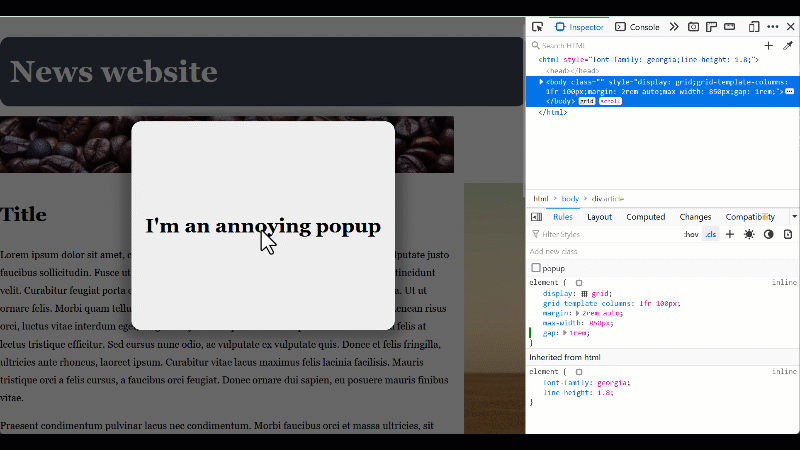
As mentioned in the introduction, the browser must map cursor coordinates to elements. This is known as “hit testing.” By default, an element captures mouse events if the cursor is within its border box. However, the CSS property pointer-events allows developers to alter this reality.
Setting pointer-events: none makes an element “transparent” to the cursor, allowing clicks to pass through to the element beneath it. This is incredibly useful for overlay effects, custom cursors, or decorative elements that shouldn’t block user interaction. Conversely, understanding the bounding client rect (via element.getBoundingClientRect()) allows developers to visualize exactly where the browser thinks an element is located, which is vital for debugging layout shifts or collision detection in CSS Animations.
CSS Grid and Flexbox: Changing the Geometry
CSS Flexbox and CSS Grid have revolutionized Web Layout. They allow elements to break free from the traditional document flow. In a Grid context, the visual order of elements can be completely different from their DOM order. While this is powerful for Responsive Design, it introduces a risk: the “disconnect” between the visual interface and the tab order.
If a developer uses grid-column or order to visually rearrange items, a keyboard user tabbing through the page will see the focus jump erratically. HTML Best Practices dictate that the DOM order should logically match the visual order whenever possible to maintain a coherent experience.
The Shadow DOM and Web Components
Modern Frontend Development has embraced component-based architectures. While libraries like React and Vue virtualize the DOM, the native platform offers the Shadow DOM. This allows developers to encapsulate HTML Templates, styles, and logic within a custom element, completely isolated from the rest of the page.

This encapsulation prevents global CSS from leaking into the component and vice versa. It represents the evolution of HTML elements from simple tags to complex, self-contained applications. This is particularly relevant when building design systems or integrating with CSS Frameworks like Bootstrap or Material Design.
Section 4: Tooling, Frameworks, and Best Practices
In a professional environment, raw HTML is rarely written in isolation. It is generated by frameworks, styled by preprocessors, and debugged with sophisticated tools. This section covers the ecosystem surrounding HTML elements.
CSS Preprocessors and Frameworks
Managing styles for thousands of HTML elements requires robust tooling. CSS Preprocessors like SASS and LESS allow for nesting and variables, making it easier to target specific elements within a complex hierarchy. Furthermore, utility-first frameworks like Tailwind CSS have changed how we think about mapping styles to elements. Instead of writing semantic class names (e.g., .user-profile-card), developers apply atomic utility classes directly to the HTML.

While controversial, this approach provides immediate visual feedback and reduces the size of the CSS bundle. However, it places a heavier burden on the HTML markup itself, making the code visually “noisy.” Regardless of the tool—be it PostCSS, Styled Components, or CSS-in-JS—the underlying output is always standard CSS applied to standard HTML elements.
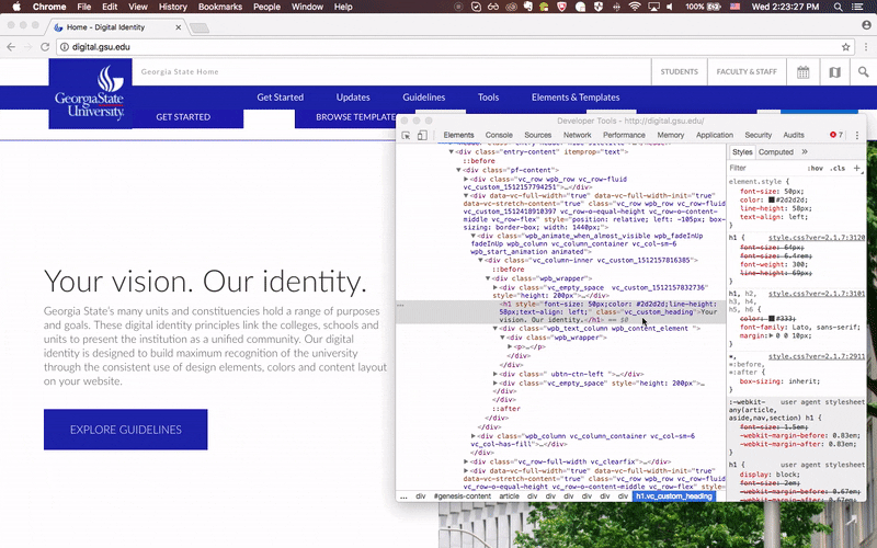
Debugging and Developer Tools
Modern browsers (Chrome, Firefox, Edge, Safari) come equipped with powerful DevTools that allow developers to inspect the live DOM. Features include:
- Element Inspection: visualizing the padding, margin, and border of any element on hover.
- Computed Styles: seeing the final values of CSS properties after the cascade is applied.
- Accessibility Tree: viewing how the browser exposes the content to screen readers.
- Layer Inspector: visualizing stacking contexts and CSS Transitions to debug rendering performance.
Using these tools effectively is essential. For example, if an element isn’t appearing where expected, the “Computed” tab can reveal if a parent container has overflow: hidden or if a CSS Variable is undefined.
HTML in Unique Contexts: Email and Landing Pages
Not all HTML is rendered by a modern browser engine. HTML Email development is a unique beast that often requires using outdated techniques like table-based layouts because email clients (like Outlook) have poor support for Modern CSS. Similarly, high-conversion Landing Pages often require extremely lightweight HTML to ensure instant loading times (Core Web Vitals). In these scenarios, understanding the raw efficiency of HTML tags—stripping away heavy frameworks and relying on native browser capabilities—is a distinct advantage.
Conclusion
The humble HTML element is the atom of the web. While it may seem simple on the surface, the mechanisms that govern its rendering, interaction, and accessibility are deep and complex. From the mathematical precision of the box model and hit-testing to the semantic importance of W3C Standards, mastering HTML elements is a non-negotiable skill for any serious developer.
As the web moves toward more immersive experiences with CSS Animations, Mobile-First Design, and complex state management, the bridge between the code we write and the visual output the user sees becomes increasingly important. By understanding the architecture of the DOM and utilizing modern debugging tools to visualize how the browser interprets our code, developers can build applications that are not only visually stunning but also robust, accessible, and performant. Whether you are using React, Foundation, or vanilla code, the quality of your work ultimately depends on your command of the underlying HTML elements.