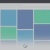
This feat could be achieved by employing Tailwindcss’s flexbox utilities:
A dissected view of this snippet in a tabular form:
| Element | Classes | Explanation |
|---|---|---|
| <div> | “flex flex-col h-screen” | Here, ‘flex’ employs a layout model that lends flexibility to the item arrangement. ‘flex-col’ aligns children vertically – one atop another while ‘h-screen’ sets it to the full height of screen. |
| <header> | (No specific classes) | This header section can include specified class styling applicable for the website’s top-most part |
| <div> | “mb-auto” | The “mb-auto” enables ‘auto’ margin at the element’s bottom, pushing down everything which comes after it, thus keeping the footer stuck at the screen’s bottom. |
| <footer> | (No specific classes) | This footer section embeds the necessary class styling according to design requirements for the website’s bottom-most part |
Applying apt classes to the different structural sections ensures the footer firmly stays at the bottom of the page regardless of the content’s length. However, do note that maintaining the semantic structuring is crucial for this implementation.
As veteran computer scientist Donald Knuth pointed out, “Programmers waste enormous amounts of time thinking about, or worrying about, the speed of noncritical parts of their programs, and these attempts at efficiency actually have a strong negative impact when debugging and maintenance are considered.” The same principle applies here, where functionality prioritizes over perfection, especially when tailoring UI/UX solutions using flexible frameworks like TailwindCSS.
Implementing Fixed/Sticky Footer with TailwindCSS

To successfully implement a fixed or sticky footer with TailwindCSS into your webpage, you’ll need to understand three important concepts:
1. The use of `flex` utility for managing the layout.
2. The utility class provided by TailwindCSS for positioning (`absolute`, `fixed`).
3. Lastly, aligning text or content using the padding and margin utilities.
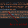
Use the `flex`, `min-h-screen`, `flex-col` classes on the body of your HTML page to allow the main elements such as header, content, and footer to adjust according to the screen height. Here is an example:
<body class="flex flex-col min-h-screen">
    <header>
        ...
    </header>

    <main class="flex-grow">
        ..
    </main>

    <footer class="footer bg-gray-800 p-3">
       ...
    </footer>
</body>
The `flex-grow` class applied in the `
To make the footer sticky which stays visible while scrolling down the page, switch from `flex-col` to `flex-row` utility and use the `fixed` utility along with `bottom-0` to affix the footer at the bottom.
  <footer class="fixed bottom-0 inset-x-0">
     ...
  </footer>
This approach permits a clean, efficient application of a fixed or sticky footer using Tailwind’s utility-first design principle.
Steve Schoger, co-author of Refactoring UI and co-founder of Tailwind CSS, once said: “Utility-first CSS is sort of like writing inline styles. The only difference is that you’re restricted to a finite set of choices.”
By keeping the above details in mind and effectively utilizing the control Tailwind CSS provides, it becomes increasingly possible to create better user interfaces with components like fixed or sticky footers with a high degree of customization and flexibility.
For further insight on applying TailwindCSS in projects, this online resource TailwindCSS documentation may prove helpful.
Manipulating the Position Property in Tailwind for Sticky Footers

Leveraging the ‘position’ property in Tailwind CSS to create a sticky footer provides an optimal solution for maintaining an engaging, organized, and structured web page layout. A fixed or sticky footer persistently remains at the bottom of the webpage, no matter the amount of scrolling done by the user. It is particularly advantageous when your website contains less content and leaves some blank space at the bottom.
In the context of TailwindCSS, the placement of footers can be manipulated through utility classes that define CSS position properties. A ‘sticky’ footer can be created using the `fixed`, `inset-0`, `space-y-2` and `bottom-0` classes available in Tailwind CSS.
The most relevant HTML and TailwindCSS code might look like this:
... ...
This code structure helps facilitate a sticky or fixed footer. Let’s break it down:
– `h-screen`: This class specifies that the div should take up the full height of the screen.
– `flex`: This turns the div into a flexible container, allowing the contained elements to adjust their widths or heights to fill the available space.
– `justify-between`: This class inserts space between the flex items, pushing the footer to the bottom of the screen.
– `fixed`: This positions the footer relative to the browser window.
– `inset-x-0`: This sets the left and right margins to 0, forcing the footer to span the width of the page.
– `bottom-0`: This forces the footer to stick to the bottom side of the parent container.
With changes in web design trends, it has become more commonplace to see footers host important navigational and legal information. Therefore, having them in a permanent, easy-to-find place such as the bottom of the viewport helps enhance user experience.
Tim Berners-Lee, one of the pioneers of the World Wide Web once said, “Anyone who has lost track of time when using a computer knows the propensity to dream, the urge to make dreams come true, and the tendency to miss lunch.” So, despite its simplicity, configuring a sticky footer plays a small part in fulfilling that dream by delivering a website layout that optimizes space and improves content discoverability.
For further study, the Tailwind CSS official documentation for position is a rich resource for understanding how best to implement the various positioning techniques achievable with the framework.
Exploring Flexbox Utility to Keep Your Footer at the Bottom

Making use of Flexbox utility in HTML development allows us to efficiently tackle problems such as maintaining the footer at the bottom of a webpage. This situation is often encountered when using Tailwind CSS, where footers tend not to stick to the bottom of the page.
Using the Flexbox’s `flex` container defined under a class known as `.flex` in Tailwind CSS, you can align your website’s sections vertically or horizontally, making it possible to fix the footer issue persistently. Here’s a basic example on how to handle it:
/* HTML */
<div class="flex flex-col min-h-screen">
   <header>
      /* Header content */
   </header>

   <main class="mb-auto">
      /* Main content */
   </main>

   <footer>
      /* Footer content */
   </footer>
</div>
In this code snippet above:
– The `
– Next, we have a `