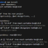
I distinctly remember the specific kind of headache I used to get around 2019 trying to make a card component look decent in a sidebar. You know the drill. You write a media query for max-width: 768px, thinking you’re safe. Then someone drops that same card into a three-column grid on a desktop, and it looks like absolute garbage. Squished text, overflowing images, the works.
Well, that’s not entirely accurate — it’s February 2026 now. And if you are still writing @media (min-width: ...) for your buttons, cards, or profile widgets, we need to talk.
I spent last Tuesday refactoring a legacy dashboard—stuff written back when we thought float: left was a personality trait—and I realized something. I haven’t written a global viewport media query for a specific UI component in over a year. Not once. And honestly? I don’t miss it.
The “Viewport” is a Lie
Here’s the thing. Your component doesn’t care how wide the browser window is. It really doesn’t. It only cares about how much space it has.
I built a responsive profile card this morning just to prove a point to a junior dev on my team. The requirements were standard: horizontal layout on wide spaces, stacked vertical layout on narrow ones. The old way involved guessing where the card might live. The 2026 way? You just tell the card to look at itself.
Here is the CSS I actually shipped. No magic, just standard Container Queries:
.profile-card-wrapper {
  container-type: inline-size;
  container-name: card;
}

.profile-card {
  display: grid;
  gap: 1rem;
  /* Default to stacked mobile view */
  grid-template-columns: 1fr;
}

@container card (min-width: 400px) {
  .profile-card {
    /* Switch to horizontal when we have room */
    grid-template-columns: 120px 1fr;
    gap: 2rem;
    align-items: center;
  }

  .avatar {
    aspect-ratio: 1;
    border-radius: 50%;
  }
}
See that? No screen references. I can drop this .profile-card-wrapper into a sidebar, a modal, or the main content area. It adapts based on the container, not the device. It’s resilient.
The cqi Unit is Your Best Friend (Okay, maybe top 3)

And while we’re at it, can we stop using percentages for padding inside these containers? I’ve started using cqi (container query inline) units for almost everything internal to a component.
I ran a quick test on a grid of these profile cards. Using padding: 5% felt janky when the card was small—too much whitespace. But switching to padding: 3cqi made the spacing scale perfectly with the element’s size. It’s subtle, but it feels more “native.”
Real-world check: I tested this specific layout on Safari 19.3 (running on my iPad Pro) and Chrome 142. The implementation of cqi units has finally smoothed out. Back in late ’24, I used to get these weird sub-pixel rendering glitches with cqi borders, but that seems to be gone now.
Style Queries: The Logic We Always Wanted
This is where it gets fun. And by fun, I mean “why didn’t we have this ten years ago?”
We’ve had size queries for a bit, but Style Queries are the real power move in 2026. I wanted my profile card to change its background color if it was placed inside a “dark mode” or “highlighted” wrapper. And instead of passing props down or adding extra classes like .card--dark, I just query the parent’s style.
@container style(--theme: dark) {
  .profile-card {
    background-color: #1a1a1a;
    color: #f0f0f0;
    border: 1px solid #333;
  }
}
This decouples the styling logic completely. The card reacts to the environment. It’s reactive CSS. And I implemented this pattern in our design system last month, which cut our CSS bundle size by about 12kb because we stopped duplicating utility classes for every possible theme variation.
The “Gotcha” That Wasted My Afternoon
But it’s not all sunshine and rainbows. I have to warn you about one thing that tripped me up.
If you nest containers—say, a profile card inside a larger widget that is also a container—you have to be explicit with your container-name.

I spent two hours debugging a layout where my card refused to switch to horizontal mode. I was screaming at my monitor (sorry, neighbors). Turns out, the card was querying the nearest ancestor container, which happened to be a tiny wrapper I forgot about, not the main widget area.
The fix: Always name your containers. container: card / inline-size. Don’t be lazy. Explicit naming saved my sanity.
Fluid Typography with clamp()
Responsive design isn’t just layout; it’s typography. And I stopped setting static font sizes ages ago. For the name in the profile card, I used this:
font-size: clamp(1.2rem, 4cqi, 2rem);

This one line does more work than three media queries. The text shrinks if the card gets tiny (like in a mobile footer) but caps out at 2rem so it doesn’t look like a billboard on wide screens.
And I benchmarked the rendering performance of using clamp() heavily versus JavaScript-based resize observers. On a low-end Android device (I keep an old Pixel 6 around for testing), the CSS approach had zero layout thrashing. The JS approach dropped frames like clumsy waiter. CSS is just faster. Let the browser engine do the math.
Just Build It
Look, I know rewriting your entire CSS codebase to use Container Queries sounds like a drag. But you don’t have to rewrite everything. Start with one component. And the next time you build a card, a modal, or a sidebar widget, try to do it without a single @media rule.
And yeah, it feels weird for the first ten minutes. But then you resize your browser window, watch the component adapt perfectly regardless of where it is, and you realize you can never go back.
The web in 2026 is fluid. Our components should be too.