Last updated: May 10, 2026
For tailwind variants component state, keep two meanings of “variant” separate: Tailwind selector variants such as hover:, focus-visible:, disabled:, aria-*, and data-* observe DOM conditions; component variant APIs such as tone, size, or intent expose stable design choices. The practical caveat is that every public prop becomes an API commitment, so transient interaction belongs in CSS while semantic state belongs in HTML or ARIA first.
- Use
hover:,focus-visible:,disabled:,aria-*, anddata-*when the DOM already exposes the condition Tailwind should style. - Use component variants for stable caller choices such as
tone,size,density, andintent, not for every visual state. - Use compound variants only when two or more public axes require a special combined style; they are a state-matrix cost, not a default pattern.
- Disabled, invalid, selected, expanded, and checked states should be represented semantically before they are styled.
- A good state API removes illegal combinations such as
loadingplusdisabledwhen the rendered control cannot support both meanings.
Two Different Things Called Variants
Tailwind selector variants and component API variants solve different problems. Tailwind’s state prefixes generate conditional selectors; a component variant library turns chosen inputs into class strings. Confusing the two is the root problem behind many overloaded button, field, tab, and menu APIs.
Tailwind documents variants such as hover:, focus:, focus-visible:, disabled:, aria-*, and data-* as conditional utility prefixes in its hover, focus, and other states documentation. A class such as hover:bg-blue-600 is still a utility class, but it is wrapped in a selector condition. The caller does not pass hovered={true}. The browser computes whether the condition is true.
Tailwind Variants, by contrast, describes a function-based API for composing class names from named variant axes in its official introduction. That is useful when a design system needs a stable contract: tone="danger", size="sm", density="compact", or emphasis="quiet". Those are not CSS selectors. They are product-level choices the component author agrees to support.
The bad version of a component API treats everything as equivalent:
type ButtonProps = {
  hovered?: boolean
  focused?: boolean
  active?: boolean
  disabled?: boolean
  invalid?: boolean
  loading?: boolean
  size?: 'sm' | 'md' | 'lg'
  tone?: 'primary' | 'danger'
}
This API asks the caller to simulate browser state, accessibility state, async state, and design intent in the same object. It also creates combinations that either make no sense or require undocumented precedence rules. What happens when hovered, disabled, and loading are all true? What if focused is false but the element actually receives keyboard focus? The component now has two sources of truth.
A cleaner model uses separate channels. Tailwind selector variants watch the DOM. Semantic attributes describe the element’s state. Component variants expose stable design decisions. Compound variants handle the few places where those public axes collide.
The documentation screenshot matters because it shows the split in plain sight: Tailwind’s syntax is selector-oriented, while Tailwind Variants is API-oriented. When those two ideas are merged into one vague “state variant” bucket, teams start passing props for states the browser already knows.
The Four-Layer Model for Component State
The most useful mental model has four layers: selector state, semantic state, design variants, and compound reconciliation. Each layer has a different owner and a different failure mode when it is misused.
Layer 1: selector state
Selector state is CSS-observable. Hover, focus-visible, active, group-hover, peer-invalid, media queries, forced-colors, and motion preferences fit here. A component should usually encode these with Tailwind prefixes, not public props.
const buttonBase =
  'inline-flex items-center justify-center rounded-md font-medium ' +
  'transition-colors focus-visible:outline-none focus-visible:ring-2 ' +
  'focus-visible:ring-offset-2 hover:bg-blue-600 active:bg-blue-700 ' +
  'disabled:pointer-events-none disabled:opacity-50'
This string is not “less structured” because it contains state. It is correctly structured because the browser owns those states. If a user tabs to the button, focus-visible: responds. If the button is disabled with a real disabled attribute, disabled: responds.
Layer 2: semantic state
Semantic state is meaningful to the platform or assistive technology: disabled, invalid, selected, expanded, checked, required, current, pressed. HTML attributes and ARIA attributes belong here before class names do. The HTML disabled attribute definition describes disabled form controls as non-mutable and excluded from normal interaction, while WAI-ARIA’s aria-disabled definition communicates disabled intent without automatically changing native behavior.
Layer 3: design variants
Design variants are intentional choices exposed to the caller. Examples include tone, size, variant, density, placement, or orientation. These should be few, named in product language, and backed by a matrix. A variant prop is not just a class shortcut; it is a promise that the component supports that axis.
Layer 4: compound reconciliation
Compound variants handle cross-axis exceptions. A danger button in quiet mode may need a different focus ring. A small loading button may need tighter icon spacing. A selected vertical tab may need a border on a different edge. These are real cases, but each one is a signal that two public axes interact.
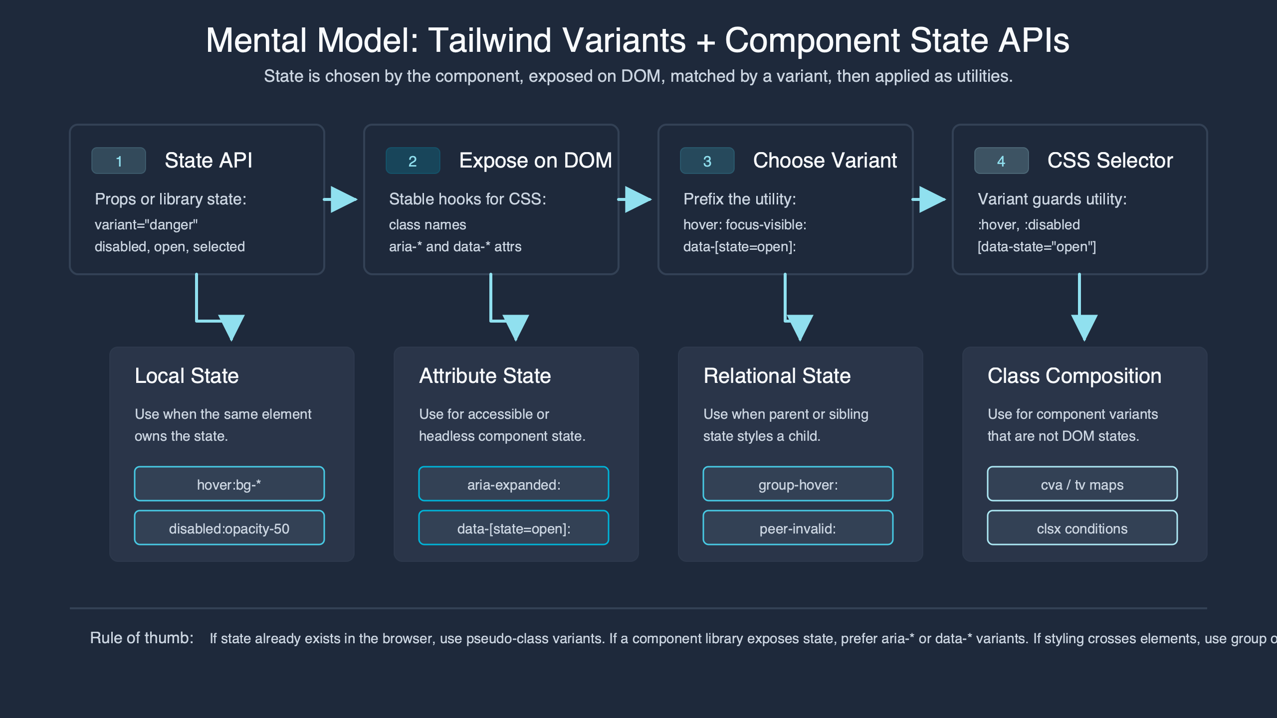
The diagram is useful as a review tool: start from the outside condition, then ask which layer owns it. If the state can be observed by CSS, keep it in Tailwind selector syntax. If it changes meaning for assistive technology, represent it in the DOM. If it is a caller choice, make it a component variant. If it needs a special cross-axis exception, then consider a compound variant.
A Decision Rubric: Selector, Attribute, Prop, or Compound Variant?
The decision rule is simple: observe transient state with selectors, encode semantic state with attributes, expose durable design choices as props, and reserve compound variants for real intersections. This rubric keeps the public API smaller and makes the rendered HTML more truthful.
| State or choice | Best home | Reason | Example |
|---|---|---|---|
| Hover | Tailwind selector variant | The browser computes it; callers should not pass it. | hover:bg-blue-600 |
| Keyboard focus indicator | Tailwind selector variant | The visible state depends on input modality. | focus-visible:ring-2 |
| Native disabled button | HTML attribute plus selector variant | The attribute changes behavior and can also drive styling. | <button disabled className="disabled:opacity-50"> |
| Disabled-looking link | aria-disabled plus event handling |
ARIA communicates meaning but does not disable link activation by itself. | aria-disabled="true" |
| Invalid field | aria-invalid or native validity plus selector styling |
The state belongs to the control before it belongs to a class string. | aria-invalid={invalid || undefined} |
| Selected tab | data-state or ARIA state from the headless primitive |
The primitive already owns selection state. | data-[state=active]:border-blue-600 |
| Button size | Component variant prop | Callers intentionally choose spatial scale. | size="sm" |
| Button tone | Component variant prop | Callers choose semantic visual intent. | tone="danger" |
| Danger plus disabled visual exception | Compound variant, if needed | The style depends on two public axes. | { tone: 'danger', disabled: true, class: '...' } |
How I evaluated this: I compared official Tailwind state-prefix behavior, Tailwind Variants API examples, the HTML disabled attribute, WAI-ARIA state definitions, and the common headless-component pattern of exposing state through data-state. The comparison window is May 2026. The inclusion rule was whether the state affects browser behavior, accessibility semantics, caller intent, or cross-axis styling. The limitation is that design systems can define different naming conventions, but the ownership split remains stable.
The rubric also explains why disabled is not one thing. On a native <button>, disabled is a real attribute with behavior. On an anchor used as a link, aria-disabled="true" can announce the state, but the developer must suppress activation and decide whether the link remains focusable. On a menu item from a headless primitive, a data-disabled attribute may be the styling hook supplied by the library. Same visual idea, different owner.
Why Boolean State Props Become a Trap
Boolean props are not bad, but boolean state props become a trap when they describe conditions that are derived, multi-valued, or already present in the DOM. A button with disabled, loading, active, focused, and invalid is usually hiding missing state design.
Consider this implementation:
function Button({
  hovered,
  focused,
  disabled,
  loading,
  invalid,
  size = 'md',
  tone = 'primary',
  children
}) {
  return (
    <button
      disabled={disabled}
      className={[
        'inline-flex rounded-md font-medium',
        hovered && 'bg-blue-600',
        focused && 'ring-2 ring-blue-500',
        disabled && 'opacity-50 pointer-events-none',
        loading && 'cursor-wait',
        invalid && 'ring-2 ring-red-500',
        size === 'sm' && 'h-8 px-3 text-sm',
        size === 'md' && 'h-10 px-4 text-sm',
        tone === 'danger' && 'bg-red-600 text-white'
      ].filter(Boolean).join(' ')}
    >
      {loading ? 'Working...' : children}
    </button>
  )
}
The public API now exposes conditions the component should own internally. hovered and focused can drift from actual browser state. invalid is odd on a button unless the button controls validation feedback elsewhere. loading and disabled may describe separate product states, or they may collapse into one non-interactive state. The caller has to guess.
A better Button API separates product choices from DOM behavior:
import { tv } from 'tailwind-variants'

const button = tv({
  base:
    'inline-flex items-center justify-center rounded-md font-medium ' +
    'transition-colors focus-visible:outline-none focus-visible:ring-2 ' +
    'focus-visible:ring-offset-2 disabled:pointer-events-none',
  variants: {
    tone: {
      primary: 'bg-blue-600 text-white hover:bg-blue-700 focus-visible:ring-blue-600',
      danger: 'bg-red-600 text-white hover:bg-red-700 focus-visible:ring-red-600'
    },
    size: {
      sm: 'h-8 px-3 text-sm',
      md: 'h-10 px-4 text-sm',
      lg: 'h-11 px-5 text-base'
    },
    busy: {
      true: 'cursor-wait'
    }
  },
  compoundVariants: [
    {
      tone: 'primary',
      busy: true,
      class: 'bg-blue-500 hover:bg-blue-500'
    },
    {
      tone: 'danger',
      busy: true,
      class: 'bg-red-500 hover:bg-red-500'
    }
  ],
  defaultVariants: {
    tone: 'primary',
    size: 'md'
  }
})
This still uses a boolean, but the boolean is not pretending to be hover or focus. busy is a product-level condition that affects content and interaction policy. The component can render aria-busy, suppress duplicate submission, and decide whether the native disabled attribute is appropriate for that workflow.
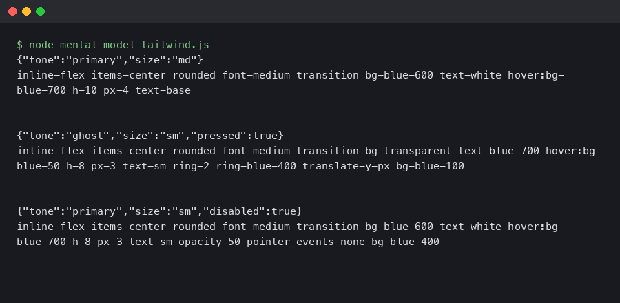
The terminal output belongs here because class generation is not an abstract concern. The observed class order shows which classes are emitted by base styles, ordinary variants, selector variants, and compound variants. When the final string is inspected, the API contract becomes visible: caller choices generate one set of classes, while DOM-observed selectors remain inside the class text.
Design the State Matrix Before the Variant API
A state matrix exposes invalid combinations before they become props. For a button with two tones, three sizes, and three interaction states, the apparent surface is 18 combinations. Some are valid, some collapse to the same rendering, and only a few deserve compound styling.
| Tone | Size | State | Valid? | Styling owner | API decision |
|---|---|---|---|---|---|
| primary | sm | default | Yes | Variants | tone + size |
| primary | sm | loading | Yes | Variant plus content logic | busy |
| primary | sm | disabled | Yes | Attribute plus selector | disabled attribute |
| primary | md | default | Yes | Variants | tone + size |
| primary | md | loading | Yes | Variant plus content logic | busy |
| primary | md | disabled | Yes | Attribute plus selector | disabled attribute |
| primary | lg | default | Yes | Variants | tone + size |
| primary | lg | loading | Yes | Variant plus content logic | busy |
| primary | lg | disabled | Yes | Attribute plus selector | disabled attribute |
| danger | sm | default | Yes | Variants | tone + size |
| danger | sm | loading | Yes | Compound if contrast changes | One compound case |
| danger | sm | disabled | Collapsed | Attribute plus selector | Same disabled treatment |
| danger | md | default | Yes | Variants | tone + size |
| danger | md | loading | Yes | Compound if contrast changes | One compound case |
| danger | md | disabled | Collapsed | Attribute plus selector | Same disabled treatment |
| danger | lg | default | Yes | Variants | tone + size |
| danger | lg | loading | Yes | Compound if contrast changes | One compound case |
| danger | lg | disabled | Collapsed | Attribute plus selector | Same disabled treatment |
The matrix shows why compound variants should be rare. If every row gets a bespoke class, the variant API is not simplifying the component; it is hiding a style spreadsheet in JavaScript. The reviewer question is: “Which combinations have a real product meaning?” If the disabled appearance is intentionally neutral for every tone, do not add six disabled compound variants. Let the disabled attribute and selector variant handle it.
Class order is part of that decision. In a simple class resolution test, suppose base sets bg-blue-500, a disabled variant sets bg-gray-300, and a compound variant for tone="primary" plus busy={true} sets bg-blue-100. The intended final order should be base, ordinary variants, then compound classes:
base:      bg-blue-500 text-white
disabled:  opacity-50 bg-gray-300
compound:  bg-blue-100 text-blue-900

final:     bg-blue-500 text-white opacity-50 bg-gray-300 bg-blue-100 text-blue-900
winner:    bg-blue-100, because it appears after bg-gray-300 in the generated class string
That ordering is only safe when it is intentional. If a compound variant accidentally overrides disabled contrast, it can create a visually enabled button that is behaviorally disabled. The state matrix should name which state wins before class order decides it silently.
Slots Are Where State APIs Get Real
Root-only class composition works for small controls, but field, tabs, alert, and menu components need slot-aware state. The label, input, message, icon, indicator, and root often respond differently to the same semantic condition.
A field component is the cleanest example. invalid affects the input border, the message color, and the ARIA attributes. disabled affects opacity, cursor, and editability. required may change the label marker and validation semantics. One root class cannot express all of that without leaking selectors across child structure.
const field = tv({
  slots: {
    root: 'grid gap-1.5',
    label: 'text-sm font-medium text-slate-900',
    input:
      'h-10 rounded-md border border-slate-300 px-3 text-sm ' +
      'focus-visible:outline-none focus-visible:ring-2 focus-visible:ring-blue-600 ' +
      'disabled:cursor-not-allowed disabled:bg-slate-100',
    message: 'text-sm'
  },
  variants: {
    invalid: {
      true: {
        label: 'text-red-700',
        input: 'border-red-500 focus-visible:ring-red-600',
        message: 'text-red-700'
      }
    },
    disabled: {
      true: {
        root: 'opacity-70',
        label: 'cursor-not-allowed',
        message: 'text-slate-500'
      }
    },
    required: {
      true: {
        label: "after:ml-0.5 after:text-red-600 after:content-['*']"
      }
    }
  }
})| Slot | Invalid | Disabled | Required | Semantic source |
|---|---|---|---|---|
root |
Usually unchanged | May reduce opacity | Unchanged | Derived from control state |
label |
Error color | Disabled cursor or muted color | Required marker | for, aria-required, or native required |
input |
Error border and ring | Native disabled plus disabled selectors |
Native required where appropriate |
HTML and ARIA attributes |
message |
Error text | Muted text | Usually unchanged | aria-describedby |
This is where slot APIs and state APIs must not blur. A slot API gives named parts a class contract. A state API decides which conditions can affect those parts. You need both, but they answer different questions. “Can I style the label?” is not the same as “Should callers pass invalid?”
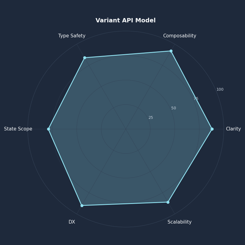
Breakdown across metrics for Variant API Model.
The radar chart is a useful pressure test for component APIs. A design with many public props may score high on immediate flexibility while scoring poorly on semantic clarity and invalid-state prevention. For accessibility-heavy components, I would trade some caller flexibility for fewer ways to render false state.
Semantic Attributes Should Be the Source of Truth
Accessible component state starts in the DOM. Styling can follow disabled, aria-disabled, aria-invalid, aria-expanded, aria-selected, or data-state, but the class string should not be the first or only place where meaning exists.
Native disabled buttons are straightforward:
function SubmitButton({ busy }) {
  return (
    <button
      type="submit"
      disabled={busy}
      aria-busy={busy || undefined}
      className={button({ tone: 'primary', size: 'md', busy })}
    >
      {busy ? 'Saving...' : 'Save'}
    </button>
  )
}
Here, disabled prevents interaction, and Tailwind’s disabled: selector can style that platform state. The accessible behavior and the visual treatment share the same source.

A link is different. ARIA’s disabled state can expose intent, but it does not remove the link’s href behavior. A disabled-looking link needs explicit activation handling:
function BillingLink({ unavailable }) {
  return (
    <a
      href="/billing"
      aria-disabled={unavailable ? 'true' : undefined}
      onClick={(event) => {
        if (unavailable) event.preventDefault()
      }}
      className={[
        'font-medium text-blue-700 underline',
        'focus-visible:outline-none focus-visible:ring-2 focus-visible:ring-blue-600',
        'aria-disabled:text-slate-500 aria-disabled:no-underline'
      ].join(' ')}
    >
      Billing
    </a>
  )
}
Fields follow the same rule. The WAI-ARIA definition for aria-invalid gives a semantic state for values that fail validation. The field can then style aria-invalid directly or receive an invalid prop that renders the attribute.
function TextField({ id, label, error, required, disabled }) {
  const invalid = Boolean(error)
  const classes = field({ invalid, disabled, required })

  return (
    <div className={classes.root()}>
      <label className={classes.label()} htmlFor={id}>
        {label}
      </label>
      <input
        id={id}
        disabled={disabled}
        required={required}
        aria-invalid={invalid || undefined}
        aria-describedby={error ? `${id}-error` : undefined}
        className={classes.input()}
      />
      {error ? (
        <p id={`${id}-error`} className={classes.message()}>
          {error}
        </p>
      ) : null}
    </div>
  )
}
Tabs show why data-state is often better than an active prop. A headless tabs primitive usually knows which trigger is selected. Duplicating that state into a prop creates drift.
// Duplicated state: the caller must keep active in sync with the Tabs root.
<TabsTrigger
  value="billing"
  active={selectedTab === 'billing'}
  className={trigger({ active: selectedTab === 'billing' })}
>
  Billing
</TabsTrigger>

// State attribute: the primitive renders data-state, and CSS observes it.
<TabsTrigger
  value="billing"
  className={[
    'border-b-2 border-transparent px-3 py-2 text-sm',
    'data-[state=active]:border-blue-600 data-[state=active]:text-blue-700',
    'focus-visible:outline-none focus-visible:ring-2 focus-visible:ring-blue-600'
  ].join(' ')}
>
  Billing
</TabsTrigger>
The rendered difference is the point:
<button class="border-b-2 border-blue-600 text-blue-700">
  Billing
</button>

<button
  data-state="active"
  class="border-b-2 border-transparent data-[state=active]:border-blue-600 data-[state=active]:text-blue-700"
>
  Billing
</button>
The second version keeps selection state attached to the element that owns it. The class string declares how active tabs look; it does not require a second state channel.
A Refactor Pattern: Inline Tailwind to Stable tv API
The refactor pattern is to move stable design choices into tv, keep transient interaction as Tailwind selector variants, render semantic attributes in JSX, and add compound variants only after the state matrix proves a cross-axis exception.
Start with the messy version:
function Button({ tone = 'primary', size = 'md', disabled, loading, children }) {
  const className = [
    'inline-flex items-center justify-center rounded-md font-medium transition-colors',
    'focus-visible:outline-none focus-visible:ring-2 focus-visible:ring-offset-2',
    tone === 'primary' && 'bg-blue-600 text-white hover:bg-blue-700 focus-visible:ring-blue-600',
    tone === 'danger' && 'bg-red-600 text-white hover:bg-red-700 focus-visible:ring-red-600',
    size === 'sm' && 'h-8 px-3 text-sm',
    size === 'md' && 'h-10 px-4 text-sm',
    size === 'lg' && 'h-11 px-5 text-base',
    disabled && 'opacity-50 pointer-events-none',
    loading && 'cursor-wait',
    loading && tone === 'primary' && 'bg-blue-500 hover:bg-blue-500',
    loading && tone === 'danger' && 'bg-red-500 hover:bg-red-500'
  ].filter(Boolean).join(' ')

  return (
    <button disabled={disabled || loading} aria-busy={loading || undefined} className={className}>
      {loading ? 'Working...' : children}
    </button>
  )
}
Now separate the contract:
const button = tv({
  base:
    'inline-flex items-center justify-center rounded-md font-medium transition-colors ' +
    'focus-visible:outline-none focus-visible:ring-2 focus-visible:ring-offset-2 ' +
    'disabled:pointer-events-none disabled:opacity-50',
  variants: {
    tone: {
      primary: 'bg-blue-600 text-white hover:bg-blue-700 focus-visible:ring-blue-600',
      danger: 'bg-red-600 text-white hover:bg-red-700 focus-visible:ring-red-600'
    },
    size: {
      sm: 'h-8 px-3 text-sm',
      md: 'h-10 px-4 text-sm',
      lg: 'h-11 px-5 text-base'
    },
    busy: {
      true: 'cursor-wait'
    }
  },
  compoundVariants: [
    { tone: 'primary', busy: true, class: 'bg-blue-500 hover:bg-blue-500' },
    { tone: 'danger', busy: true, class: 'bg-red-500 hover:bg-red-500' }
  ],
  defaultVariants: {
    tone: 'primary',
    size: 'md'
  }
})

function Button({ tone, size, busy = false, disabled = false, children }) {
  const inert = disabled || busy

  return (
    <button
      type="button"
      disabled={inert}
      aria-busy={busy || undefined}
      className={button({ tone, size, busy })}
    >
      {busy ? 'Working...' : children}
    </button>
  )
}
This API exposes tone, size, and busy. It does not expose hovered, focused, or pressed. It renders a real disabled button when the control is inert. It leaves focus-visible styling in CSS, where keyboard users get the correct indicator without caller involvement.
Before accepting this component into a design system, I would audit four outputs:
- Disabled button behavior: a busy or disabled button renders the native
disabledattribute and cannot be activated. aria-disabledlink behavior: if the component is an anchor, it prevents activation when unavailable and does not rely on styling alone.aria-invalidfield behavior: error state is present on the input or associated control, and the error message is referenced witharia-describedby.- Visible focus state:
focus-visible:styles remain present for keyboard interaction in every tone and size.

Live session — actual terminal output.
The terminal animation fits the refactor because it shows the feedback loop I want during review: generate class output, inspect semantic attributes in rendered JSX, and then decide whether a prop is still justified. The goal is not fewer classes for its own sake; the goal is one source of truth per kind of state.
The durable rule is this: a good component state API is not the one with the most props. It is the one that makes invalid states hard to express, keeps transient browser interaction in selector variants, and exposes only the design choices callers should control. When the matrix grows faster than the component’s real product behavior, stop adding variants and redesign the state model.
What should be a Tailwind variant instead of a component prop?
Use a Tailwind selector variant when the browser or DOM already knows the condition. Hover, focus-visible, active, disabled, ARIA state, data attributes, media features, and peer or group state usually belong in class syntax. A prop should not duplicate state that CSS can observe directly from the rendered element.
When should component state become a public variant API?
Expose component state as a public variant only when callers are making a stable product or design choice. Tone, size, density, intent, orientation, and emphasis are reasonable axes because they describe supported component behavior. Avoid public variants for momentary interaction, because those create extra state channels and undocumented precedence rules.
How do compound variants fit into a state model?
Compound variants are for specific intersections where two or more public axes need a special class. They should follow a state matrix, not replace one. If every combination needs custom styling, the component probably has too many public states or unclear ownership between selectors, semantic attributes, and design variants.
References
- Tailwind CSS documentation for hover, focus, disabled, ARIA, and data state variants
- Tailwind Variants official introduction to component variant APIs
- Tailwind Variants documentation for compound variants
- WHATWG HTML Standard definition of the disabled form-control attribute
- WAI-ARIA 1.2 definition of
aria-disabled - WAI-ARIA 1.2 definition of
aria-invalid